this post was submitted on 31 Mar 2024
1055 points (98.3% liked)
tumblr
3432 readers
312 users here now
Welcome to /c/tumblr, a place for all your tumblr screenshots and news.
Our Rules:
-
Keep it civil. We're all people here. Be respectful to one another.
-
No sexism, racism, homophobia, transphobia or any other flavor of bigotry. I should not need to explain this one.
-
Must be tumblr related. This one is kind of a given.
-
Try not to repost anything posted within the past month. Beyond that, go for it. Not everyone is on every site all the time.
-
No unnecessary negativity. Just because you don't like a thing doesn't mean that you need to spend the entire comment section complaining about said thing. Just downvote and move on.
Sister Communities:
-
/c/[email protected] - Star Trek chat, memes and shitposts
-
/c/[email protected] - General memes
founded 1 year ago
MODERATORS
you are viewing a single comment's thread
view the rest of the comments
view the rest of the comments

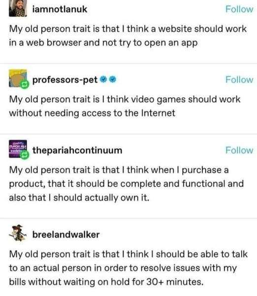
Cars should have buttons and knobs. Not complicated menus and touchscreens. That’s not a “I don’t like change” thing, it’s a safety thing.
Hell yes I should own it if I pay for it.
Event tickets shouldn’t cost a month’s pay or more, fuck middleman businesses that do nothing except price gouge you as a “service.”
Exactly, I've railed on this exact topic.
a screen offers no tactile feedback.
You can learn what buttons feel like, and where they are (and the same for knobs) so yo ucan operate your vehicle without having to take your eyes off the road.
Tablets are sleek and shiny, and fundamentally horrible as a car interface.
I don’t necessarily have an issue with the screens. The problems are:
Commonly accessed features like choosing a media source, setting environmental controls, or even lighting, are buried several “clicks” deep. These need to be surface-level and need zero distraction from driving to interact with.
The “touch” part of touch-screen often sucks. Every car I’ve driven with touch interface requires too long of a press and/or doesn’t pick up the press. So you have to look away from driving to repeatedly mash a touch control. That’s not safe.
The touch area is often too small, such as arrow buttons to raise or lower volume, skip a song, or change temperature. Not only do they not register the touch, they’re too small. Double whammy for distraction.
and theres no tactile feed back. you have no idea where your finger is on the screen, So you have to take your eyes off the road to futz with a stupid menu in a stupid interface.
a button/knob? You can just reach, feel, and operate without ever taking your eyes or attention off the road.
This is why, at the ripe old age of mid-thirties, I just drive with one finger on the scan radio button and stop when I hear a song I like. About a year ago we purchased our first car with a touch screen and I will not adapt.
I'm fairly certain I saw the EU already put something into action about trying to turn this tide. It needs to be expanded for sure
And they should bring back knobs and tactile functions for all white goods for people with disabilities or at least prepare and provide the model for exactly that. Touch screen was a terrible idea for washers, driers and dishwashers. This isn’t just an old person thought, it’s an inclusive thought.
Shitty user interfaces for the sake of looking "modern" can genuinely jack themselves off with the entire monkey paw
I freaking hate this software trend. Years of good engineering design practices have been thrown away for almost no reason.
On purpose! You having agency is your masters losing it.
Knobs are highly underrated for control interfaces. Gives users a fine degree of control to dial in as quickly or as slowly as they're comfortable. They're an old concept, but they can still benefit from contemporary tech. Have you ever used a Nest thermostat? The little blocks as you scroll through the settings, pushing the whole thing in like a button to select. It's weirdly satisfying and I want to control everything with a big knob now.