Fun fact, even if you delete the comment I can still read it in the notification lmao. And they only KINDA did
jaykay
But why do you need another one?
Human review is NEVER going to happen. The amount of comments from Reddit and user queries is mind boggling
It does, but… it’s sounds cool to do everything with the keyboard and all, but in everyday use sometimes you have the mouse in your hand, or only one hand available. I don’t want to be thinking „oh yeah I need to do that instead”, it’s not comfortable anymore, even if it’s not as efficient
Floorp also exists :)
Im a simple man, less browser UI = good. I only want to see what I need to see. I’d hide the address bar if it wasn’t cumbersome to use with hover (as in hover at the top of the browser window to show the address bar).
It’s more efficient to stack wide elements on top of each other than next to each other.
Especially with websites that are optimised for mobile which means they use only the middle 60% of the whole 16:9 screen, not to mention ultrawide. So vertical space is needed more than horizontal space.
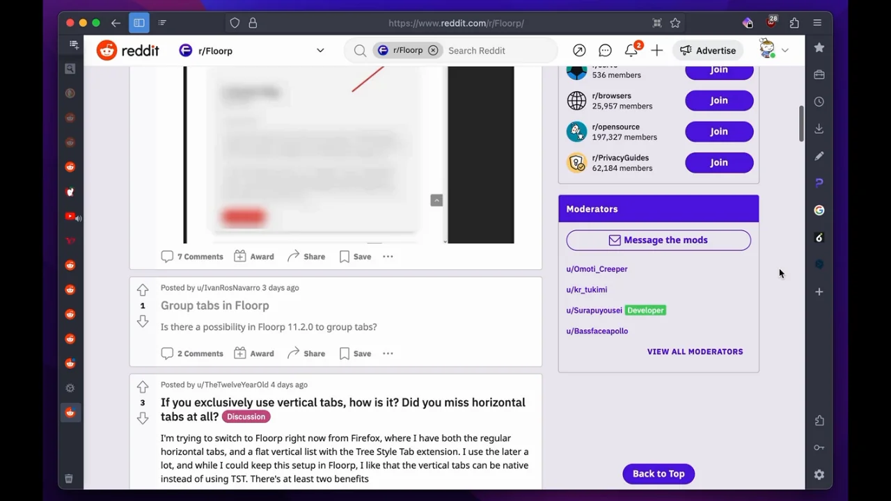
In addition, you can have the vertical tabs hide the text, so you can only see the favicon, unless hovered over. I basically have a 50px bar on the left and top. So this (without the right sidebar, I’m not at my PC so I stole the photo from Reddit :P) :

Clone Wars is awesome. Above anything else from the SW universe. Im in mid 20s and watched it again recently
My anime head sees „quirk” think MHA lmao
No, it’s a picture of your mum, cos she’s so fat. I’m sorry
What if I’m planning to live for more than 130 years, then what? Fuck big corporations /s
You can type it with one hand. Also, you have other buttons on the top bar, like extensions, settings, arrows, home etc