this post was submitted on 15 Jul 2024
28 points (96.7% liked)
3DPrinting
15130 readers
18 users here now
3DPrinting is a place where makers of all skill levels and walks of life can learn about and discuss 3D printing and development of 3D printed parts and devices.
The r/functionalprint community is now located at:
[email protected]
or [email protected]
There are CAD communities available at:
[email protected] or [email protected]
Rules
-
No bigotry - including racism, sexism, ableism, homophobia, transphobia, or xenophobia. Code of Conduct.
-
Be respectful, especially when disagreeing. Everyone should feel welcome here.
-
No porn (NSFW prints are acceptable but must be marked NSFW)
-
No Ads / Spamming / Guerrilla Marketing
-
Do not create links to reddit
-
If you see an issue please flag it
-
No guns
-
No injury gore posts
If you need an easy way to host pictures, https://catbox.moe may be an option. Be ethical about what you post and donate if you are able or use this a lot. It is just an individual hosting content, not a company. The image embedding syntax for Lemmy is 
Moderation policy: Light, mostly invisible
founded 1 year ago
MODERATORS
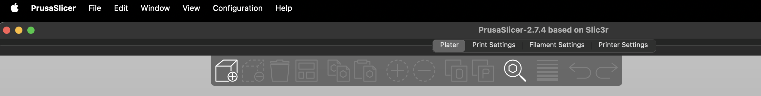
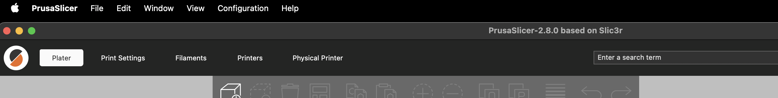
On Windows: I hate it too.
Takes up more space without any benefit. this version looks "modern" but from a usability standpoint, it is worse.
Hope Prusa goes in and makes the toolbar (Menu, Platter, Print Settings, filament, Printers, physical printer) small/less height and gives the buttons something to make them look like a button. Right now it is just text on a grey background. Big steps in the wrong direction in my opinion as it stands but easy to fix.
The addition of the physical printer page/tab is nice. Now I can view the Duet web interface directly in prusaslicer. While the printer are 99% upload and forget from time to time I need to view the control panel to check or adjust a thing or two.
Gnome 3's guiding philosophy
And CLion's new UI.. and Cura slicer.. and discord with default settings.. and most websites.. it seems to be a cornerstone of "modern" UI design, and personally I hate it too.