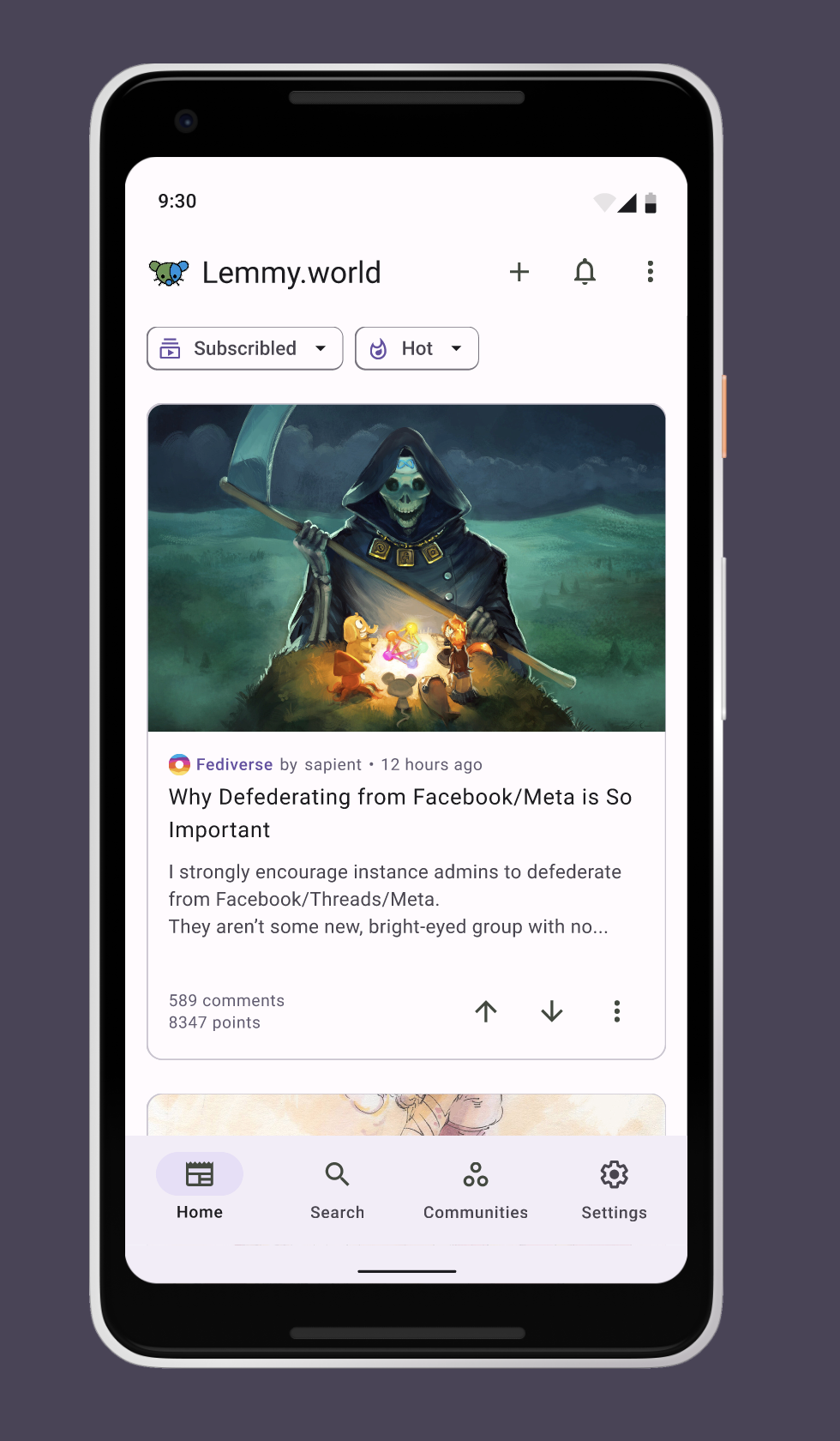
Hi everybody, I'm a UI/UX designer and I wanna contribute to the community here with my expertise. Here is a quick prototype for a Android Lemmy app with Material You Design, it's a simple and customizable app. With this app, I also want to improve the experience when exploring different servers.
Obviously, this is just a concept, so if any developer interest, I'm very willing to collaborate with 🫡 . Vice versa, if anyone stucks with designing his/her own Lemmy client, just reach out to me and I will give you a hand.
Here is a quick demo of some basic features: https://vimeo.com/843481714?share=copy
And here is the figma file if you wanna take a look: https://www.figma.com/file/ZBR30l0ZcKuyKMPjeDmvdF/Lemmy-Android-app?type=design&node-id=53526-31054&mode=dev
Does liftoff look different on Android? I feel like it’s ugly as sin on iOS.
I think it looks fine on android, but it probably doesn't integrate with iOS nicely. I also think light themes are bad by default so I can't judge your photo accurately lol.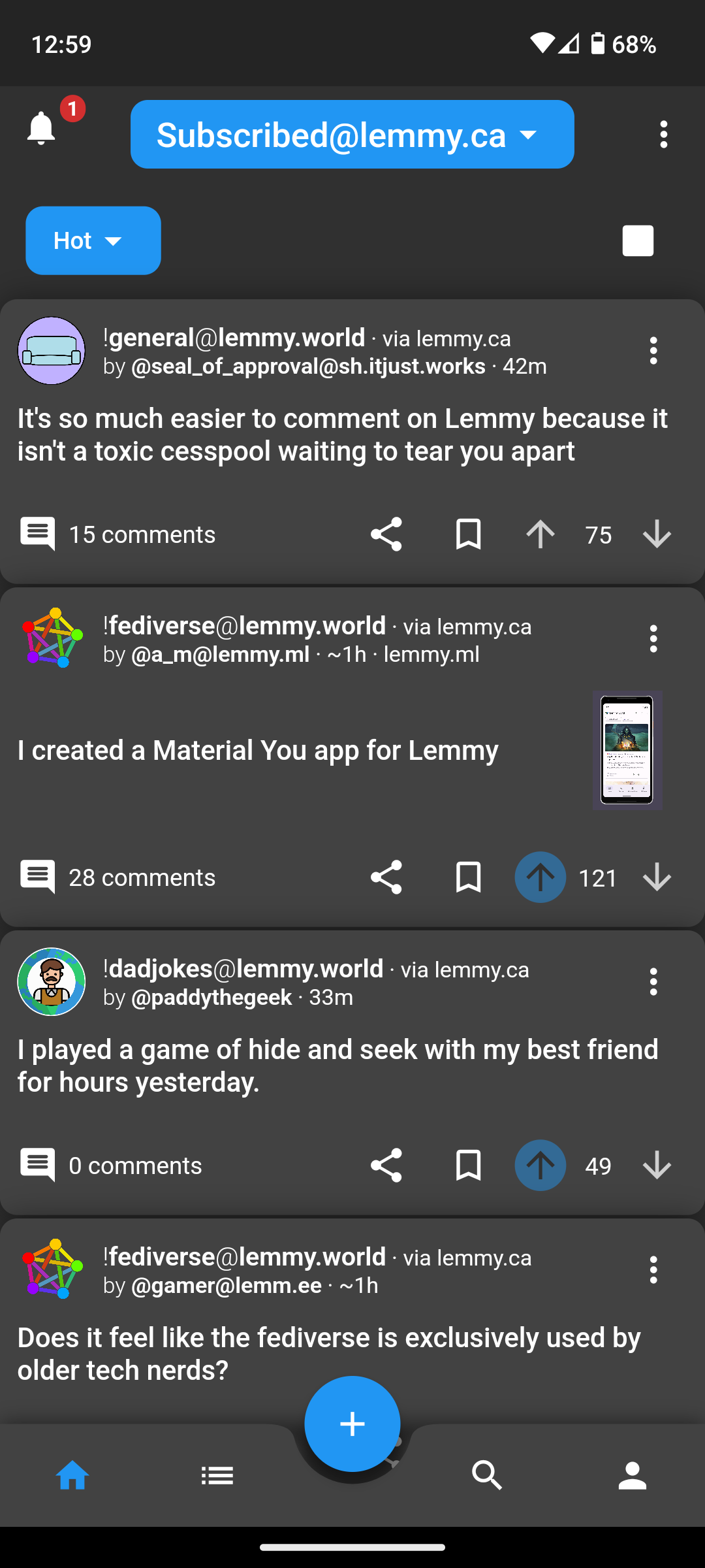
Here is iOS dark / compact
IMHO, the shadows, padding around cards, corner radiuses, drop down stylings, etc. are all pretty rough. It doesn’t feel as refined as Material You or iOS’s design system.
After driving in Memmy, Mlem, and Wefwef (now Voyager), Liftoff feels kind of janky to me.
Just my 2¢
If you go into settings and turn off card shadows and rounded corners it gets a bit better IMO
Oh god, that’s way better. That stuff should be off by default. That said, I still feel like they need a UI person to contribute, and OP should hit them up.
As someone who does UI for a living, it feels rough to me. I wish I had the time to help out, but I’ve already got a couple other nasty side projects on my plate.
Just popping in to mention the UI got a pretty big update recently. You might want to take another look, I think its a lot better now.
The card shadows are a little much. I forgot those were on my default. @[email protected] would you agree?
I don't use compact so I've not seen those before, but I'm sure that's not what anyone intended!
I'd be interested to see what's in the video. I think we're at a good point to spend some time understanding what works on both main target platforms and making the changes to get us there.
Pretty sure that’s just how Android looks.