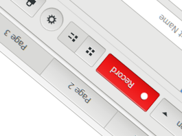
I can't help you but I just came here to say that I also very much dislike the trend that everything has to look flat. Imho visual, simulated depth (through shadows, gradients, etc.) can make UIs look actually much cleaner, because hierarchy, grouping of elements and differentiation between buttons/text inputs and non-interactive elements is often much more obvious on first sight.
Linux
From Wikipedia, the free encyclopedia
Linux is a family of open source Unix-like operating systems based on the Linux kernel, an operating system kernel first released on September 17, 1991 by Linus Torvalds. Linux is typically packaged in a Linux distribution (or distro for short).
Distributions include the Linux kernel and supporting system software and libraries, many of which are provided by the GNU Project. Many Linux distributions use the word "Linux" in their name, but the Free Software Foundation uses the name GNU/Linux to emphasize the importance of GNU software, causing some controversy.
Rules
- Posts must be relevant to operating systems running the Linux kernel. GNU/Linux or otherwise.
- No misinformation
- No NSFW content
- No hate speech, bigotry, etc
Related Communities
Community icon by Alpár-Etele Méder, licensed under CC BY 3.0
Thanks, I agree. So far the only theme I've found is this one, which is at least Adwaita-level skeuomorphic. Might give it a try later
Maybe check this itsfoss.com list and see if anything catches your eye?
I can't really suggest any specific themes; Every year or so I try a heap of different ones, they all annoy me in different ways, and I end up right where I started: using Adwaita again.
There are a number of nice skeuomorphic tagged themes on pling and other icons and such also are available there. The best option might be to just abandon the trendy GTK scene and embrace good old TDE! TDE has KDE3's Plastik theme which looks great to me! (And there is a new port available for current KDE if anyone is interested.) But the early pre-gummy version of ClearLooks would be my favorite if it existed. Raleigh is pretty nice with those classic zebra stripes! Please do let us all know what you find because there are many of us not so happy with the corporate minimalist aesthetic.
Hmm, I'm quite accustomed to Gtk 3 by now but thanks for all these links, those are some cool+useful projects!
Simplewaita. Despite the name, it SCREAMS skeueo.
