this post was submitted on 05 Dec 2024
264 points (96.8% liked)
Games
16953 readers
370 users here now
Video game news oriented community. No NanoUFO is not a bot :)
Posts.
- News oriented content (general reviews, previews or retrospectives allowed).
- Broad discussion posts (preferably not only about a specific game).
- No humor/memes etc..
- No affiliate links
- No advertising.
- No clickbait, editorialized, sensational titles. State the game in question in the title. No all caps.
- No self promotion.
- No duplicate posts, newer post will be deleted unless there is more discussion in one of the posts.
- No politics.
Comments.
- No personal attacks.
- Obey instance rules.
- No low effort comments(one or two words, emoji etc..)
- Please use spoiler tags for spoilers.
My goal is just to have a community where people can go and see what new game news is out for the day and comment on it.
Other communities:
founded 2 years ago
MODERATORS
you are viewing a single comment's thread
view the rest of the comments
view the rest of the comments
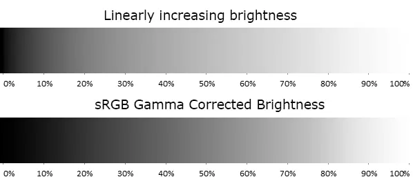
Stupid article needs a before and after comparison.
Instead it has way too many ads.
This should have been easy enough to illustrate.
Edit: Here is a greyscale illustration of a similar phenomenon:
From https://www.odelama.com/photo/Developing-a-RAW-Photo-by-hand/
Of course in reality it get a bit more complex when we perceive colors as having different brightness too:
From https://www.vis4.net/blog/avoid-equidistant-hsv-colors/
This is amazing! I wish there was something akin to Lemmy Gold! Lemmy give it to ya!
EDIT I've posted this comment to bestoflemmy
Lemmy Gold you say?