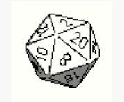
Here is a canvas link with the image as template. There is a bit too much white around the dice so ignore that.
Dungeons and Dragons
A community for discussion of all things Dungeons and Dragons! This is the catch all community for anything relating to Dungeons and Dragons, though we encourage you to see out our Networked Communities listed below!
/c/DnD Network Communities
- Dungeons and Dragons - Art
- DM Academy
- Dungeons and Dragons - Homebrew
- Dungeons and Dragons - Memes and Comics
- Dungeons and Dragons - AI
- Dungeons and Dragons - Looking for Group
Other DnD and related Communities to follow*
- Tabletop Miniatures
- RPG @lemmy.ml
- TTRPGs @lemmy.blahaj.zone
- Battlemaps
- Map Making
- Fantasy e.g. books stories, etc.
- Worldbuilding @ lemmy.world
- Worldbuilding @ lemmy.ml
- OSR
- OSR @lemm.ee
- Clacksmith
- RPG greentext
- Tyranny of Dragons
- DnD @lemmy.ca
- DnD [email protected]
DnD/RPG Podcasts
*Please Follow the rules of these individual communities, not all of them are strictly DnD related, but may be of interest to DnD Fans
Rules (Subject to Change)
- Be a Decent Human Being
- Credit OC content (self or otherwise)
- Posting news articles: include the source name and exact title from article
Format: [Source Name] Article Title
- Posts must have something to do with Dungeons and Dragons
- No Piracy, this includes links to torrent sites, hosted content, streaming content, etc. Please see this post for details
- Zero tolerance for Racism/Sexism/Ableism/etc.
- No NSFW content
- Abide by the rules of lemmy.world
Do you know what is the

overlaying the D20?
It's the spot we choose on the empty canvas for the RetroDECK logo.
But as a DM myself I hope we can both coexist.
The RetroDECK Team loves D&D and TRPGs
We're misaligned with the template on the "20". Might be worth whiting out the misaligned "20" just so we don't get confused.
EDIT: It's mostly fixed now, it looks like we were working with a rough outline someone made on the template, likely just to establish territory. Should be fine to just correct the shading. Now, something's covering part of the d20, but it's still recognizable, so might as well let that be...
