this post was submitted on 07 Sep 2024
11 points (100.0% liked)

Connect for Lemmy App

2672 readers
14 users here now

A community for the mobile app Connect for Lemmy.

Links

founded 1 year ago
MODERATORS
 

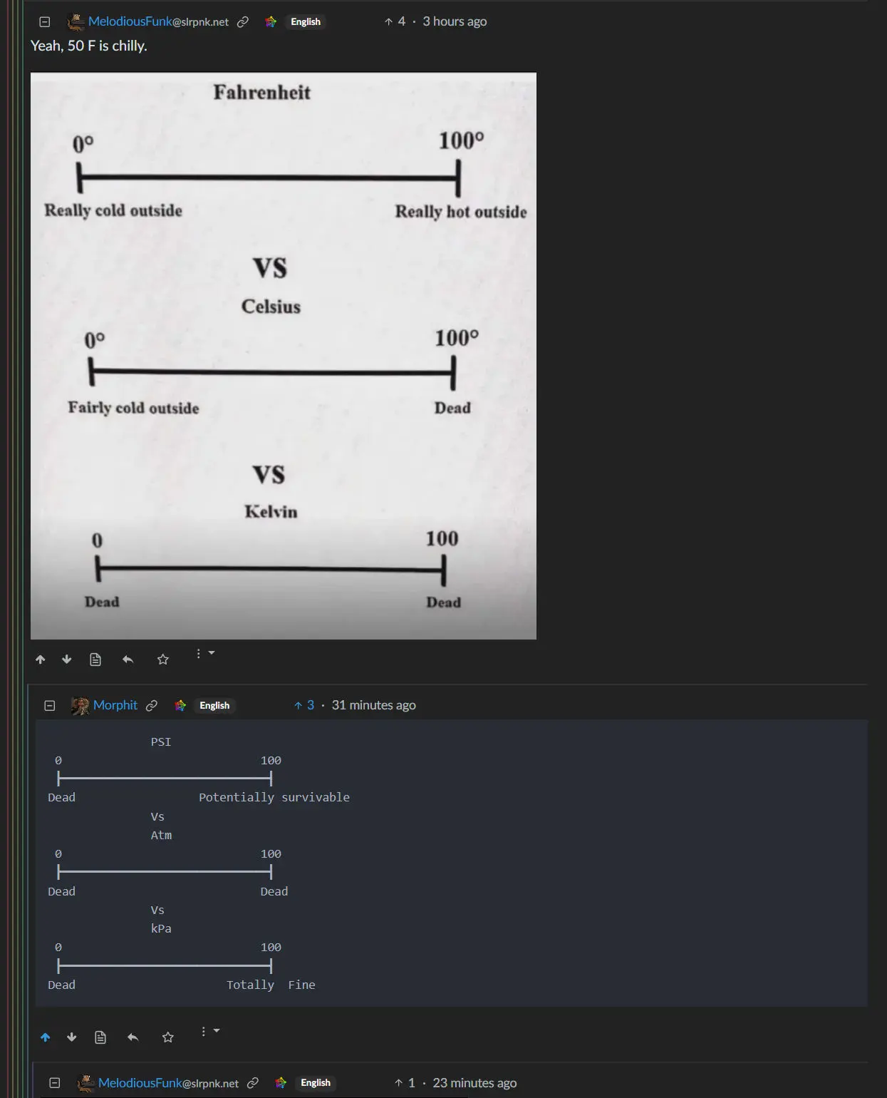
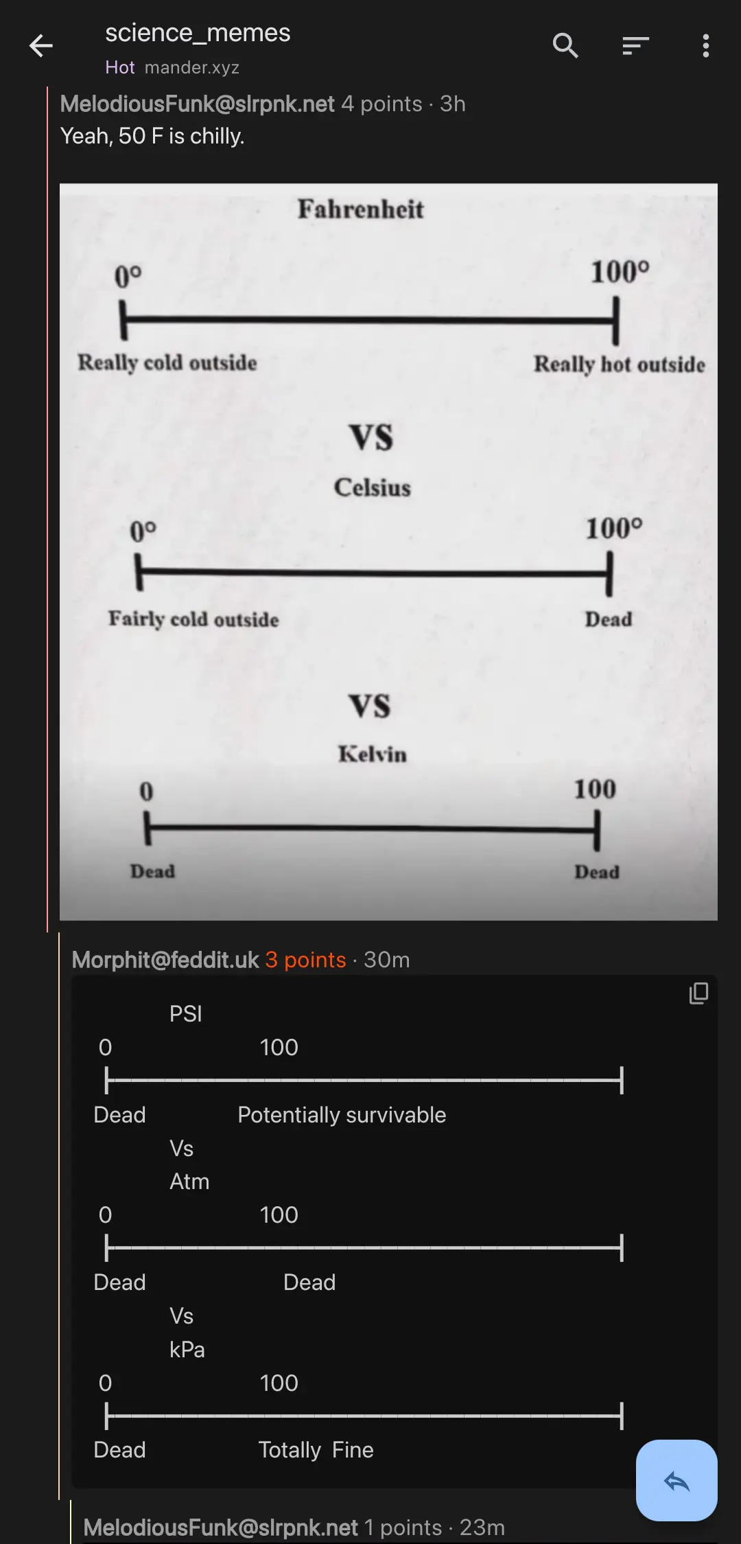
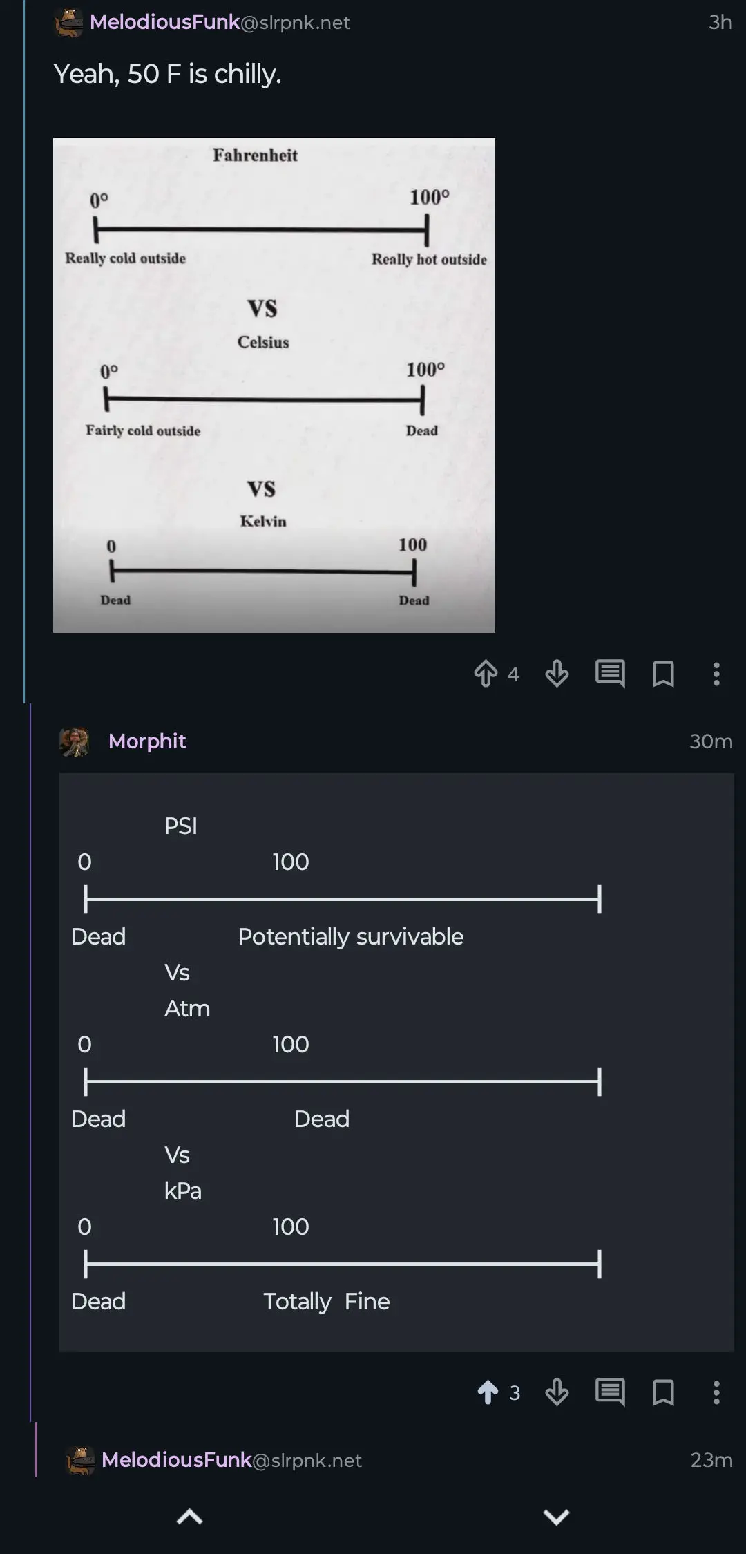
I'm upset that a meme I tried to remake with Unicode box drawing characters lines up terribly in apps: https://lemmy.ca/post/28490027 Shouldn't code blocks render in monospace?

On Lemmy's web frontend it's perfect:

On Connect it looks like this:

On Jerboa it's basically the same:

Eternity does use monospace but the box drawing characters seem to be too wide.

All I can find about it here is one post from a year ago: https://lemmy.ca/post/1492857

top 1 comments
sorted by: hot top controversial new old
[–] [email protected] 5 points 2 months ago* (last edited 2 months ago)

Another, perhaps more obvious, example here: https://fedia.io/m/[email protected]/t/1171425/-/comment/7185393

https://fedia.io/m/[email protected]/t/1171425

Hmm, neither of those do a lookup and open in Connect, so might need to go to [email protected] and look for it.

Here's a screenshot: