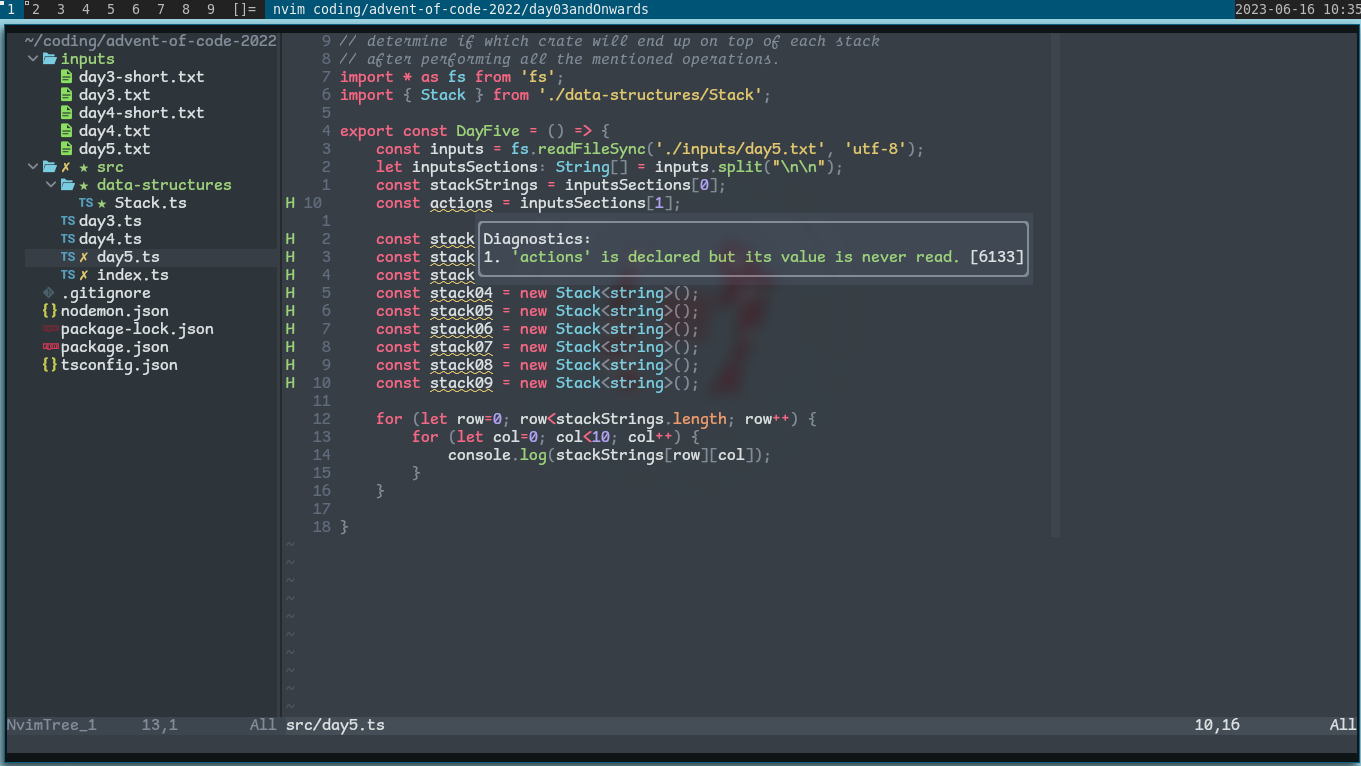
It's interesting that you added serifs and monospacing to a sans serif font. It's almost like comic sans but with all the things that make it comic sans removed.
Programming
All things programming and coding related. Subcommunity of Technology.
This community's icon was made by Aaron Schneider, under the CC-BY-NC-SA 4.0 license.
Well it is Comic Mono after all, not Comic Sans Mono :)
So despite the hate Comic Sans gets, squiggly fonts make it easier for dyslexics to read. Non-dyslexics can experience a similar effect by reading a book in serif then a non-serif font. I hate Comic Sans too lol but do what makes your life easier.
[This comment has been deleted by an automated system]
"Serious tho, Comic sans" four words I didn't expect today. Thanks for the heads up on legibility as a small font.
I unironically really like Comic Mono despite not super being a fan of Comic Sans (not cos it looks bad, I think it's actually really nice looking, just overused)
I keep thinking about switching to this font. I use Fira Code atm, and I'd miss the ligatures, but this genuinely looks a a lot more readable
I'm going to try this after trying Intel's new font that's supposed to be made to accommodate for vision impairment.
It's really weird to me how Internet sometimes decide to hate on things just for the sake of it.
I wouldn't be using it myself, because I'm not a fan of hand-written style fonts. But, I see no problem with Comic Sans.
I love Comic Mono. I use Comic Code - it's not free but it does support ligatures, which was worth it to me. The legibility boost is excellent.
There was a YouTube programmer I used to watch called funfunfunction. He'd do a weekly video where he'd take a task, a framework, and a "handicap". One episode I remember someone suggested "comic sans lol" , which he set up, but it looked good
If the font weight were ratcheted down a little, I'd be pretty happy with it.
the very typeface you’ve been trained to recognize since childhood What does this mean? I feel like the one we learned from childhood would be Times New Roman since every teacher I had required that font.
Need to give this a go at work tomorrow!
Saving that font for my e-reader tablet.
Suuuper legible and fast to read.
Great to find another Comic Mono user! It's super easy to read. I've been using it in IDEs / Terminal for a while now.
I've even set up Stylus scripts to use it in GitHub and other sites as I find weird going back to the "normal" code fonts.
I feel like a whole new world has opened its doors to me. I’m using this tomorrow at work.
Yeah, I'm surprised how much I like the look of this. I'm into it.
A dude posted his neofetch on a Linux community and he uses fucking comic sans for his terminal. Probably will rot in hell
I unironically love Comic Mono. I am not dyslexic, I have good eyesight, but I feel like I can read code so much more easily with it versus most other monospaced fonts.
Me too man! Been using it for over a year now, coming from Fira Code. It's actually a real enjoyable font to look at.
Nothing wrong with that. I personally couldn’t switch to it though.
At least you’re using a monospaced one…
I'd love to see someone code in the actual Comic Sans rather than the awesomely adapted Comic Mono. Indentation be damned!
Stumbled into this site while looking through other comments and apparently it was designed for the speech bubbles of a cartoon dog, not sure about the "legible at small sizes" claim - http://www.connare.com/whycomic.htm
That's actually not bad.
omfg this is the perfect demo font
Goddamn it...
installs the font on his computer
Might have to learn to code, love me some Comic sans
WolfgangsChannel also recently said he used a comics sans-lile font
Look what you have done! I used Operator Mono for Italics. I kind of like this!

Does it support ligatures??
Whatever helps you to the path of a 10x developer, my friend.