this post was submitted on 24 May 2024
299 points (99.3% liked)
Don't Dead - Open Inside
1012 readers
2 users here now
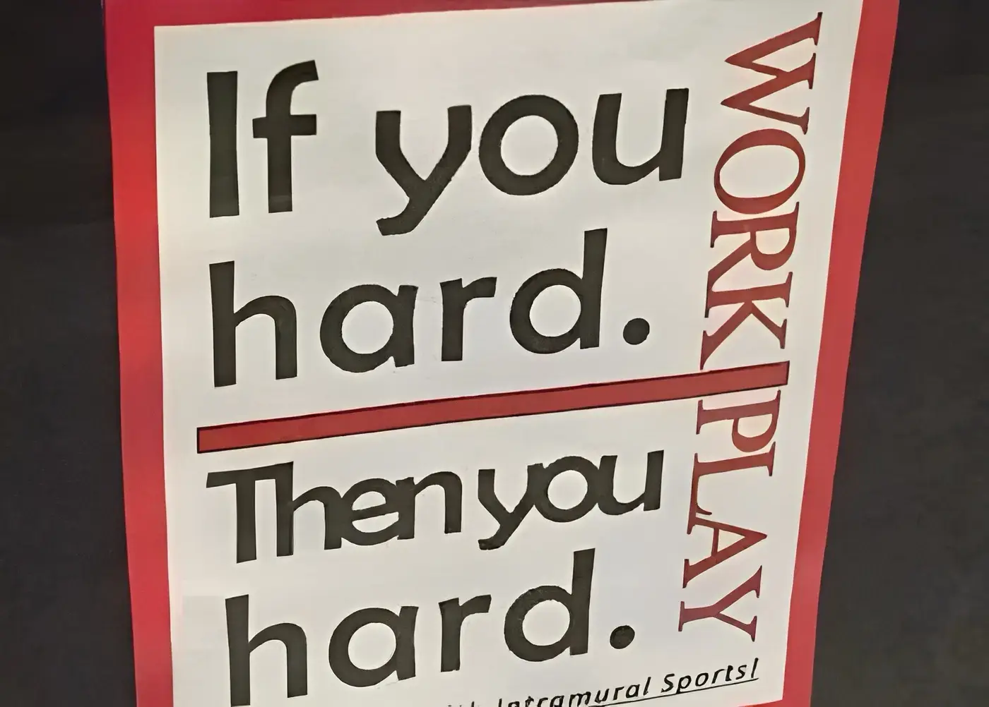
Images of text-designs, that are barely readable due to the placement of the words or letters
Please indicate which post is original by writing "OC" and properly credit stolen posts.
Please mark NSFW posts properly, don't spam, yadadadada
founded 11 months ago
MODERATORS
you are viewing a single comment's thread
view the rest of the comments
view the rest of the comments
The font and kerning is so bad it makes me want to send whoever designed this to a North Korean re-education camp, but for graphic design.
Yeah, now that someone also saw it, I’ll add that it’s idea not so much execution.
But I pulled back because it did actually appear kerned on my somewhat stoned look, leading me to not want to offend someone out there who at least used more tools than squish.