this post was submitted on 23 Jul 2023
746 points (92.6% liked)
Data Is Beautiful
6866 readers
1 users here now
A place to share and discuss data visualizations. #dataviz
(under new moderation as of 2024-01, please let me know if there are any changes you want to see!)
founded 3 years ago
MODERATORS
you are viewing a single comment's thread
view the rest of the comments
view the rest of the comments

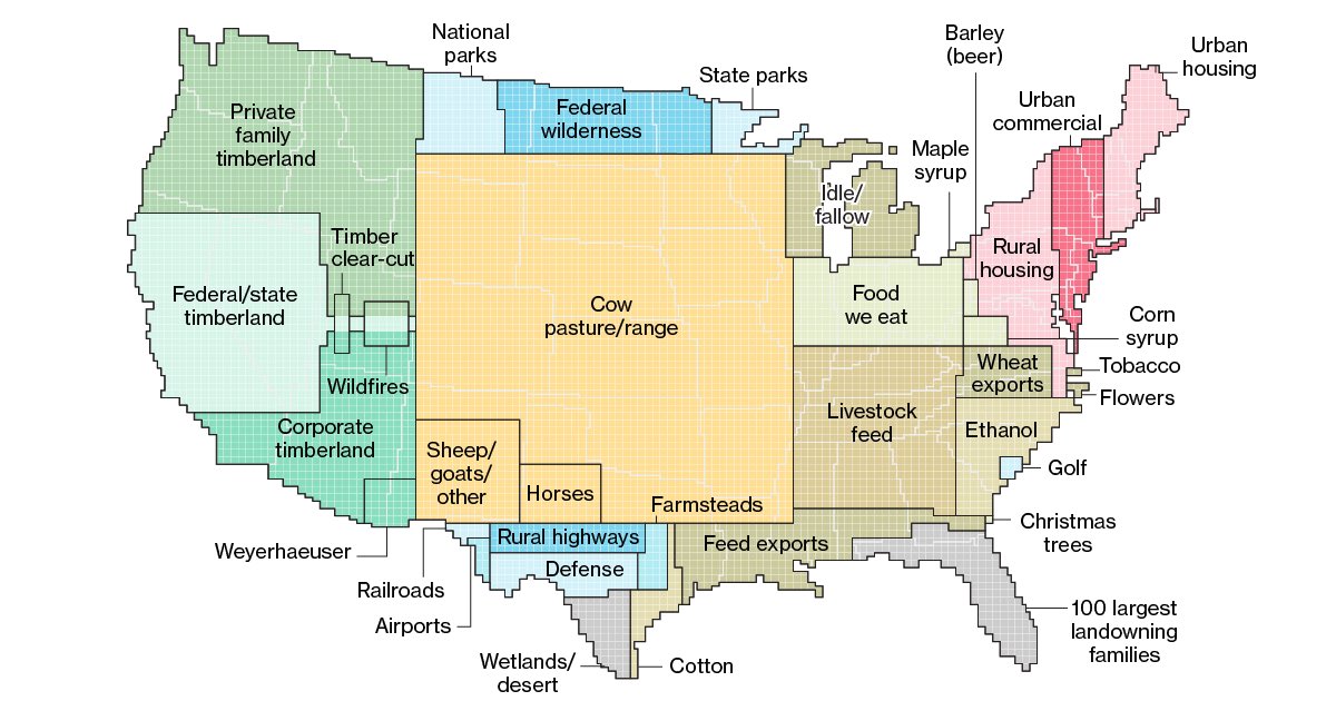
Agreed. I definitely thought that at first, thinking some of them seemed very off. Glad I read these comments. It’s especially confusing considering where some things are in the map that it seams almost believable for example that NY/NJ are made up mostly of mostly urban and commercial areas.
But it is a good chart (not map) for what it’s intended to show with some perspective provided in proper labeling.