this post was submitted on 23 Jul 2023
746 points (92.6% liked)
Data Is Beautiful
6878 readers
1 users here now
A place to share and discuss data visualizations. #dataviz
(under new moderation as of 2024-01, please let me know if there are any changes you want to see!)
founded 3 years ago
MODERATORS
you are viewing a single comment's thread
view the rest of the comments
view the rest of the comments

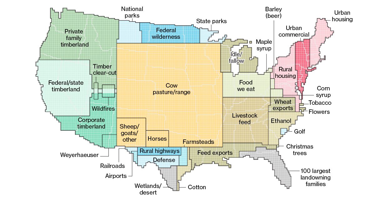
But it's clearly not broken down by state. Surely it would be nonsensical to put all of airports in the country in a giant square in southern Texas, right? That's not what this map is intending to say.
I know this map isn’t clearly broken down by state, which is (part of) why this map struggles to communicate what it’s trying to say IMO. I think the first map in the linked Bloomberg article (with land use data broken down on a more granular level) does a better job at communicating the same trends