this post was submitted on 02 Jul 2024
63 points (90.9% liked)
homeassistant
12055 readers
34 users here now
Home Assistant is open source home automation that puts local control and privacy first. Powered by a worldwide community of tinkerers and DIY enthusiasts. Perfect to run on a Raspberry Pi or a local server. Available for free at home-assistant.io
founded 1 year ago
MODERATORS
you are viewing a single comment's thread
view the rest of the comments
view the rest of the comments

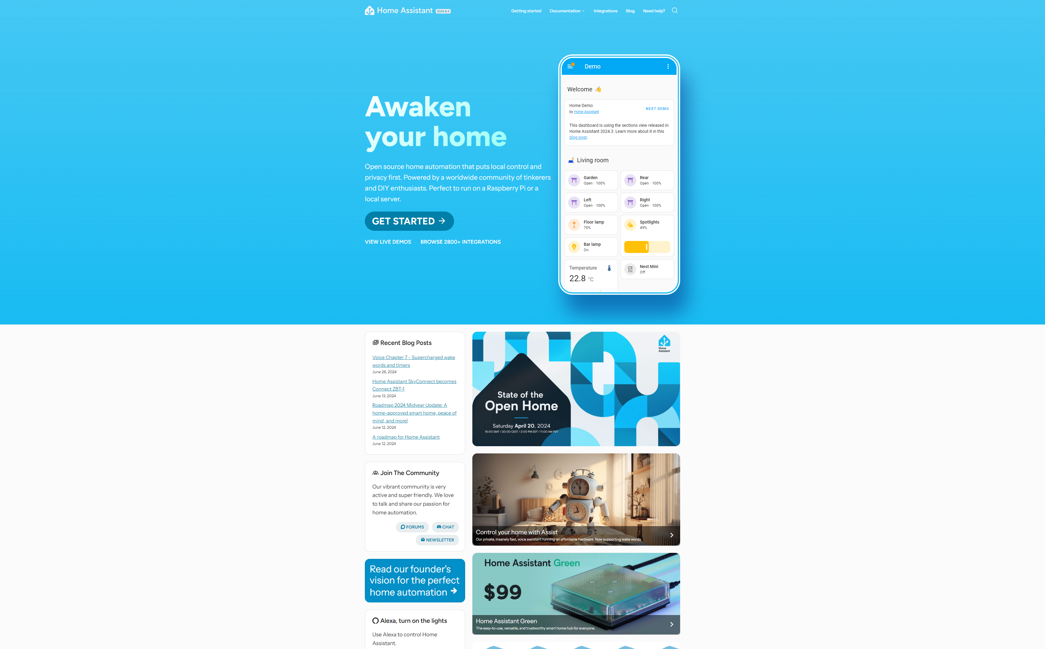
Not sure if "CVS receipt layout" is a common term or not, but I've used it over the last 10 years or so.
It describes websites that have massive margins with the content displayed as a thin strip down the middle; everything on the side is just wasted space (or crammed with ads).
Receipts from the retailer CVS are a known joke where the smallest, single-item purchase will generate a receipt that's 6 foot long because of all the ads, coupons, and other junk tacked on.
In the old days, it was a lazy way to make websites work on desktop and mobile. Now, it's a lazy excuse for not doing responsive design and/or allocating massive amounts of space for ads. I hate it. lol.