this post was submitted on 10 Jul 2024
79 points (90.7% liked)
Linux
47232 readers
937 users here now
From Wikipedia, the free encyclopedia
Linux is a family of open source Unix-like operating systems based on the Linux kernel, an operating system kernel first released on September 17, 1991 by Linus Torvalds. Linux is typically packaged in a Linux distribution (or distro for short).
Distributions include the Linux kernel and supporting system software and libraries, many of which are provided by the GNU Project. Many Linux distributions use the word "Linux" in their name, but the Free Software Foundation uses the name GNU/Linux to emphasize the importance of GNU software, causing some controversy.
Rules
- Posts must be relevant to operating systems running the Linux kernel. GNU/Linux or otherwise.
- No misinformation
- No NSFW content
- No hate speech, bigotry, etc
Related Communities
Community icon by Alpár-Etele Méder, licensed under CC BY 3.0
founded 5 years ago
MODERATORS
you are viewing a single comment's thread
view the rest of the comments
view the rest of the comments
Capital i is same as non-capital L... So a horrible font for me.
The Inter typeface is very versatile and has many different options and variants, including more distinguishable uppercase i and lowercase L. The article just installed the base version as an example. https://rsms.me/inter/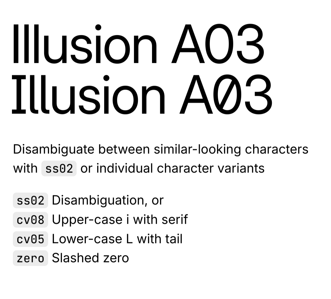
Oh thanks! This is very helpful. Next thing to figure out is how to set those options as default. Found this gem after a bit of googling.
Yeah that's really frustrating
Why do they do this?
Do what? Nothing has even been done yet, they're just discussing the possibility of changing the font...
I mean making a font whete the l and I are the same
Fair, they're pretty common but most fonts support OpenType variations which let you change parts of the fonts to other variants. Having a variant with distinct l's and I's is pretty common and Inter supports this.
but thats counter intuitive, why not stick to a clear fonts? im not gonna judge ones choices but i just dont understand it is all.
I agree, I wish fonts just defaulted to distinguishing between them
time for a mass boycott of bad fonts!!
Like most modern fonts, it supports a lot of OpenType features, so this can be changed dynamically. Changing some settings by default has already been mentioned in the discussion around the change.
I guess they're copying mainstream OSes (at least Android) with this one
IIRC this issue is mentioned in the gitlab discussions (from months ago ... not sure how this became news suddenly); they're looking to patch Inter if they decide to use it as the UI font.
Generally it renders much better but that's a turn off for me as well.
I'm normally not someone who gets hung up on fonts but this one thing bugs me SO MUCH.