this post was submitted on 30 Aug 2024
1536 points (97.1% liked)
Memes
45731 readers
1147 users here now
Rules:
- Be civil and nice.
- Try not to excessively repost, as a rule of thumb, wait at least 2 months to do it if you have to.
founded 5 years ago
MODERATORS
you are viewing a single comment's thread
view the rest of the comments
view the rest of the comments

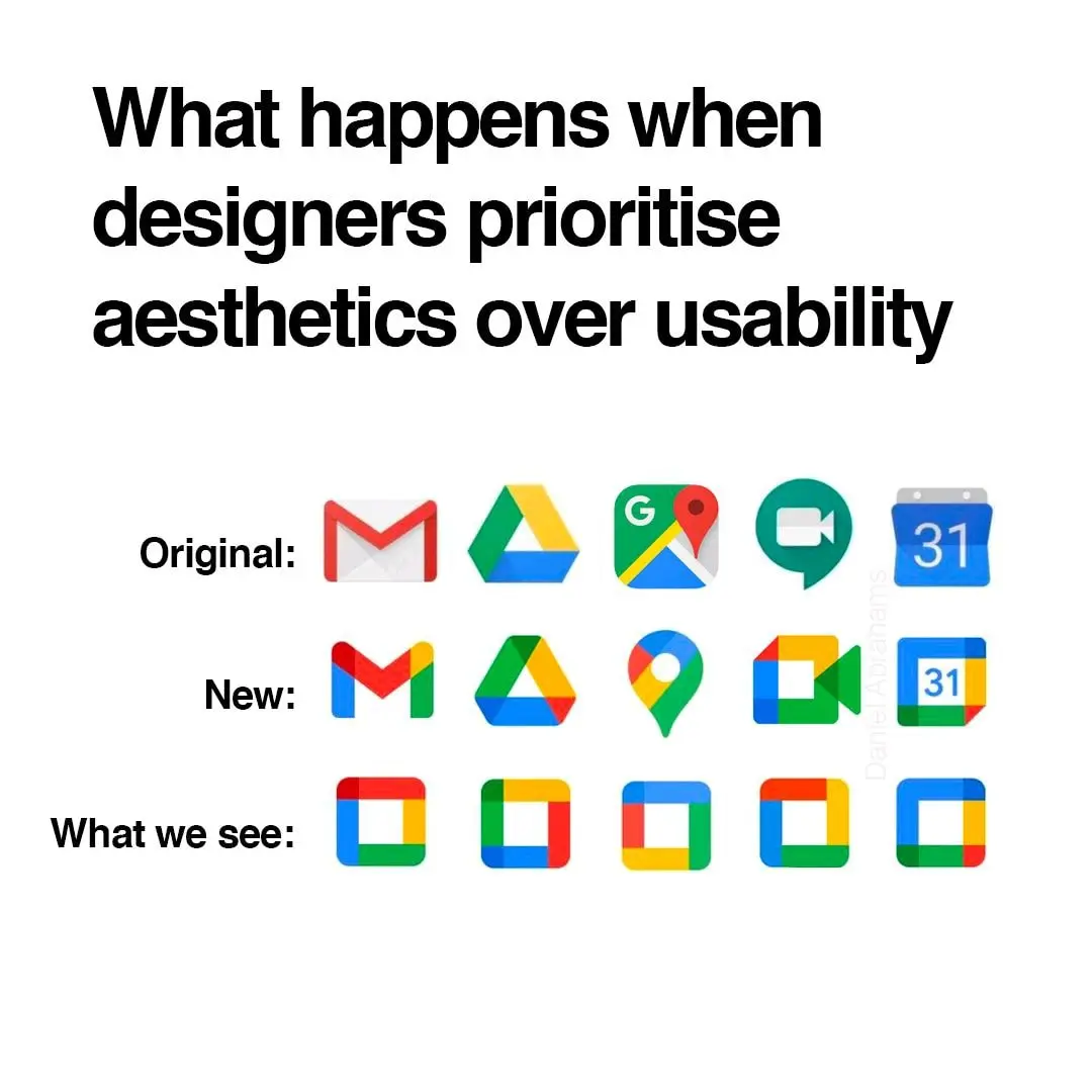
It's not even more aesthetic. Just more unified in branding.
And the interface of their apps are still incoherent af. I don't know how, but they manage to make things worse every time
It's ok, they'll just retire the service eventually.
Yeah, the old logos were all over the place. At first glance it’s not obvious they’re all Google apps.
And? All of those being part of the same walled garden is a bug in the legal system not a feature.
Better be explicit about the walled garden rather than being diffuse about it
To me, that's just the case for camera and calendar. Maps is IMHO perfect (except the unnecessary G) and the red-and-white envelope is quite well-known.
I think what really bothers me about the aesthetics is that the shapes are broken up by the coloration. For example, the pin icon for Google Maps looks almost like a hook, because the yellow has little contrast on this white background.
And that’s why I don’t really hate it. I hate Google, but I think it’s a neat design choice. I still hate Microsoft’s icon design a lot though, they can’t seem to stick with one thing.
Whatever. It sucks ass is the point.
My point is that it's also ugly.
I definitely find it more aesthetically pleasing. Just like the icon packs.