this post was submitted on 31 Oct 2024
7 points (100.0% liked)
No Stupid Questions
2315 readers
86 users here now
There is no such thing as a Stupid Question!
Don't be embarrassed of your curiosity; everyone has questions that they may feel uncomfortable asking certain people, so this place gives you a nice area not to be judged about asking it. Everyone here is willing to help.
- ex. How do I change oil
- ex. How to tie shoes
- ex. Can you cry underwater?
Reminder that the rules for lemmy.ca still apply!
Thanks for reading all of this, even if you didn't read all of this, and your eye started somewhere else, have a watermelon slice 🍉.
founded 2 years ago
MODERATORS
you are viewing a single comment's thread
view the rest of the comments
view the rest of the comments


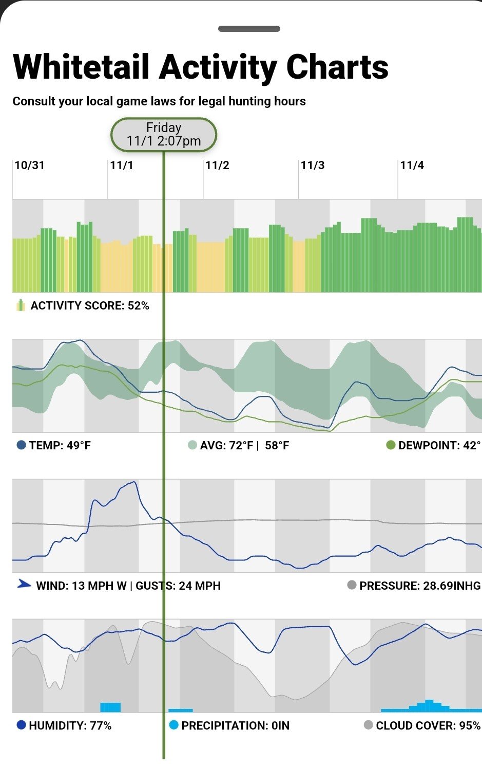
Maybe the shaded area is some sort of long run expected range of temperature, based on a sample of past years?
The top of the range has a nice daily insolation profile (cloud free), temp peak lags solar noon a bit. The lower green range are maybe repreenting cooler cloudy days, so less regular.
So around and after the green vertical line it will be unusually cold until shortly after dawn on the third when it will be back in the expected range for a day or so. Temp stays above dewpoint, so no ground level mist (just)?
naah - just guessing - it tells me there is more information needed / bad graph.