this post was submitted on 08 Oct 2023
258 points (97.1% liked)
Crappy Design
3004 readers
4 users here now
Noticed that theres no equivalent to r/crappydesign here yet so i made one
founded 1 year ago
MODERATORS
you are viewing a single comment's thread
view the rest of the comments
view the rest of the comments

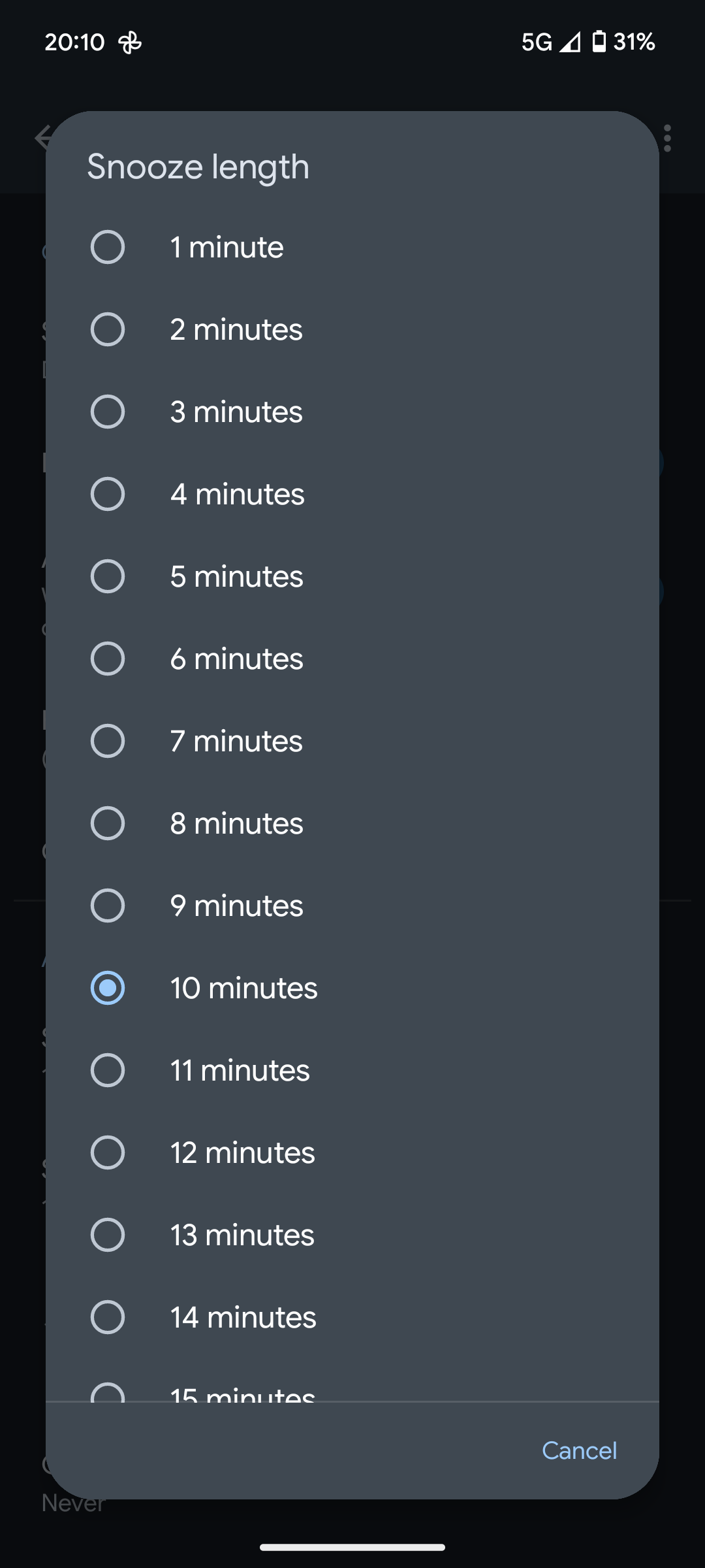
Its a small thing but google is the example for most people. This is bad ui.
How would you change it? A slider would be worse for this setting.
Ever try to use a slider in a password manager to determine the length?
Trying to set your password to 21 characters? 20... 22.. 20.. 24.. 18.. ah fuck it, I guess my password is going to be 18 instead.
When you have a hard limit of 1-30, on a setting you touch once, if ever, this is fine. A text field with the ability to input a number would be okay, except it would confuse people who want more than 30, and that's bad UX.
I still think a slider would be better but im nit a ux developer because im horrible at it but im pretty sure that someone who is paid to do this could figure out something better.
with the easiest method ever: an input that takes only non negative values up to 60 or 24