this post was submitted on 14 Jan 2024
354 points (96.8% liked)
Crappy Design
2991 readers
1 users here now
Noticed that theres no equivalent to r/crappydesign here yet so i made one
founded 1 year ago
MODERATORS
you are viewing a single comment's thread
view the rest of the comments
view the rest of the comments

Theyre.... They're two different products though. This seems super helpful for visual shoppers
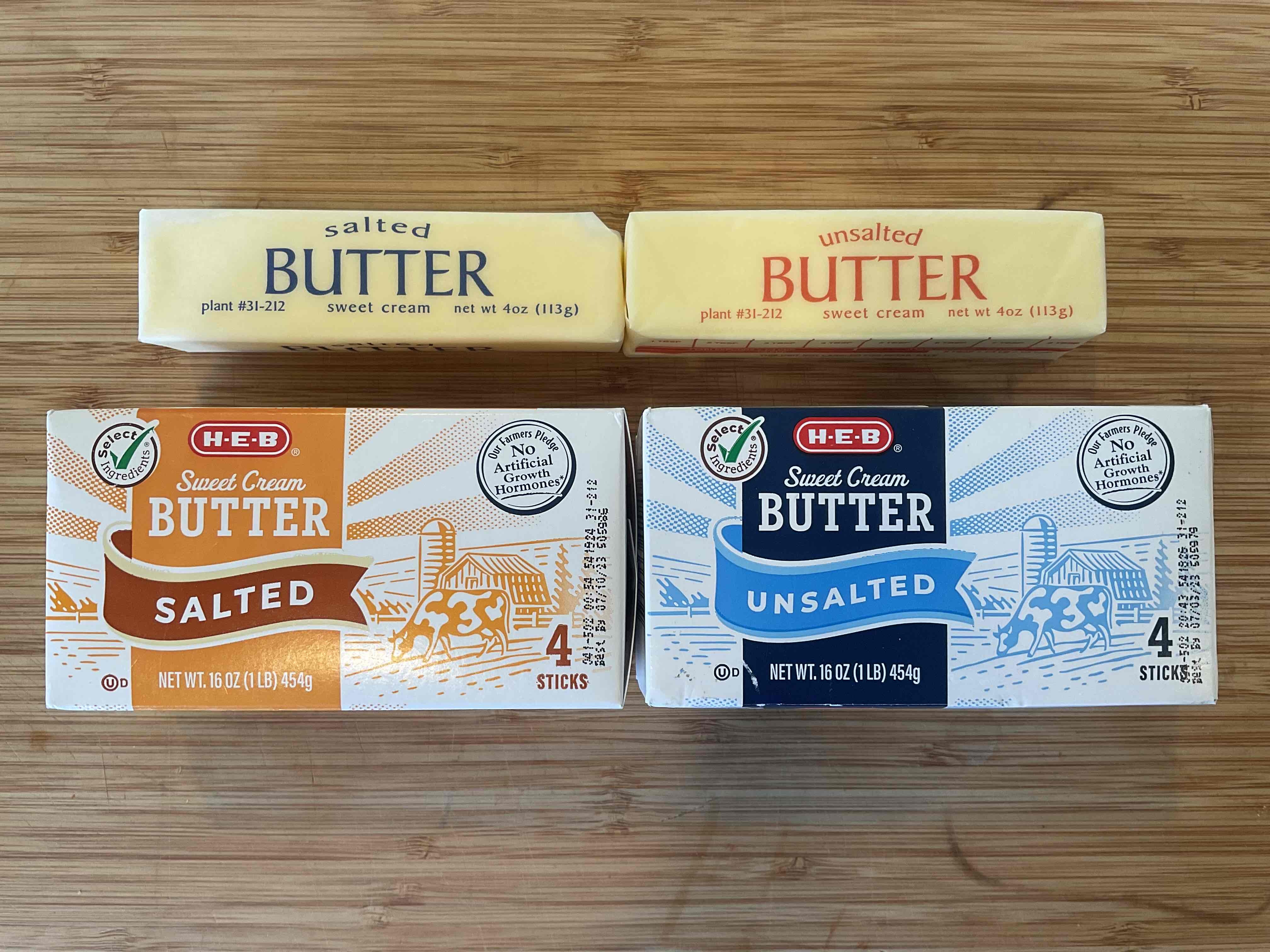
the unsalted butter is packaged in a blue box, but the butter itself is wrapped in paper with orange print.
the salted butter is packaged in an orange box, but the salted butter is wrapped in a blue wrapper.
op wants the packaging color to match the color of the wrappers inside
Take a second look. Salted butter = Orange box, Blue wrapper. Unsalted butter = Blue box, Orange wrapper.
How you misunderstood that is exactly how they take advantage of this kind of packaging. Great example
Compare the sticks to the packaging.
Found the typical American shopper
Because fuck people with limited English vocabularies, right?
Because fuck people who don't know everything about you, right? Works both ways chief.
You don't even need to know English to see that "salted" and "unsalted" doesn't match with the colors.
One package is blue and says unsalted, while the other is red and says unsalted.
Deep breaths buddy. In… Out…
No one is attacking you. In… Out…
You are capable of taking a joke. In… Out…