this post was submitted on 13 Jul 2023
62 points (84.4% liked)
Memmy - An iOS client for Lemmy
5095 readers
1 users here now
founded 2 years ago
MODERATORS
you are viewing a single comment's thread
view the rest of the comments
view the rest of the comments


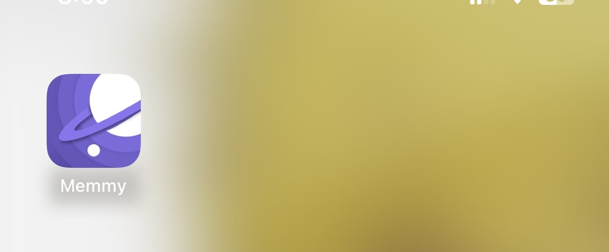
I think it looks way better!
Looks more professional but it feels… flatter. And less distinguishable from other apps. But it could just be my eyes.
You can also change the color of the icon on the settings.
Thanks. Tried it out. Looks great on brown. :)
Mines brown as well!
I agree. I like the concept overall but it does feel “off” compared to all the other app icons.
I hated the previous icon. The current one is nothing amazing but still better.
Devs are open to good submissions for icons. Any designers out there?