this post was submitted on 07 Mar 2024
473 points (97.4% liked)
Linux
46794 readers
1171 users here now
From Wikipedia, the free encyclopedia
Linux is a family of open source Unix-like operating systems based on the Linux kernel, an operating system kernel first released on September 17, 1991 by Linus Torvalds. Linux is typically packaged in a Linux distribution (or distro for short).
Distributions include the Linux kernel and supporting system software and libraries, many of which are provided by the GNU Project. Many Linux distributions use the word "Linux" in their name, but the Free Software Foundation uses the name GNU/Linux to emphasize the importance of GNU software, causing some controversy.
Rules
- Posts must be relevant to operating systems running the Linux kernel. GNU/Linux or otherwise.
- No misinformation
- No NSFW content
- No hate speech, bigotry, etc
Related Communities
Community icon by Alpár-Etele Méder, licensed under CC BY 3.0
founded 5 years ago
MODERATORS
you are viewing a single comment's thread
view the rest of the comments
view the rest of the comments

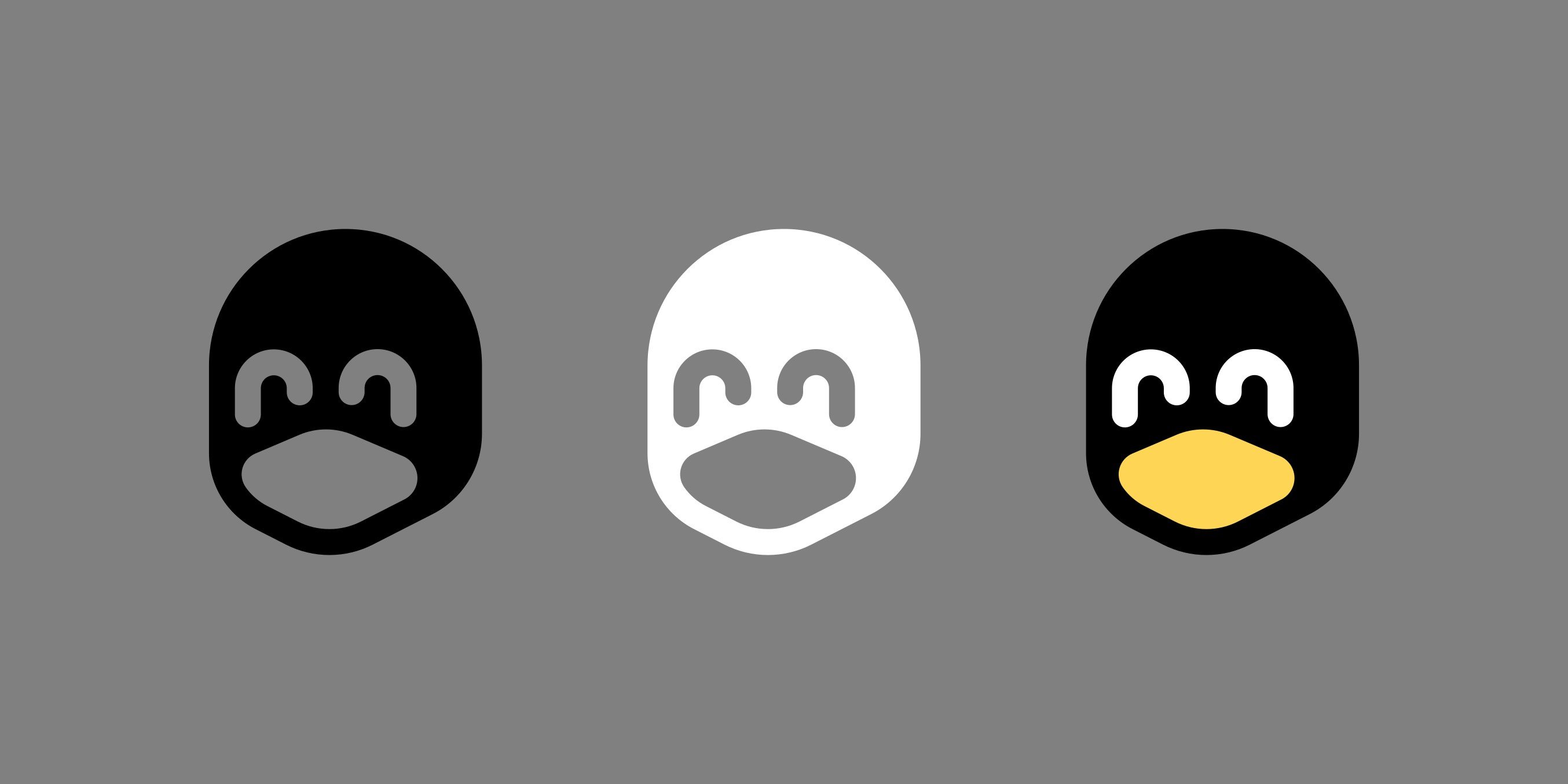
Why is the white one happiest? Shit, am I a racist?
The black one has open o_o eyes but the white one has closed ^_^ eyes
I can't find it, but I have seen a video where a designer talked about how you can't just invert your monochromatic logo to make it white-on-black. There's an effect that will make several aspects of the logo feel very differently, even though it's just inverted.
he won't stop me.. (e: /s)
You will live in fear that one day when you come home, you'll find him sitting in your chair, patiently waiting for his revenge.
xD
Yeah, there must be something subjective going on because they all look the same to me. They all look like closed happy eyes to me.
I think you’re absolutely right… perhaps something with the effect of lighter compared to the rest = open vs darker compared to the rest = closed.
I think it’s also magnified by the fact that we’re comparing to the full color one on the right which has the lighter color for (in my perception) open eyes.
Yeah I think the black part tricks your brain into thinking "those are pupils", and the eyes go from smiley shut ones to normal open ones.
Yeah exactly.