this post was submitted on 08 Aug 2023
5 points (100.0% liked)

Alexandrite

340 readers
1 users here now

Alexandrite is a desktop-first alternative Lemmy client.

Find a bug or have a feature request? Create an issue on Github, or post here.

founded 1 year ago
MODERATORS
 

EDIT: This is now released.

Hey! I'm almost done with a new feature and was looking for some feedback. I'm adding alternate post layouts for when viewing posts in a feed. There's a new setting for it:

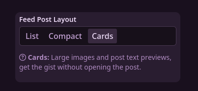
(List is the default, the only style until now)

Card layout shows the post's image at full height, and the first few lines of the embedded description/post content (got some of the ideas from Sync).

Compact Layout uses smaller thumbnails and fonts to fit a bit more on screen.

With this I'm also working towards mobile support. You'll find things generally work a bit better now with this.

Anyways, let me know how things go, if you find any bugs, or if you have any other feedback.

top 3 comments
sorted by: hot top controversial new old
[–] [email protected] 4 points 1 year ago

Oh... this is my kind of shit!

I also agree that title works better on top of the image!

[–] [email protected] 2 points 1 year ago

These options don't look bad at all! From a quick glance at all three options there doesn't seem to be any bugs.

[–] [email protected] 2 points 1 year ago

With cards, it reminds me of when I had the Voyager PWA on my desktop. One difference (apart from the colour) is that Voyager has the title above the image, rather than below. As for which way around works best, it unfortunately depends on the post.

I moved from Voyager to Alexandrite because I didn't like all the blank space on either side of posts. I can see how this works much better for mobile though, so it makes sense if you're targeting those platforms next.