this post was submitted on 25 May 2024
34 points (97.2% liked)

Voyager

5624 readers
71 users here now

The official lemmy community for Voyager, an open source, mobile-first client for lemmy.

Download on App Store

Download on Play Store

Use as a Web App

Download on F-Droid

Rules

  1. Be nice.
  2. lemmy.world instance policy

Sponsor development! ๐Ÿ‘‡

Number of sponsors badge

๐Ÿ’™

founded 1 year ago
MODERATORS
 

The UI for discarding a comment always confuses me.

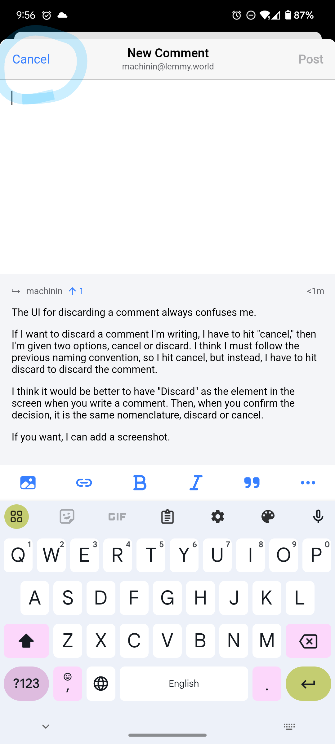
If I want to discard a comment I'm writing, I have to hit "cancel," then I'm given two options, cancel or discard. I think I must follow the previous naming convention, so I hit cancel, but instead, I have to hit discard to discard the comment.

I think it would be better to have "Discard" as the element in the screen when you write a comment. Then, when you confirm the decision, it is the same nomenclature, discard or cancel.

If you want, I can add a screenshot.

top 4 comments
sorted by: hot top controversial new old
[โ€“] [email protected] 9 points 5 months ago

This is what I think should be changed to "Discard."

[โ€“] [email protected] 4 points 5 months ago

Only who can prevent forest fires? https://youtu.be/wX1x7pfH8fw

[โ€“] [email protected] 2 points 5 months ago (1 children)

or confirmation pop-up could write: confirm/cancel, maybe?

[โ€“] [email protected] 3 points 5 months ago

I think that would have the same problem of cancel for the first button and a different name for the desired function on the next screen.

Cancel (delete) -> Cancel (cancel deleting) / Confirm (confirm deleting)

My suggestion is

Discard (delete) -> discard (delete) / Cancel (cancel deleting)