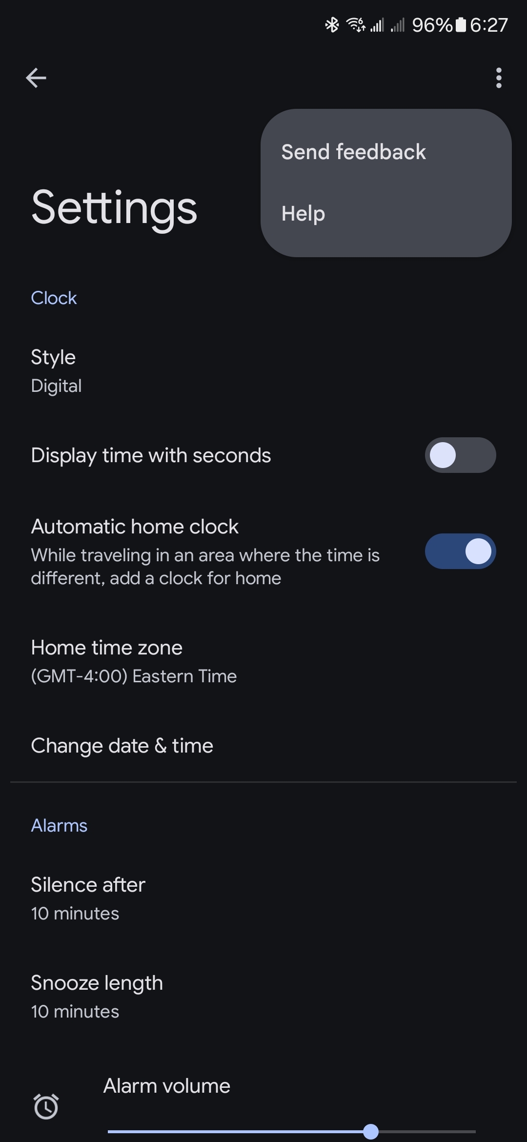
If a 10 minute alarm time isn't enough to wake you up, you might wanna either put down the drugs, turn up the volume, or go see a sleep doctor.
Android
A place to discuss anything related to Android or Android adjacent.
INFO:
-
No attacking others based on their phone preferences. Criticizing OEMs/devices is allowed. Attacking users because a different brand/device works for them isn't.
-
Obvious spam will be removed.
-
Anything directly or indirectly related to Android is allowed.
Check Out Our Partner Communities:

For me it's in the alarm settings, but I'm on lineage. If it isn't there, I'd consider getting a different alarm app.
Thank you, I found it

Can confirm, it's there in the stock Pixel ROM
What do the three dots do? Settings settings?
Haha I didn't even notice it. But you made me realize how incredibly inconsistent the feedback "button" is in the used-to-be-AOSP apps
- Clock has it in the three dot menu on the main screen AND in the three dot menu in settings
- Phone only has it in the main three dot menu, but it's completely missing from settings (oh and the Settings->Accessibility screen ignores Material You colors for some reason)
- Contacts has a decoy three dots menu that only contains Select and Select all buttons, the feedback option is hiding in the account switcher (and is once again missing from settings)
- Messages once again hides the feedback button in the account switcher, but it doesn't have a three dots menu so it makes sense. No feedback in settings
- Calculator has it in the three dots menu and doesn't have any further settings
- and finally, Camera: tap the quick settings button, tap More settings, scroll to the bottom and boom, the feedback button.
I know this is completely useless information, but I was curious and thought it would be a shame to just forget my findings 5 minutes later
I mean, I'm not a fan of the iOS UX, but I feel like they're doing pretty good with consistency, and would like it if the system app Devs took a slice of inspiration from that (though not necessarily everything else).

Huh. Dunno how I feel about layered three dot menus.
Hmm... I don't have that

It is in settings named as silence after in Alarms section and actually it have a never option.