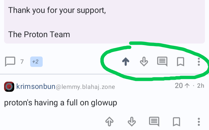
It's the 3 differently sized horizontal lines in the top right corner that appear when a post is opened. Very confusing placement but it is what it is.
Jerboa
Jerboa is a native-android client for Lemmy, built using the native android framework, Jetpack Compose.
Warning: You can submit issues, but between Lemmy and lemmy-ui, I probably won't have too much time to work on them. Learn jetpack compose like I did if you want to help make this app better.
Built With
Features
- Open source, AGPL License.
Installation / Releases
Support / Donate
Jerboa is made by Lemmy's developers, and is free, open-source software, meaning no advertising, monetizing, or venture capital, ever. Your donations directly support full-time development of the project.
Crypto
- bitcoin:
1Hefs7miXS5ff5Ck5xvmjKjXf5242KzRtK - ethereum:
0x400c96c96acbC6E7B3B43B1dc1BB446540a88A01 - monero:
41taVyY6e1xApqKyMVDRVxJ76sPkfZhALLTjRvVKpaAh2pBd4wv9RgYj1tSPrx8wc6iE1uWUfjtQdTmTy2FGMeChGVKPQuV - cardano:
addr1q858t89l2ym6xmrugjs0af9cslfwvnvsh2xxp6x4dcez7pf5tushkp4wl7zxfhm2djp6gq60dk4cmc7seaza5p3slx0sakjutm
Contact
Where do you suggest we should place it?
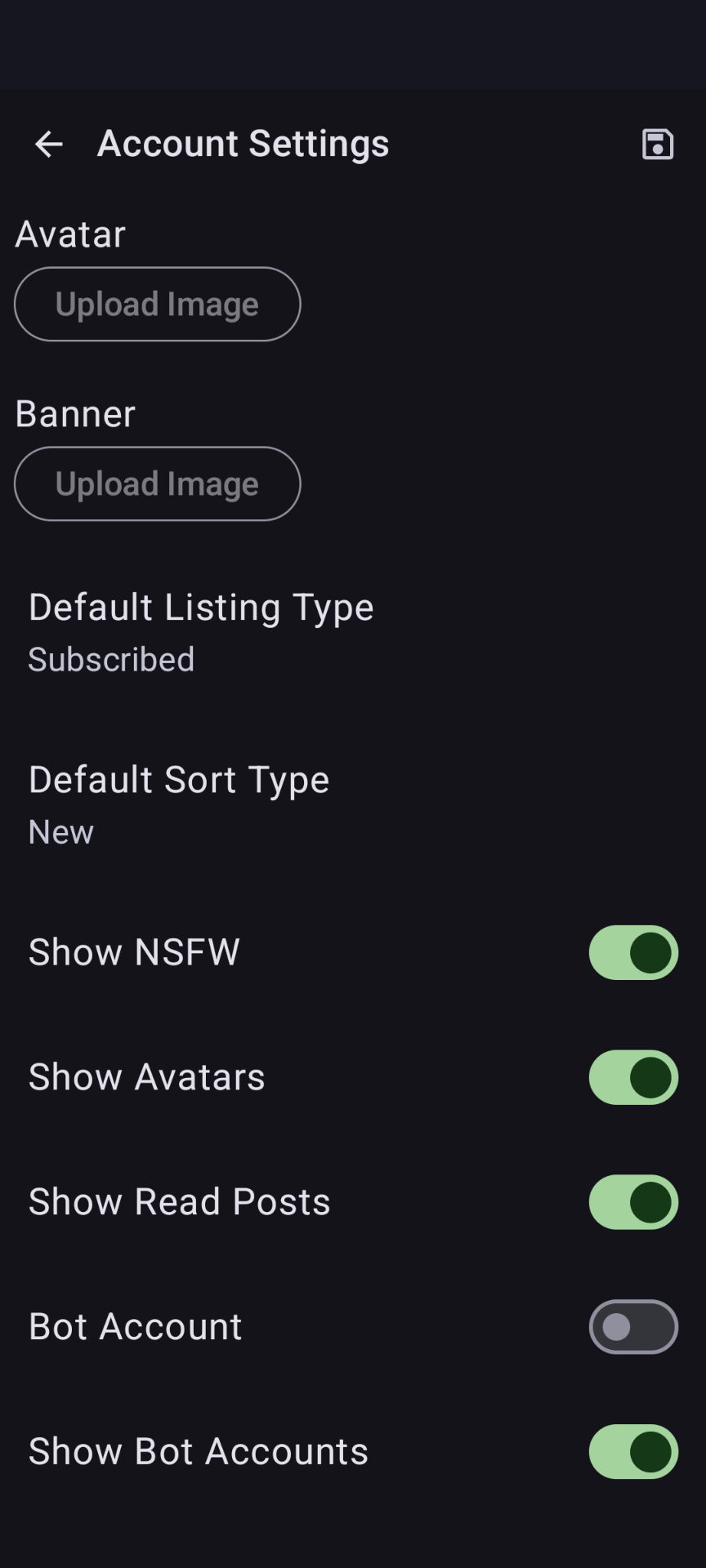
In the settings where you set your default post sorting.

Idk. Tbh just putting it in settings sounds like the best idea if you don't want to create a separate space between the post and the comment section. Having it at the top looks like it has something to do with fonts or the post itself.
maybe here?

That is only temporary though and does not set the default.
It's in your account settings.