this post was submitted on 29 Jun 2024
-97 points (24.6% liked)

Linux

48213 readers
667 users here now

From Wikipedia, the free encyclopedia

Linux is a family of open source Unix-like operating systems based on the Linux kernel, an operating system kernel first released on September 17, 1991 by Linus Torvalds. Linux is typically packaged in a Linux distribution (or distro for short).

Distributions include the Linux kernel and supporting system software and libraries, many of which are provided by the GNU Project. Many Linux distributions use the word "Linux" in their name, but the Free Software Foundation uses the name GNU/Linux to emphasize the importance of GNU software, causing some controversy.

Rules

Related Communities

Community icon by Alpár-Etele Méder, licensed under CC BY 3.0

founded 5 years ago
MODERATORS
 

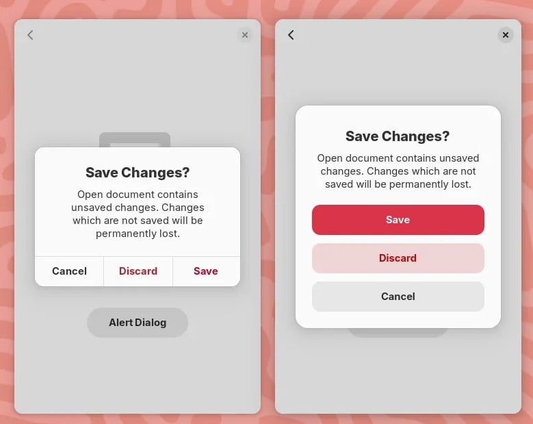
New GNOME dialog on the right:

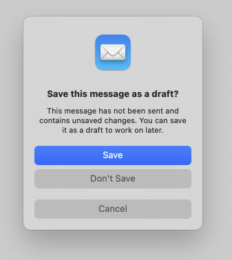
Apple's dialog:

They say GNOME isn't a copy of macOS but with time it has been getting really close. I don't think this is a bad thing however they should just admit it and then put some real effort into cloning macOS instead of the crap they're making right now.

Here's the thing: Apple's design you'll find that they carefully included an extra margin between the "Don't Save" and "Cancel" buttons. This avoid accidental clicks on the wrong button so that people don't lose their work when they just want to click "Cancel".

So much for the GNOME, vision and their expert usability team :P

top 50 comments
sorted by: hot top controversial new old
[–] [email protected] 57 points 4 months ago (6 children)

I hope they continue learning lessons from other OSes.

I'm feeling like you are wrong about them outright copying. Some good things can be taken from macOS and Windows. But a lot of bad things too, which is why they are thinking it through.

Please do not reduce the community effort to "cloning macOS". It's insulting to the people working on it... Apple doesn't own modals or modal design.

Here there are not 20 ways of putting 3 buttons in a modal. They just happen to choose a way that will also work on mobile I guess.

Kudos for noticing this extra space which could enhance these kind of modals though.

I don't like everything Gnome has been doing, especially with the lack of customization or the status bar. But Gnome has been my go to for 7+ years and I like where it is going. Extensions are pretty fly too 👌
[–] [email protected] 11 points 4 months ago

Sometimes when you get UI experts and users and engineers in the same room they iterate to similar outcomes because its the logical conclusion. Apples design in this case isn't ground breaking or even original.

If multiple species of jumping spider can independently evolve the ability to see red from different branches of their family tree, multiple dev teams can come to the same conclusion about what is more comfortable for reaching with consideration for left and right handed people on various types of screens.

The problem is so scoped these days, its fairly logical for UIs to come to the same outcome.

load more comments (5 replies)
[–] [email protected] 42 points 4 months ago (3 children)

Funny enough, I find Gnome to be more consistent and better thought than macOS... But that's just me.

[–] [email protected] 15 points 4 months ago

Not just you :)

[–] [email protected] 12 points 4 months ago

It is better :)

[–] [email protected] 5 points 4 months ago (1 children)

Indeed, I freaking love GNOME's UX/UI. But I switched to KDE for Wayland gaming.

load more comments (1 replies)
[–] [email protected] 26 points 4 months ago (7 children)

These are pretty standard UI patterns.

load more comments (7 replies)
[–] possiblylinux127 25 points 4 months ago* (last edited 4 months ago) (2 children)

Gnome is so much better than Mac OS

Also it is kind of insulting to call gnome a clone of something else. It is the work of thousands of people all over the globe. It isn't trying to be a copy of anything.

load more comments (2 replies)
[–] [email protected] 20 points 4 months ago (1 children)

I think that a lot of the recent GNOME design choices are merely because they're trying to improve usability on mobile devices. It also just so happens that Apple is trying to make the macOS desktop closer to iOS to encourage people to move from Windows. They have similar goals, which leads to similar design choices. And all design is derivative, anyway. Who cares.

load more comments (1 replies)
[–] [email protected] 18 points 4 months ago

Who gives a shit. Use the desktop you like. Don't post this /g/ tier bait.

[–] [email protected] 16 points 4 months ago (9 children)

As someone who tried out MacOS in a VM out of curiosity I don't find gnome to be like MacOS at all in overall functionality. I think to most people it just looks like Mac because top bar, dock and some design choices. Really though gnome is much more like Android. MacOS felt extremely clunky to use vs gnome's fluid workspace and app switching.

load more comments (9 replies)
[–] [email protected] 15 points 4 months ago* (last edited 4 months ago) (7 children)

Here's the thing: Apple's design you'll find that they carefully included an extra margin between the "Don't Save" and "Cancel" buttons. This avoid accidental clicks on the wrong button so that people don't lose their work when they just want to click "Cancel".

And gnome has those dialogs in a different colour to achieve easily noticable differentiation between the two options

load more comments (7 replies)
[–] [email protected] 11 points 4 months ago (2 children)

I started on gnome. I love it at first, but as time has gone on my experience with gnome had gotten worse and worse, and my KDE experience keeps getting better. It's a real shame because I actually tend to prefer the gnome look at feel, but KDE has been so much more usable for me in recent years.

[–] [email protected] 3 points 4 months ago (4 children)

It's very easy to get a Gnome look and feel with Plasma nowadays.

I still don't know why Gnome loves wasting 3 % of the screen on an empty black bar, tho.

[–] [email protected] 4 points 4 months ago

Yeah ngl I don't get using the entire space fore almost nothing. I use a few extensions to fill it up and make it more useful

load more comments (3 replies)
load more comments (1 replies)
[–] [email protected] 10 points 4 months ago (4 children)

I find that "carefully included extra margin" outrageously ugly

[–] [email protected] 10 points 4 months ago (1 children)

It's ugly, but useful.

(unlike me, I am ugly and useless /s)

load more comments (1 replies)
[–] [email protected] 3 points 4 months ago

Looks alright to me.

[–] [email protected] 3 points 4 months ago
load more comments (1 replies)
[–] [email protected] 10 points 4 months ago (3 children)

My only problem with both designs in your images is the colors. It’s a pretty standard part of UI design (in real life and on computers) that “red means cancel” and “green means continue.” Apple using blue is no big deal and I’m 90% sure they just use a user chosen “highlight color.” (Maybe Gnome as well?) But cancel or delete or similar things should probably be red or another color that signals “Stop.”

I’ve always thought Bootstrap, the web design library, has a good set of base colors. Red means danger. Light blue means info. Green means yes or success. Yellow means warning. Other buttons are a darker blue — basically the highlight color. (Not saying they chose the best version of those colors. Just that the general idea is consistency and what users most naturally expect.)

[–] [email protected] 3 points 4 months ago

The “Save” button uses the accent color which is blue by default. With configurable accent colors coming to GNOME 47 and GTK/Libadwaita, you can choose a red accent color.

See the original description of the screenshot:

It’s now using standard button styles, fixing the long-standing issue where suggested and destructive buttons would look the same when using red accent color

[–] [email protected] 2 points 4 months ago (3 children)

It's just an accent colour and can be changed.

load more comments (3 replies)
load more comments (1 replies)
[–] [email protected] 6 points 4 months ago (2 children)

The founder of GNOME, Miguel de Icaza, stopped using Linux in favor of macOS in 2014 iirc. That makes me guess that the macOS design was at least acceptable to him. Maybe the visions were similar enough.

[–] [email protected] 5 points 4 months ago

What does the founder of GNOME have to do with GNOME in 2022? He worked for Microsoft for 6 years.

load more comments (1 replies)
[–] [email protected] 6 points 4 months ago (2 children)

If you're going to give GNOME shit, at least let it before how much they destroy portability of GTK, enabling cancer like Client Side Decorations, and ignoring their community when it comes to things like desktop icons.

[–] possiblylinux127 5 points 4 months ago

They made GTK4 portable thanks to the gnome design being moved to Libadwaita.

load more comments (1 replies)
[–] [email protected] 4 points 4 months ago (1 children)

Wtf... I like the layout of the old dialogue better. It is easier to read.

[–] [email protected] 5 points 4 months ago

The older one is actually properly executed, the first button is the "Cancel" one and that makes sense because people read from left to right and tend to click mindlessly / without reading on the first button. Not sure if they actually changed the position on right to left languages but they should have...

[–] wolf 3 points 4 months ago* (last edited 4 months ago) (3 children)

Wait - Gnome user here (heavily modified and with multiple extensions) ...

macOS window management and trying to using it via keyboard is a totally miserable experience (forced to use it at work :-/ ) ... at the same time, Apple thinks their users are smart enough to use tags, while Gnome developers think the user are too dump to use tags. I still happily prefer Gnome over macOS on my desktop for literally everything, macOS has no proper software management, all apps try to up-sell me on their shitty i-cloud offerings, setup cannot be properly automated, the 'auto features' totally suck and do everything I do not want them to do and macOS feels too slow for the hardware it runs on...

Gnome sucks, but it sucks less for me than all other alternatives on the desktop at the moment...

My biggest reason to stick with Gnome are Wayland, Evolution/Online Accounts and that I can automatically configure Gnome to something usable with dconf/gsettings. I am not holding my breath that KDE ever gets their KMail story under control, stability as in zero crashes and being fully configurable via Ansible. The very moment this happens, I'll happily jump ship. (Of course also waiting for Wayland support for Xfce :-P)

load more comments (3 replies)
[–] [email protected] 3 points 4 months ago (2 children)

I’ve only spent a few hours on my wife’s MacBook Pro which was still running Catalina (now Fedora) back in the days, and I didn’t think Gnome and MacOs were so similar.

To be honest I felt a bit lost on MacOs Catalina and felt like everything was difficult compared to Gnome.

But I guess Gnome is taking a lot of inspiration from the MacOs aesthetic, and it’s okay with me because it looks great.

I don’t have a lot of experience with other DE on Linux, but they lack the clean aesthetic of Gnome.

load more comments (2 replies)
[–] [email protected] 3 points 4 months ago

I actually like it, margin is maybe a bit much. For the apple extra margin, gnome app can add any buttons they want on those dialog, it is up to app devs to add an extra margin between some button!

[–] [email protected] 3 points 4 months ago (4 children)

At least it is not a cheap copy of Windows.

load more comments (4 replies)
load more comments
view more: next ›