this post was submitted on 14 Jul 2024
18 points (90.9% liked)

CSS

462 readers
4 users here now

founded 1 year ago
MODERATORS
 

Hi,

No matter what I try


<style>
.FlexColumn {display: flex;flex-flow: column nowrap }
</style>

<div class="FlexColumn">
	<div>X</div>
	<div>X</div>
	<div>X</div>
	<div>X</div>
	<div>X</div>
</div>
<!-- I tried many CSS trick here... -->
<div>
   <span>X</span><br><span>X</span><br><span>X</span><br><span>X</span>
</div>

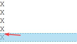
I always get a vertical gap between the characters !

Any ideas ?

Thanks.

top 11 comments
sorted by: hot top controversial new old
[–] [email protected] 21 points 1 month ago (1 children)

line-height is the property you are looking for. Beware fucking with line-height is usually a bad idea, as characters can extend below or above the "line" and will collide.

Also maybe look at divitis, you might be suffering from it.

[–] [email protected] 3 points 1 month ago

I love that word divitis

[–] [email protected] 15 points 1 month ago
[–] [email protected] 10 points 1 month ago (1 children)

Your issue is not with css, it's with typographical https://en.wikipedia.org/wiki/Leading. You can get rid of that gap with negative margin or with line-height and but it would reduce readability.

It might look okayish with your example with just letters 'X', but if you try it with any diacritic letters (like https://en.wikipedia.org/wiki/%C3%84) , the lines would overlap and the text would be unreadable.

[–] [email protected] 6 points 1 month ago

👆 Sometimes the best solution is to just let it be. It’s better to adapt your design to fit the technology, than it is to fit the technology to your design.

[–] [email protected] 5 points 1 month ago* (last edited 1 month ago)

maybe the line-height property is the thing you are looking for.

.FlexColumn {display: flex;flex-flow: column nowrap; line-height: 0.7 }

[–] [email protected] 4 points 1 month ago* (last edited 1 month ago) (1 children)

ok I've found a work around

<style>
.FlexColumn {display: flex;flex-flow: column nowrap }
.FlexColumn > div {display: inline-block; margin: -4px 0}
</style>

<div class="FlexColumn">
	<div>X</div>
	<div>X</div>
	<div>X</div>
	<div>X</div>
	<div>X</div>
</div>

But if someone have something more proper, I'm all ears.

[–] [email protected] 4 points 1 month ago

My two cents: if you have to resort to negative numbers, it’s time to rethink things. It may work, but it’s kludgy and most likely not easily scalable. Take the extra effort and find the better (more correct) way to manage this issue. Not only will it be correct, and scalable, but I’m sure you’ll learn a lot along the way. It really is a win-win when you take your time. 😊

[–] [email protected] 2 points 1 month ago* (last edited 1 month ago)

Removing the leading is possible with some tricks, but it is not recommendable, as it has it's issues. Maybe you could tell us what you actually want to accomplish? Assuming that you are not stacking X's for fun and entertainment...

[–] [email protected] -1 points 1 month ago* (last edited 1 month ago)

Why not just a single span or paragraph with ?

[–] [email protected] -2 points 1 month ago

Sorry if this is a silly answer as i don't kbow css well, but have you removed the inherent styling that comes with the browser. I think you need to have a

* {magin: 0; padding: 0}