this post was submitted on 27 Aug 2023
-24 points (16.7% liked)

science

14090 readers
562 users here now

just science related topics. please contribute

note: clickbait sources/headlines aren't liked generally. I've posted crap sources and later deleted or edit to improve after complaints. whoops, sry

Rule 1) Be kind.

lemmy.world rules: https://mastodon.world/about

I don't screen everything, lrn2scroll

founded 1 year ago
MODERATORS
 

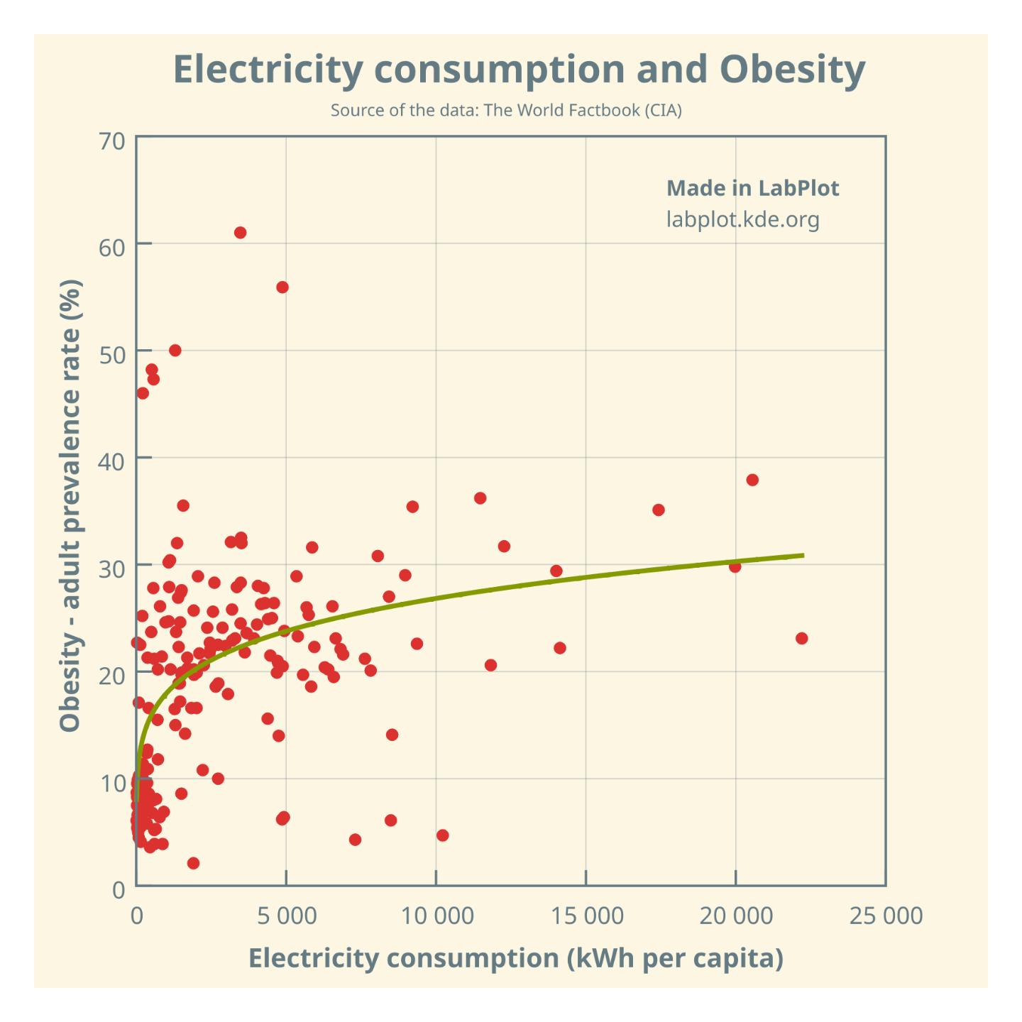
Is there a causal relationship between electricity consumption and obesity, or is it just an illusory correlation❓

@science @dataisbeautiful @health

The plot and curve fitting made in @LabPlot, a FREE, open source Data Visualization and Analysis software. It works on #Windows, #Linux and #macOS.

➡️ https://labplot.kde.org/download

#Data compiled for 184 countries.

#FOSS #FLOSS #OpenSource #FreeSoftware #DataViz #Visualization #Obesity #Health #ClimateChange #ClimateCrisis #Climate #Food

all 21 comments
sorted by: hot top controversial new old
[–] [email protected] 8 points 1 year ago
[–] [email protected] 7 points 1 year ago* (last edited 1 year ago)

I don't even know what the graph results are supposed to mean. The Lower consumption side is too jumpy and goes in the two extremes.

[–] [email protected] 6 points 1 year ago (2 children)
[–] [email protected] -2 points 1 year ago* (last edited 1 year ago) (1 children)

@edwiebe @science

We agree. But still, a question is just a question, and you can always refine your questions.

Matejka, J., & Fitzmaurice, G. (2017). Same Stats, Different Graphs: Generating Datasets with Varied Appearance and Identical Statistics through Simulated Annealing.

BTW, the Datasaurus Dozen example is already available in @LabPlot via File > Open Example.

[–] [email protected] -1 points 1 year ago

@edwiebe @science

If you are interested, please see also this thread on the importance of visualizing data (the Anscombe's quartet, Simpson's paradox are also included in @LabPlot):

https://mstdn.social/@onemoment/109692198312380103

#Anscombe #SimpsonsParadox #DatasaurusDozen #Visualization #DataViz

[–] [email protected] 5 points 1 year ago

@LabPlot @science @dataisbeautiful @health seems like a classic graphic for illustrating the wrong variables being compared. To stick a trend line in the there should result in a loss of coffee room privileges for a week.

[–] [email protected] 5 points 1 year ago

Statistics teaches how to measure the strength of a correlation. Also, science can help us understand cause VS correlation. You can't just do a curve fit and assume it means something.

[–] [email protected] 5 points 1 year ago (1 children)

The answer is... kind of, but only really at the lower end.

Countries with very low (around 0) electricity usage are going to be places where food refrigeration is hard to come by, if even possible, and so stockpiling and transporting food becomes more difficult. These places, then, have to grow or hunt their own food, and it's often just enough to get by, especially considering how much hard work goes into it.

Once electricity becomes more prevalent and food refrigeration becomes common, people tend to be a bit freer with their food consumption. This doesnt mean that they all turn into fat slobs, but it does mean that they have the the option to do so that didn't exist before.

Once you hit that threshold, you start to notice things spreading out on the chart, whereas there are basically no obese countries at 0 kWh, outside of a few outliers. I'm kind of curious about which countries are up there at 45% obesity rate and no electricity.

[–] [email protected] -1 points 1 year ago (1 children)

@Spuddaccino

For example: Tonga, Samoa, Kiribati, Nauru with electricity consumption per capita (the median) 548 kWh.

[–] [email protected] 2 points 1 year ago

Ah, that explains a lot, then.

These are all island nations in Oceania that receive large amounts of their food supply from outside the country. This offloads much of the energy cost of refrigeration onto whatever nation owns the ship. I don't know if there's a good way of figuring out how much energy is spent shipping supplies to those countries, though.

[–] [email protected] 4 points 1 year ago (1 children)

With this kind of cherry-picking and manipulation of data, you have a bright future in the news room of Fox News.

[–] [email protected] -3 points 1 year ago* (last edited 1 year ago) (1 children)

@Hazdaz @science

Is the act of distinguishing a question from an answer as difficult as recognizing spurious correlations?

The question has been raised earlier by others,. See for example this paper from 2021 (Measuring the effect of energy consumption on the epidemic
of overweight in Latin America and Caribbean countries):

https://dialnet.unirioja.es/descarga/articulo/8100043.pdf

[–] [email protected] 3 points 1 year ago

You've fitted a curve through a bunch of points and called it correlation. It is not.

If you want to do this properly, you've got a lot of reading to do.

[–] [email protected] 4 points 1 year ago

What correlation?

[–] [email protected] 1 points 1 year ago

Consumerist lifestyle of (some) richer countries leads to both of these, tho I don't see any direct relation. I guess obese people may be more likely to invest in a bigger TV, may turn up the AC more, and spend more time in hospitals hooked to machinery?

Generally speaking, electricity is mostly used up by factories and businesses.

[–] [email protected] 1 points 11 months ago

@LabPlot @science @dataisbeautiful @health I mean... A bit? But the comparison does come across as "computers make you fat and lazy" which feel a bit aimless.