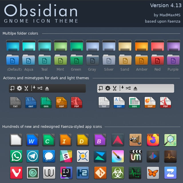
I miss being able to use bitmapped fonts back in the Gnome 1.x days.
Linux
From Wikipedia, the free encyclopedia
Linux is a family of open source Unix-like operating systems based on the Linux kernel, an operating system kernel first released on September 17, 1991 by Linus Torvalds. Linux is typically packaged in a Linux distribution (or distro for short).
Distributions include the Linux kernel and supporting system software and libraries, many of which are provided by the GNU Project. Many Linux distributions use the word "Linux" in their name, but the Free Software Foundation uses the name GNU/Linux to emphasize the importance of GNU software, causing some controversy.
Rules
- Posts must be relevant to operating systems running the Linux kernel. GNU/Linux or otherwise.
- No misinformation
- No NSFW content
- No hate speech, bigotry, etc
Related Communities
Community icon by Alpár-Etele Méder, licensed under CC BY 3.0
Hey, that's the icon set I use in KDE! And yes i'd sell my kidneys to bring back skeumorphism and aero
What icon pack? (Is this post supposed to be a link?)
Edit: Ah. Now there's an image.
Yeah, I don't understand flatness either. Neither I understand the dark themes either. My eyes and brain simply can't do the separation easily, I spend more time trying to process an image. Old style icons and UI colors are the best IMHO.
No. Old UI is terrible. The newest UI with extremely rounded corners is bad too but I'd much rather use it than old stuff.
I do miss them. But I'm happy with my custom Suru++ Aspromauros icons too.
I still have some screenshots from my old Android G1 that is skeuomorphism galore. It’s nostalgic.
Actually no, I hated the Vista era UI design. Linux themes were positively garish, add MacOS looked like a candy store. CDE greatly impressed me back then. It looked like it was made by adults for adults. Highly legible, and the pastel colors are being emulated by Solarized.
I'm sure that those UIs were a product of the times. The 90's and noughties were loud and colorful and exciting and everything looked like a comic. Now that we live in more depressing times, we can look to the science of perceptual psychology.
You see, we have an attention budget, we need to process what we see. Visually complex UIs need to be parsed, and that takes mental effort, and that robs us of mental energy to focus on our work. It's not a crippling effect, but it's there.
Look at street signs and corporate logos, they easily lodge in our mind. Effective advertising has a clear and simple visual language, and this is what UIs should strive for.
You see, we have an attention budget, we need to process what we see. Visually complex UIs need to be parsed
One of the reasons i like interfaces with clear lines. But that doesn't fit icons, all-same-isch looking rectangles are not easier to parse than "objects". The mind is optimized for 3D, not for abstract icons.
Absolutely not.
