Now is the time for maximalist style!
ㅤㅤㅤㅤㅤㅤㅤㅤㅤㅤㅤㅤㅤㅤㅤㅤㅤㅤㅤㅤㅤㅤㅤㅤㅤㅤㅤㅤart of the internet
What is this place?
• [email protected] with text and titles
• post obscure and surreal art with text
• nothing memetic, nothing boring
• unique textural art images
• Post only images or gifs (except for meta posts)
Guidlines
• no video posts are allowed
• No memes. Not even surreal ones. Post your memes on [email protected] instead
• If your submission can be posted to [email protected] (I.e. no text images), It should be posted there instead
This is a curated magazine. Post anything and everything. It will either stay up or be lost into the void.
Now is the time for maximalist style!
Honestly, fuck yeah. I would love some old timey style labeling with way too much detail in every single element.
https://bygonetheatre.files.wordpress.com/2014/10/img_0002_33082805_std.jpg?w=600
Packaging in the ['90s and] '00s [were] all about maximalism. Way too much writing and images all over huge plastic packages.
Graphic designer logic is all about following the professional gulf stream while not giving a shit what the fish thinks.
It was infinitely better.
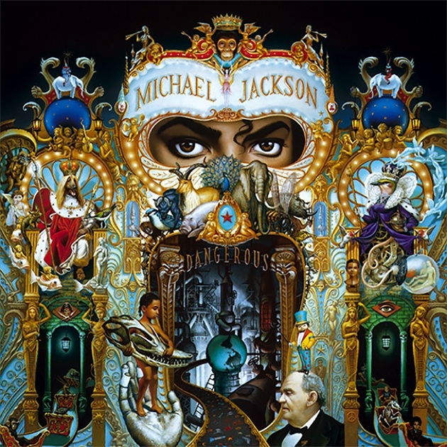
"Ew, it's painted! Gross!" — some professional graphic designer
Wow! That is neat!
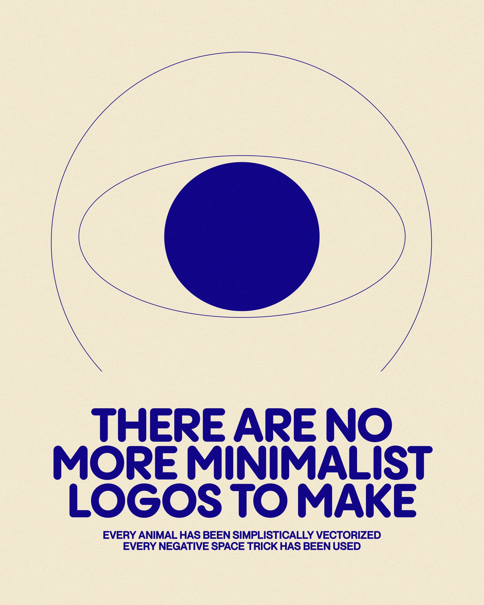
"New AI model discovers 18000 new minimalist logos."
"...and 3000 of the biggest companies have already started using them."
You mean the 6 biggest companies and their 2994 wholly-owned subsidiaries?
Those are the ones, the ones on the conglomerates_to_avoid.jpeg
.jxl
Logos should now be infinitely zoomable with differing levels of meaning depending on the depth.
Google Mandelbrot set (or other fractals)
Holy hell
Thanks. I was around when they gained public popularity in the early 80s.
Logos should now be ML models generating endless video sequences
I don't know what you mean but I think it would do well at the IPO
Vector (or even simple polygons to a degree) already allows both of those things.
Well, the meaning part would require a bit of work but you could put small detail that would only be visible when zoomed in. Like you could make the edge of that iris have little people and houses and trees (though it'd be a massive pain to do manually for the whole thing, that and it'd be kinda wasteful data-wise)
Unless maybe you mean something more like a fractal when you say zoomable. Though there have been vector drawings that people did like that (though I don't think it actually repeated endlessly, just ended where it started... and it is still manually designed thus finite in content).
I was merely being hyperbolic in an opposite direction to minimalism.
That's just the CBS logo
As it said, there’s no new minimalist logos to be made.
50% CBS, 50% Rede Globo.
Lol
“I can’t believe it. I’m a minimalist logo”
-Mike Wazowski
Not logos, but I just got here.
I want to watch all of Top Gear in this format now
I made that frame because it's meta with the meme itself (I didn't make the 1st frame, originally instead substituted with just the text "textures are great!"), though if I did another it'd probably be "Oh no! ...anyway." (and I'd probably just do it as one frame as well, but with top and bottom text).
Also, an animated eye.