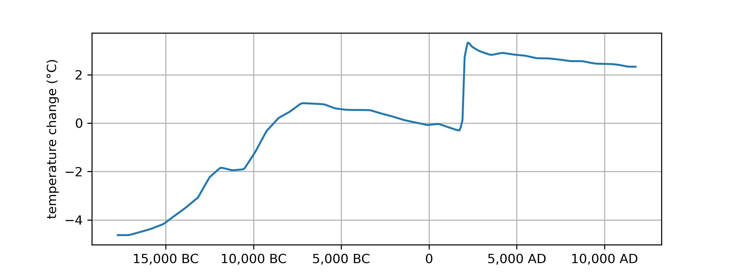
I get what's going on here (and am scared for the future), but is this a good plot? I have no idea if 5,000 years is a meaningful term for climatology -- for all I know it could have been picked just to make the 1900-2000 man-made spike look nice and vertical. You could plot no a 10,000 year scale that would make the jump from 10k BC - 5k BC look nearly as straight, and of course use a smaller scale to make shorter-term climate blips (or even weather patterns) look just as scary.
Climate - truthful information about climate, related activism and politics.
Discussion of climate, how it is changing, activism around that, the politics, and the energy systems change we need in order to stabilize things.
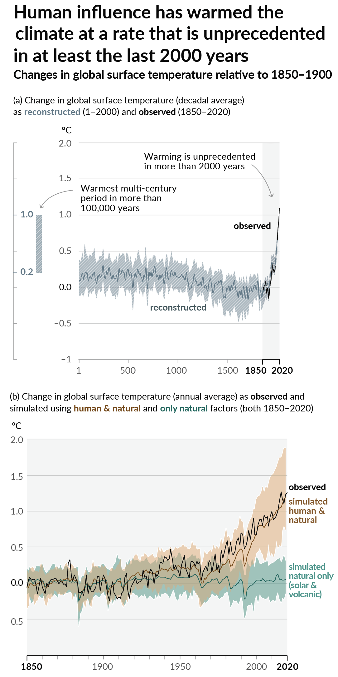
As a starting point, the burning of fossil fuels, and to a lesser extent deforestation and release of methane are responsible for the warming in recent decades:

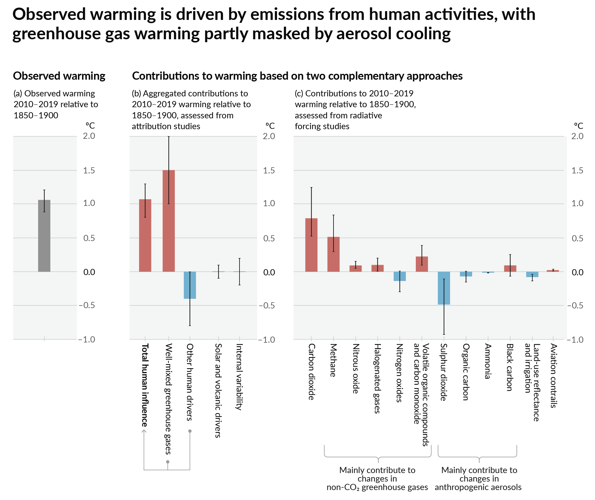
How much each change to the atmosphere has warmed the world:

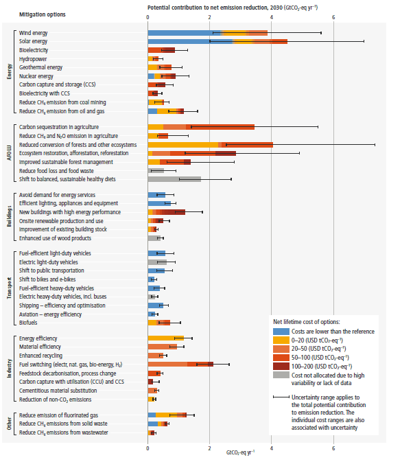
Recommended actions to cut greenhouse gas emissions in the near future:

Anti-science, inactivism, and unsupported conspiracy theories are not ok here.
It's a pretty good plot if you want to understand the time period where civilization has existed; it shows the warming which was going on for the few thousand years before civilization, the relatively stable temperatures during civilization, and then the sudden modern warming from fossil fuel burning, and what we expect to happen after we're done burning fossil fuels.
Yeah it's great because it's a very small slice of earths history. It shows how dramatic the affect we humans have had on earths climate has been.
Earths climate has done crazy things.
See history of the world on YouTube. The stuff earth has been through is crazy.
But the key is how long it takes for something so dramatic to happen to earth. The great dying, snowball earth, etc etc all takes hundreds of thousands of years. Not hundreds of years.
And we can see in the geologic record how fucking extreme the consequences were for life on earth in those events. Extrapolating to what we are doing here, it could be an extinction event. We won't know it because it'll still be thousands of years for that irreversible process to happen.
https://youtu.be/uxTO2w0fbB4?si=G2SL3Gh-GqQlDR6h
https://youtu.be/H476c8UjLXY?si=fY6moTrWa2_iZtRn
https://youtu.be/rwHFwltF4yk?si=-wVgVQxJEOc7m-Ba
Look at this xkcd that's much less arbitrary about it's time scale
In short, the time scale they are showing this graph on is generous if anything.
Every time I interact with a climate change denier, I ask them if they think the earth is flat. When they say no, I ask where exactly they are drawing their line on what observational science is real and what isn't. They get very confused and usually shut up.
This graph is neglecting future advances in energy production and CO2 removal. I bet temperatures will be elevated for no more than 200 years before humans dial in their desired CO2 concentration.
Edit: and y'all are neglecting future advances in energy production and CO2 removal too
It's very easy to release CO2. It's FAR harder to recapture it. Much of our generation is less than 20% efficient. Assuming they get it up to 50% efficiency in recapturing CO2 (which would be impressive, plants are around 4-6%) they would have to expend 10x the energy we have, since the industrial revolution to undo the changes. That's a HUGE burden to put on future generations. If we can't not burn it in the first place, why do we expect them to do so much better than us?
That's going to require:
- Essentially free energy
- Industrial carbon removal ~8x the size of the current oil industry paid for out of taxes
- actual geological sequestration, and not just "let forests grow" kind of stuff
- No more non-CO2 greenhouse gas emissions
Sounds do-able imo
you do realize for instance that fusion would not be essentially free energy if we figured it out. It would need to be something more akin to zero point modules.
It doesn't matter if it's free, it just matters that it's nearly carbon free and in excess.
the excess needs to be so great for carbon capture as to be practically free. fusion requires tritium and its not as easy to get as people think.
Well we'll just build more energy production? Small reactors, big reactors, renewables, fusion, whatever. What choice do we really have?
there is limits to it all though and we have to meet our energy needs in the interum. capturing carbon is way more intensive than not using it to begin with. I doubt that we will every realy be able to do it. Sometimes things are not a choice but just a reality. We will do what we can and live or worse not with what is. Its the whole reason the graph is scary.
I don't understand why you want to win this argument. Do you want me to give up all hope? You haven't convinced me of your position, so I won't. Yes, it's possible you're right, but there will be advances in the field we can't predict at this time plus we're adding more and more low carbon energy to our capacity every day. It's just a matter of outrunning our demand. It's totally possible to get a grip on this problem and get ahead of it.
No worries. Its fine for people to have differing viewpoints and we don't have to convice each other. I wish I could have yours honestly but for me the math just does not add up. There are some technologies that are possible to mitigate it but none might even materialize. AI (to get us to scifi level stuff), mind uploading, maybe genetic engineering. There are even a few that have come to mind at times that I can't recall now (actually just recalled one which is channeling heat right into space). but wind, solar, nuclear, tidal, etc combined with population combined with consumption. It won't work and that is not even taking into account carbon capture to bring it back to normal which as the one guy said requires virtually limitless energy. I mean it will take more energy than what we got from fossil fuels to bring it back to neutral and that is a lot of energy.
I'm starting to think you don't want it to work. All of the mentioned factors can be altered and your numbers are constantly in flux, constantly improving. Now don't assume I'm naive, it'll get worse before it gets better, but it'll get better. This is a multigenerational undertaking and progress will look excruciatingly slow to us poor mortals living in the endeavor's first generation.
Want has nothing to do with it. We have had massive increase in technology in the last 50 years yet we have not even slowed down our damage. You have to understand we are just talking global warming as well and that is more of an easily measurable bad consequence of pollution in general. Overfishing, air, water, soil contamination, over farming, overpopulation. Those still all exist. I have not gotten through life by wants. If I did then the world would be like star trek because that is what I would want. That is fantasy though. Look we want to do everything we can but to be realistic that is to minimize suffering at this point, because suffering is happening now from pollution and global warming. We need to reduce, reuse, recycle, and research ways to mitigate and if by some chance we get that sci fi level stuff we need to actually get out of this mess then great.
You're clearly overwhelmed. Everything you mentioned is being addressed and things will be okay.
I think we live in two different worlds. In mine renewables usage is going up for economic reasons and so is coal usage. There is a lot of talk around bad fishing and farming practices but little put into practice. Recycling is often not happening especially with plastics which are increasing in usage. We have been tracking closer to the worst case scenario in past global warming predictions than in best case. I do not see things being addressed much. Don't get me wrong there are many many people trying their hardest to do the best they can but globally, governmentally. I don't see things being addressed adequately. I see a lot of talk. That being said I don't work off of wants or fears. Things just are and I just try to do the best I individually can and practice mindfulness and acceptance. The old have serenity to accept the things I cannot change, the courage to change the things I can, and the wisdom to know the difference.
I still don't think you're accurately assessing the situation, it's really not possible to make an accurate assessment anyway since we're in the beginning. So are you saying that you're old and don't have a real stake any of this? Why are you trying to convince me that you're right and there's nothing that can be done? I don't really understand why you're digging your heels into hopelessness or at least why are you trying to drag me into your hole of despair? That's not very kind, especially if you are in fact old.
Well old is a relative term and its possible you are older than I. I think you misundersand me as I have state quite a few times that we should do everything we can. We should just not be under the delusion that magical future technology will reverse it all and get us back to where we used to be. Is it impossible. No. Is it unlikely. Yes. Its highly unlikely. Everything you base your view on would apply equally to us just finding another perfect planet and the technology to get to it and live happily ever after. But in terms of todays technology and even technology that we can conceivably develop in the next few decades. We can't fix the issue. I really don't understand how you think despair is the only choice if we can't fix everything hunky dory because again I have made it clear I do everything I can to make the best of things and do the best I can for the earth and everyone should as well.
Okay that's great. Your earlier comments made me think you were a doomer. Well you do sound like a doomer, but anyway, I can understand how it's hard to see today how in 200 years we'll have this under control. Every little attempt at sequestration, every insignificant advance, every time an old politician dies in office, will snowball into something amazing. 200 years is a very long time.
oh im a doomer but doomer does not mean give up. Being on the absolute worst track possible is way worse than being on the best. Doomer just means you think there is a greater than 50% chance that society as it is today won't make it or worse with varying degrees between the planet will become unihabitable, humanity won't make it, advanced society won't make it, or probably the brightest is some percent of humanity manages to retain enough knowledge to help jump start things after the really bad parts and learns a fair amount of coping with it all. I fall somewhere in the middle. Some doomers believe in giving up or going full hedonist and not care because nothing matters but thats not me. I am sad for all the lives that will be more miserable than they should be in the coming decades and will do as much as possible to not be responsible for it till my last breath.
i would agree with you if not for the very real possibility of total societal collapse due to climate change.
future scientific discoveries, very complex in nature due to the incremental advances already made, need a long time of social stability to be achieved. lots of specialists that spent 20 years in school, lots of special resources, lots of functioning scientific grade equipment, lots of logistical support. if we are talking about complete control over the quantities of whatever gas there is on the atmosphere, then than makes it 1000 more difficult to achieve and implement.
so, no. 200 years will not be enough time to achieve that kind of control over the atmosphere.
So no... 200 years will be enough. Surely you know how much turmoil the world went through as humans were building up the infrastructure to accidentally alter the global climate. It was anything but stable, yet somehow here we are arguing about how long it'll take to fix this. 200 years of targeted research in an unstable world will be more than sufficient. It's happened before, it'll happen again.
so you think that a humanity going from climate disaster to climate disaster on a global scale, will have the resources to achieve total atmospheric control?
and please explain to me how putting co2 in the atmosphere is as easy as taking it out? because i can burn down 20000000 trees in a day but you can't grow 20000000 in a day.
so no, 200 years for total atmospheric, considering the future that waits us, is simply delusional.
It's obviously not as easy. It's a matter of low carbon energy production. Make enough energy and you can do whatever you want.
It depends on if we are still profit driven. If we are profit driven then it's likely we wouldn't manually dial in anything unless there was a significant and immediate profit to be made from repairing the climate that was far greater than the profit from destroying.
I would agree that the chart definitely does not take into account any major political realignments either.
Edit: and y'all are neglecting future advances in energy production and CO2 removal too
I hope there are advances too. But 70 years ago they also thought we'd be flying around in cars and have colonized multiple planets by now.
Should I now list all the things they didn't predict? Seriously what kind of argument is that?
The argument is that you're not making an argument based on science. You're assuming science is going to fix things. But the best evidence we have whether science can fix these specific things is whether they've been fixed. They have not. So the most likely outcome is in fact that they won't be fixed, unless you have some specific insight into specific carbon removal technologies - in which case, please share.
Yes, new things will be invented that don't exist, my argument is not that nothing will change. But you're the one who said "This graph is neglecting future advances in energy production and CO2 removal." That's completely unpredictable and adding assumptions about that is unreliable.
Bro your argument is worse than mine. I'm saying things will change in ways we cannot predict, and probably for the better since we are powerful humans with desires. You're saying they haven't changed already, therefore they will not. What the hell is that?
they're saying that plotting future hopes on a graph is both impossible and undesirable. we can't just assume that things will get better unless there is provable evidence that it will, and we definitely can't just make a dotted line going back to pre-industrial CO2 levels because we think someday we will solve this problem with technology that doesn't currently exist.
Do you mean that the technology does exist, but, for example, the fossil fuel industries want us to use the technologies that keep them in business?
I've also heard the owners of shops want to sell their products (it's not speculation)
And then there is your average consumer, or at least where l live, who is either not thinking that much about pumping fuel into their 'beloved' CEV or is concerned, but, for example, it's not as if governments & industries are helping.
Do you mean that the technology does exist, but, for example, the fossil fuel industries want us to use the technologies that keep them in business?
I've also heard that the owners of shops want to sell their products (it's not speculation)
And then there is your average consumer, or at least where l live, who is either not thinking that much about pumping fuel into their 'beloved' CEV or is concerned, but, for example, it's not as if governments & industries are helping
lol. 200 years. so a period like between 1823 and now. So like 4x the change I have seen in my lifetime and then we will dial it down. I mean I do think we will dial it down quite a bit in that time but not because of a lack of desire.
