ThatOneKirbyMain2568

joined 5 months ago
MODERATOR OF
[–] [email protected] 3 points 2 months ago* (last edited 2 months ago)

I'm not a linguist, but here's my guess.

Take these sentences where a similar thing happens.

  • "Look out the window."
  • "I'm heading to the gym."
  • "You should hold the door for people."
  • "You need a trip to the barber."

In these cases, the noun isn't actually that important, more than it is what you're doing with the noun. These nouns represent the general act of doing something, and I guess since that action is a singular specific thing, we use "the".

This applies to "Look in the mirror." The actual mirror doesn't really matter much. The focus is on the general act of looking at your clear reflection.


[–] [email protected] 12 points 5 months ago (4 children)

A magazine is like a Reddit subreddit or Lemmy community.

A collection is a way to view multiple magazines in one feed. /c/Technology, for example, has a bunch of tech magazines. That way, you can view all the tech news in the fediverse without having to go to separate magazines.
[–] [email protected] 19 points 5 months ago

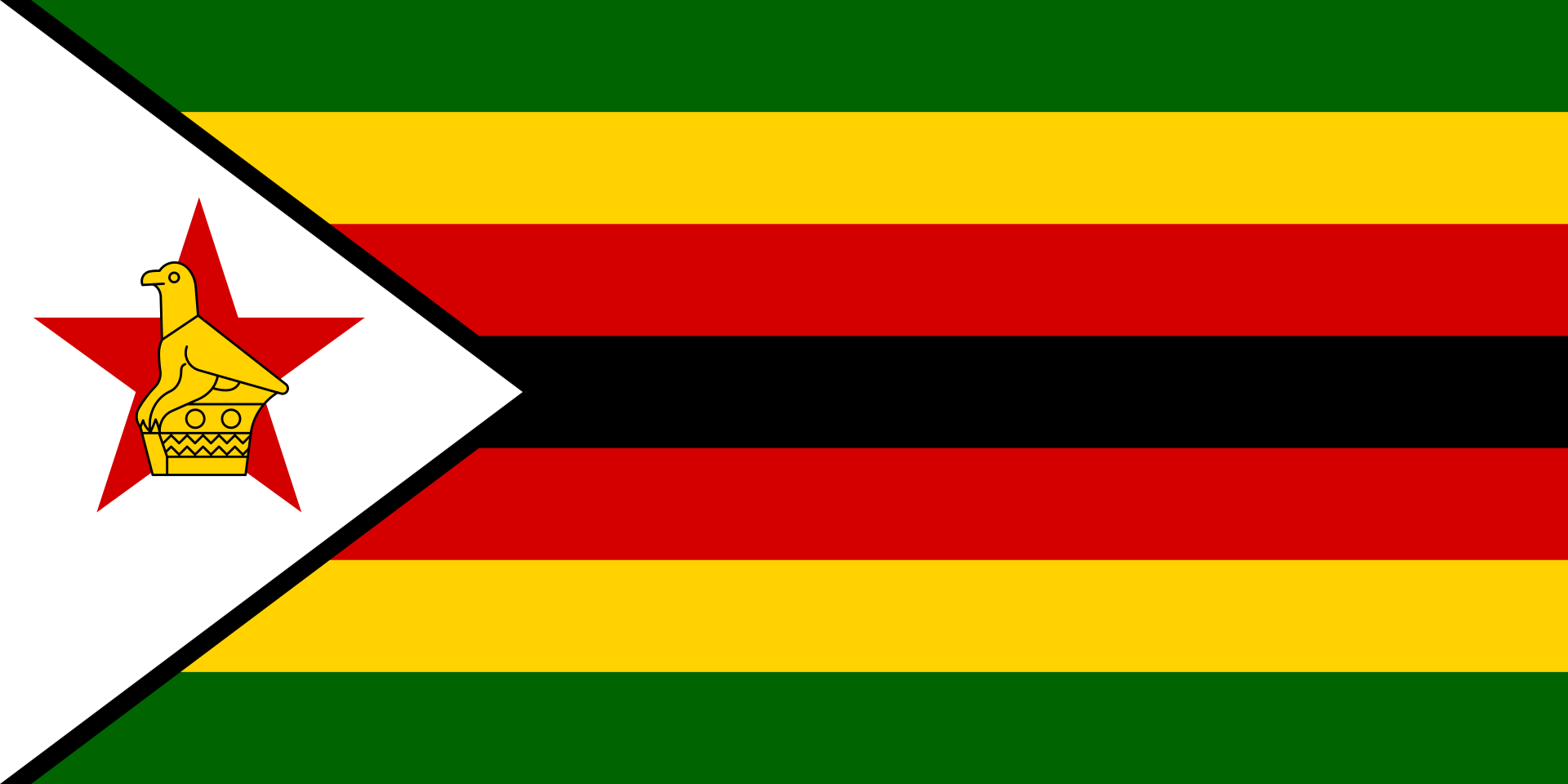
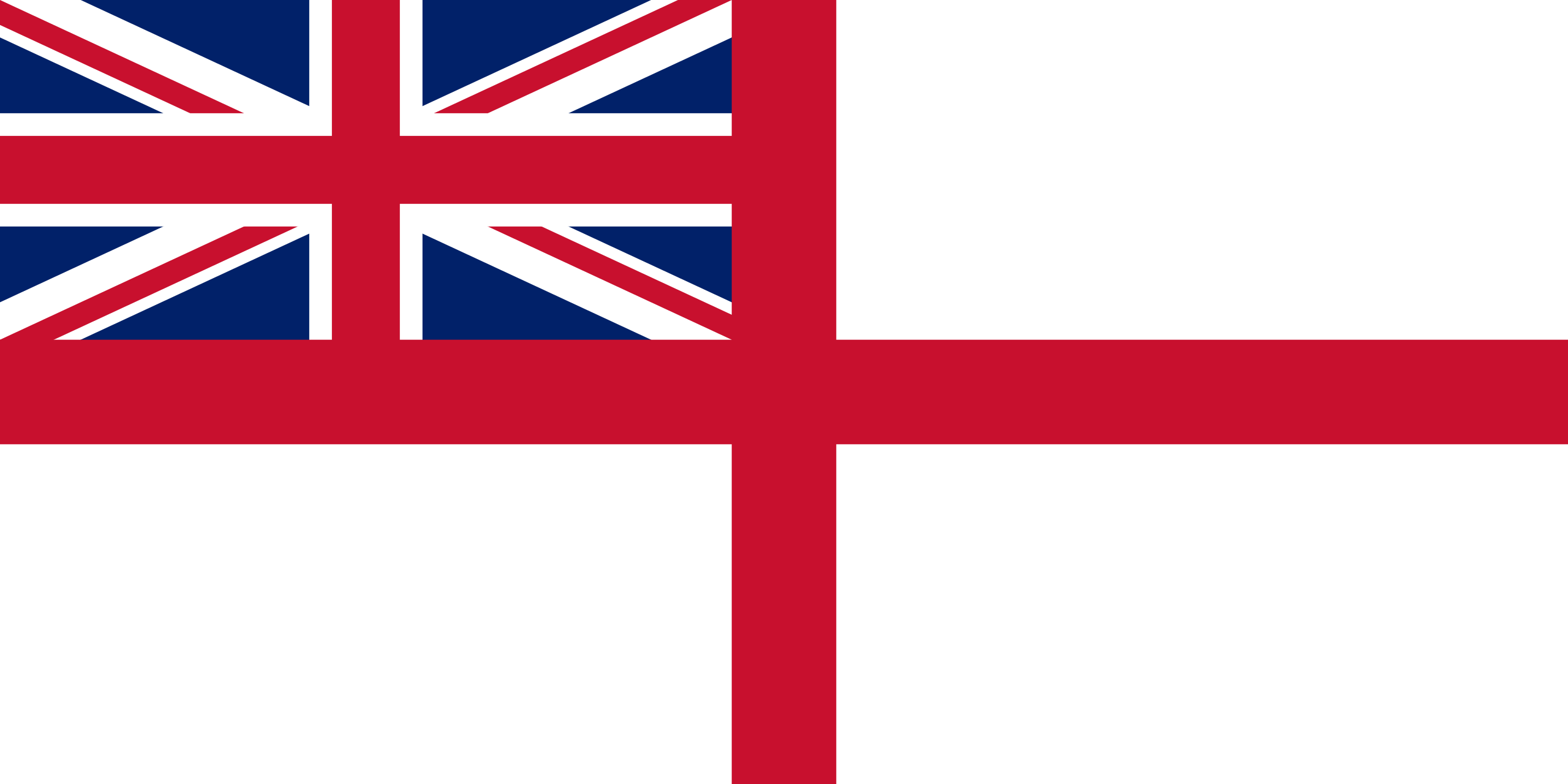
NOTE: Not to be confused with the flag of Ireland.

 
[–] [email protected] 2 points 5 months ago

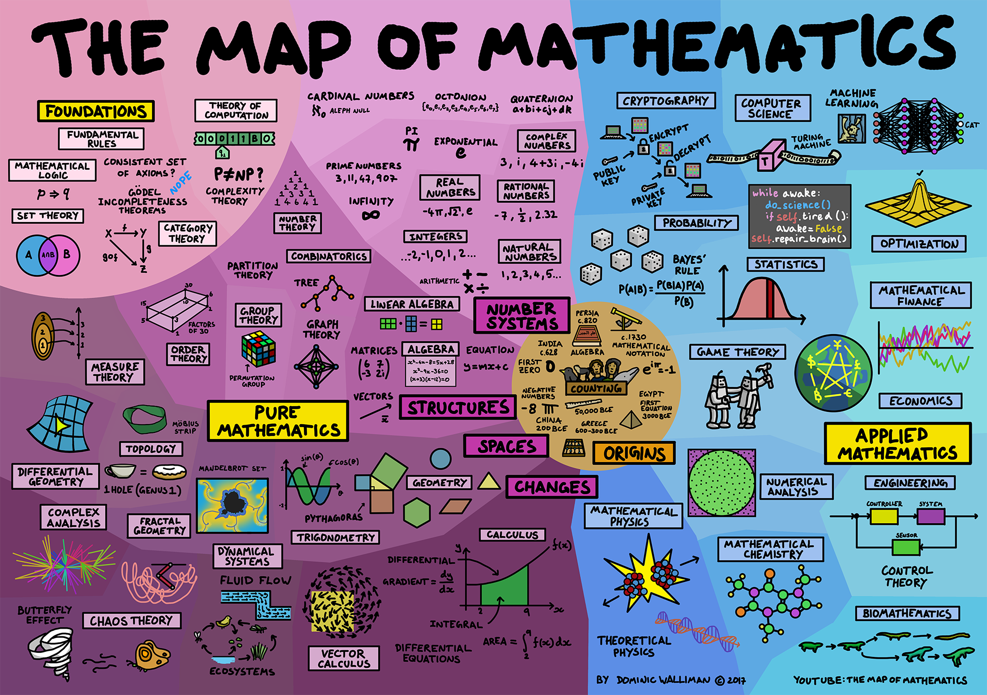
This video is actually what got me interested in vexillology! After watching it, I thought, "Hmm, maybe I could try making the state flags better," and made a whole set of redesigns.

[–] [email protected] 17 points 5 months ago (1 children)

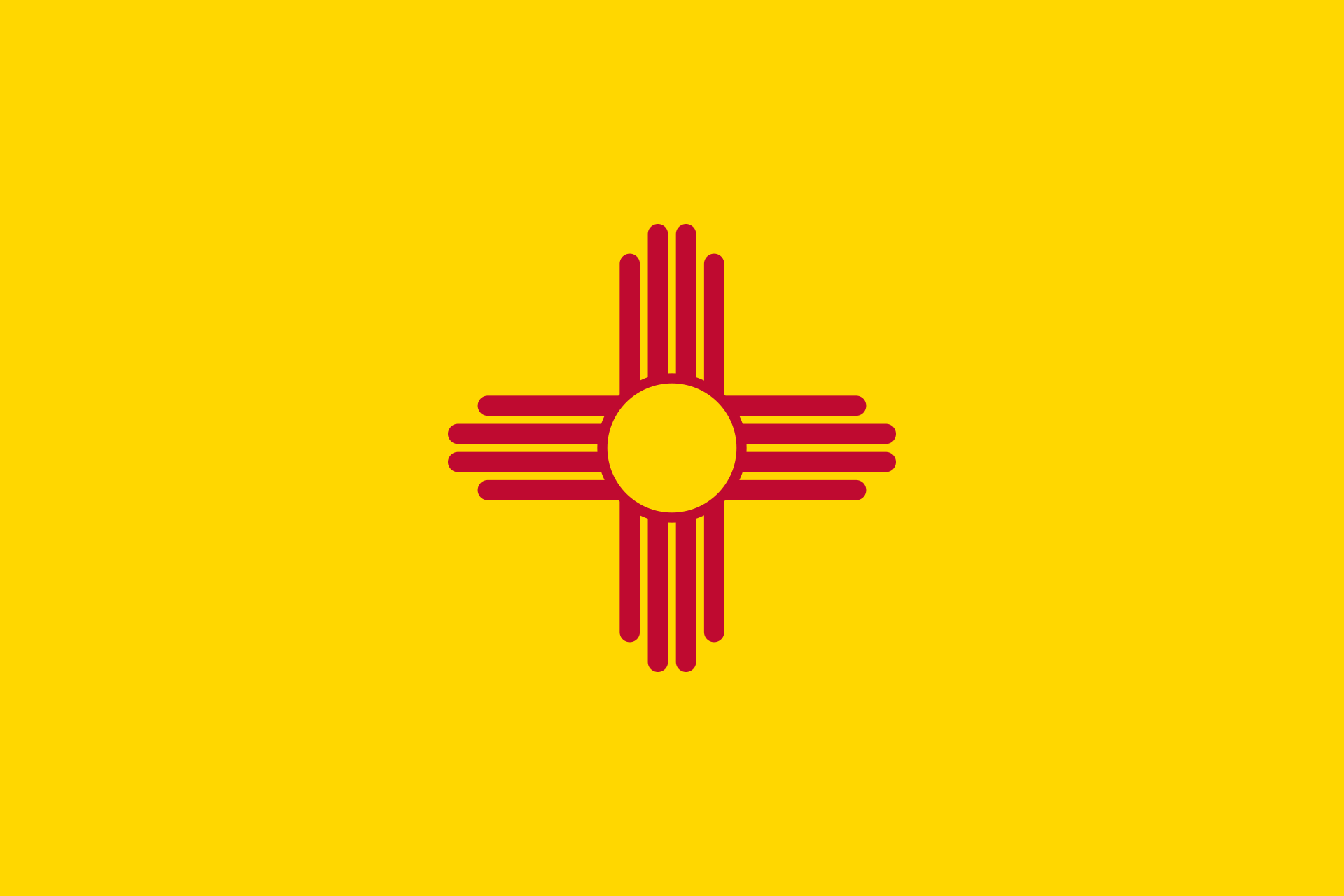
On March 15, 1925, this flag was adopted by the U.S. state of New Mexico. It's a widely liked flag for (imo) good reason. The design is simple and striking, the colors go very well together and fit a relatively arid state, and the Zia sun symbol does a great job distinguishing this flag from others.

 
[–] [email protected] 1 points 5 months ago

I prefer the first icon for the same reasons that snooggums brought up. It's simpler, its solid color fits the rest of the design better, and it's more widely applicable.

[–] [email protected] 5 points 5 months ago* (last edited 5 months ago) (1 children)

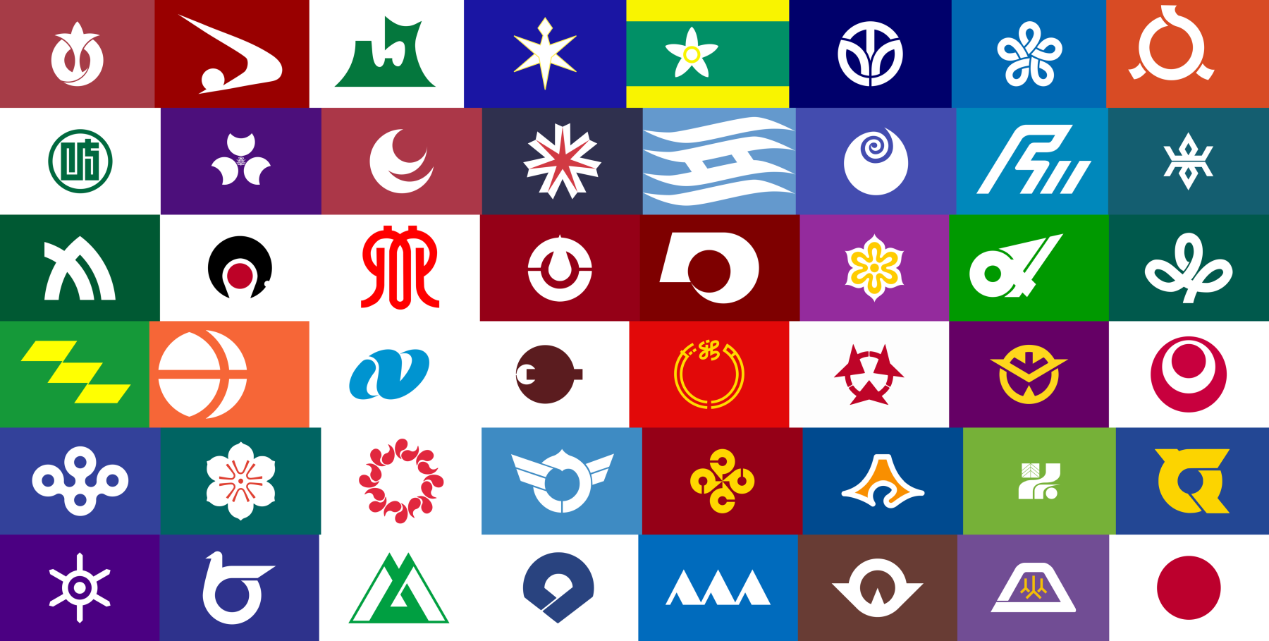
My favorites are probably the flags of Niigata and Okayama. They have really appealing colors imo, and the symbols are great as well (especially Niiagata's).

 
[–] [email protected] 2 points 5 months ago

I know everyone else has said these exact words, but glad that you're feeling better!

It's good to see that you're looking into delegating tasks. It's important for others to be able to pick things up whenever you're unavailable, unwell, or just exasperated. Alongside getting more instance admins, I'd also recommend getting other moderators on the magazines you own (e.g., /m/tech). The spam on those can get really bad, so there should be a few active magazine moderators to deal with those.

[–] [email protected] 2 points 5 months ago

there is no way that a bee should be able to fly.

[–] [email protected] 15 points 5 months ago (1 children)

It represents the blood that will be spilled in Utah's conquest for world domination.

In all seriousness, it's meant to evoke a rocky canyon. Additionally, the white is meant to be mountains (hence the shape), and the blue is sky.

[–] [email protected] 9 points 5 months ago

Imo the new Minnesota flag is great. It's not as good as the original submission (and that sentiment might contribute to people not liking it as much), but it's still a good flag. The colors are nice, the design is distinct & readable, and you can even combine other flags with it (an obvious example being a pride flag) by replacing that light blue field.

 
[–] [email protected] 3 points 5 months ago* (last edited 5 months ago)

Ooo, didn't know about that. The bill says that the Flag Commission has until September 1 to select up to 10 flag designs and up to December 3 to recommend a flag, so we should see some cool stuff about that later this year.

EDIT: Correct link.


view more: next ›