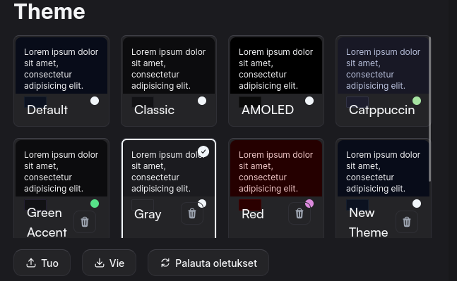
I don't know. Just "Gray" is also fine by me.
sevon
(👀)
(👀) indeed, definitely interested to see that.
On some devices I could not tell.
Well now that you made me open my inbox, I found it
Whoops. I was trying to find usages of that color and found none.
Edit: Changed to #555555
I went and did the same to light colors. The change is more subtle, but I like it.
{
    "slate": {
        "25": "251 251 251",
        "50": "242 242 242",
        "100": "229 229 229",
        "200": "226 226 226",
        "300": "222 222 222",
        "400": "154 153 150",
        "500": "102 102 102",
        "600": "51 51 51",
        "700": "85 85 85",
        "800": "51 51 51",
        "900": "51 51 51",
        "950": "2 6 23"
    },
    "zinc": {
        "50": "250 253 255",
        "100": "243 244 246",
        "300": "209 213 219",
        "400": "156 163 175",
        "500": "107 114 128",
        "600": "75 85 99",
        "700": "72 78 87",
        "800": "55 59 65",
        "900": "40 42 46",
        "925": "32 34 37",
        "950": "29 31 33"
    },
    "primary": {
        "100": "241 245 249",
        "900": "15 23 42"
    },
    "other": {
        "black": "0 0 0",
        "white": "255 255 255"
    }
}
Edit: Orange replaced with dark gray.
<Also: blue accent version>
{
    "slate": {
        "25": "251 251 251",
        "50": "242 242 242",
        "100": "229 229 229",
        "200": "226 226 226",
        "300": "222 222 222",
        "400": "154 153 150",
        "500": "102 102 102",
        "600": "51 51 51",
        "700": "85 85 85",
        "800": "51 51 51",
        "900": "51 51 51",
        "950": "2 6 23"
    },
    "zinc": {
        "50": "250 253 255",
        "100": "243 244 246",
        "300": "209 213 219",
        "400": "156 163 175",
        "500": "107 114 128",
        "600": "75 85 99",
        "700": "72 78 87",
        "800": "55 59 65",
        "900": "40 42 46",
        "925": "32 34 37",
        "950": "29 31 33"
    },
    "primary": {
        "100": "26 145 235",
        "900": "22 122 198"
    },
    "other": {
        "black": "0 0 0",
        "white": "255 255 255"
    }
}
Feel free to steal.
Lemmy-ui does it by default. I don't know why, maybe it's for other activitypub software that won't understand lemmy syntax.
Regardless of the reason, I feel that rant. It could have been simple and straightforward, but no, f u, you'll do regex instead.
Now we're going very modern.
I'm not sure, I might decrease transparency and try it with a bunch of different themes as some colors can make blurs look like ass.
Seems that there's still some time to be spent fiddling with CSS layouts.

But anyway, this is an awesome update.
Since we're discussing rounding, how about dropdowns?


Thankfully I also had an old usb dongle on hand. I don't want to leave it like that because it ate 50% of my two available usb ports.