We're Live! Gogogogo!
UPDATE: There may be pixel sync issues (the pixel timer not timing 100% right), still working 'fine'. Reload the canvas if any issues occur.
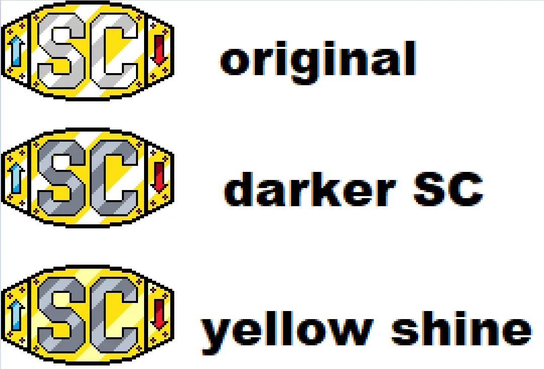
UPDATE: Border is in place, begin fil! Please use "Darker SC" colouring (the middle one)
Final Update We did it! The event is over and we made our mark! See you all next year to do it again!
It's almost time!
Last year with the Reddit exodus, the folks over at Canvas set up the Fediverses own version of /r/place from Reddit. (If you aren't familiar, it's that pixel placing game where you make weird collaborative art!)
This year's (the 2nd annual) Canvas will be going live this Friday morning. The url also shows a countdown to it's start to help keep track)
siv9939 has designed a great piece of pixel art for us to go for:

The design isn't too big, should be easy to locate, and shouldn't be too hard for us to map out and maintain!
PLACEMENT:
We can move things if need be, but for a starting place I feel we should avoid edges/corners/the dead center. People will hit those areas quick. For now (unless if you all say otherwise) I'm gonna place us south-east of center since it should give a lot of clearance. The template above should reflect this.
For calibration - This jewel's (the one to the upper-left of the S) red centerpoint https://imgur.com/a/kknUZJE is at co-ordinates 364, 328. Whoever starts off the first few pixels tonight I highly recommend start here and everyone focus outwards. Should something happen and we need to change locations, post below so we can co-ordinate.
The map unlocks Midnight, Friday Morning and is open for anyone with an account on the Fediverse (not just Lemmy users). Anyone who wishes to work on it can feel free, exact placement will be decided within the next day, if you know that you'll be online with the intent of helping, please chime in so we know! (or if you just plan to pop in now and then too!)
Our own home instance Lemmy.zip is also doing a piece for the server as a whole, so feel free to join in on that should you have extra time and want a second one to work with!
Outlines are coming along a good bit!
I'm back and don't have much I need to do today. I also just found a pixel that's red on the template but should be black. Oops :P
Bahah :P
As for the other colour variants you posted last night/this morning, I couldn't really see em (they were stuck as thumbnails) so i avoided colouring anything in till you were up lol.
It's less they're stuck as thumbnails and more I posted them at 1:1 because people actually seeing the changes didn't cross my mind in the middle of the night. Here's a bigger version of all 3.
Oh lol fair enough :P
Good timing as well since it's decision time.
I like em all..darker SC may be better than original for visibility with all the white around, yellow shine would be easy to transition to from there as well if we wanted. Your thoughts?
We could do the darker parts of the SC and yellow background first, then fill in the shines if we have time.
Works for me!
Edit: If nothing else, this whole experience has assisted with getting me to learn how to use Matrix lmao