the_dunk_tank
It's the dunk tank.
This is where you come to post big-brained hot takes by chuds, libs, or even fellow leftists, and tear them to itty-bitty pieces with precision dunkstrikes.
Rule 1: All posts must include links to the subject matter, and no identifying information should be redacted.
Rule 2: If your source is a reactionary website, please use archive.is instead of linking directly.
Rule 3: No sectarianism.
Rule 4: TERF/SWERFs Not Welcome
Rule 5: No ableism of any kind (that includes stuff like libt*rd)
Rule 6: Do not post fellow hexbears.
Rule 7: Do not individually target other instances' admins or moderators.
Rule 8: The subject of a post cannot be low hanging fruit, that is comments/posts made by a private person that have low amount of upvotes/likes/views. Comments/Posts made on other instances that are accessible from hexbear are an exception to this. Posts that do not meet this requirement can be posted to [email protected]
Rule 9: if you post ironic rage bait im going to make a personal visit to your house to make sure you never make this mistake again
view the rest of the comments
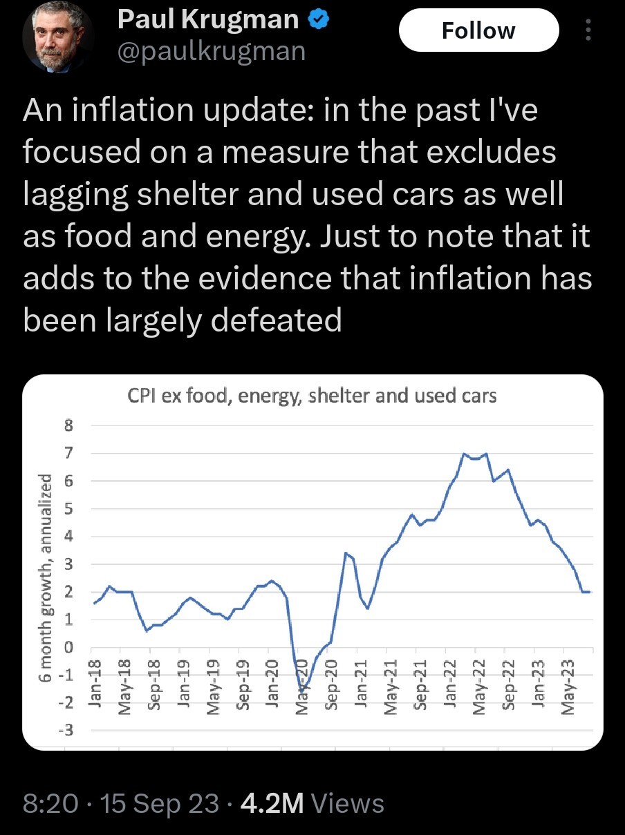
It's silly to present only this graph, then. Surely it's possible to put a dashed line next to this one that includes the "lagging" measures and just stops where the data stops or becomes unreliable, but would still show the trend(s).
Or hell show each component as a different line, maybe faded some, and end each line where the data become questionable, and put the composite line darker/bolder. Lots of good options.
If we're back at/near the target 2%, that does count as "defeated" from the point of view of the monetary policy makers. But I'd need to see complete inflation data to be certain. If we're missing inflation data because it "lags," then we'll know one way or another later.