Enjoy your vacation!
Cyberpunk
What is Cyberpunk?
Cyberpunk is a science-fiction sub-genre dealing with the integration of society and technology in dystopian settings. Often referred to as “low-life and high tech,” Cyberpunk stories deal with outsiders (punks) who fight against the oppressors in society (usually mega corporations that control everything) via technological means (cyber). If the punks aren’t actively fighting against a megacorp, they’re still dealing with living in a world completely dependent on high technology.
Cyberpunk characteristics include:
- Dystopian city setting where mega-corporations rule
- Full integration of technology into society, featuring cybernetic implants
- Outsider protagonists (punks) who often are very familiar with the technology around them
- Hard boiled detective and film noir vibes and influence
- Themes dabbling in trans-humanism, existentialism, and what it means to be human.
Prefixes for posts
- [Art]
- [AI Art]
- [Game]
- [Video]
- [Movie]
- [Book]
Icon created by @[email protected].
Banner generated via AI model.
Thanks!
I'll see if I can come up with something! And thanks for the heads-up for next week
More abstract:
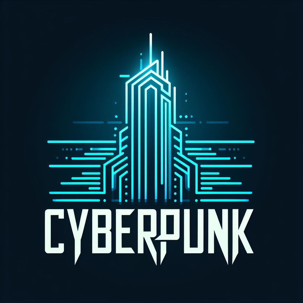
More colourful:
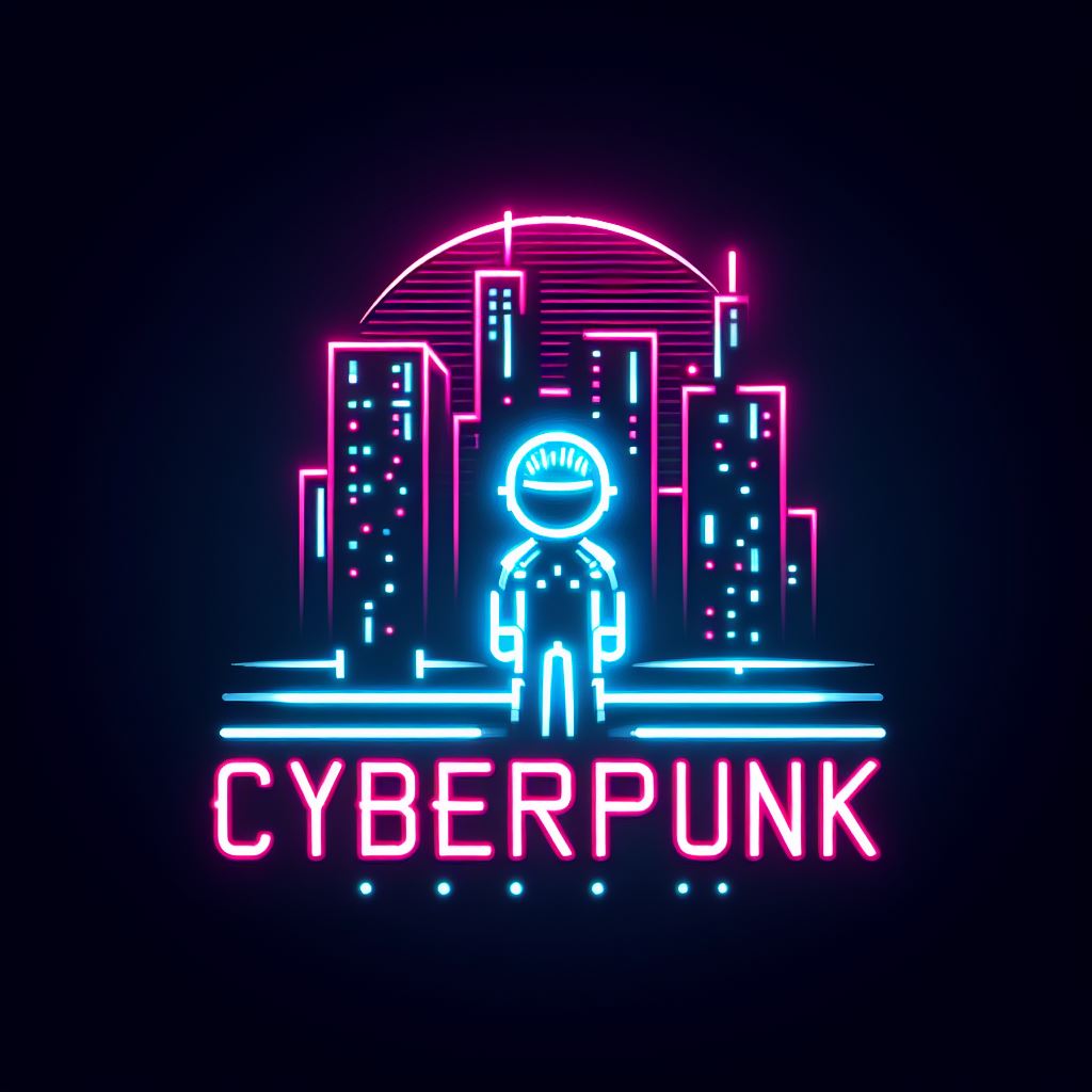
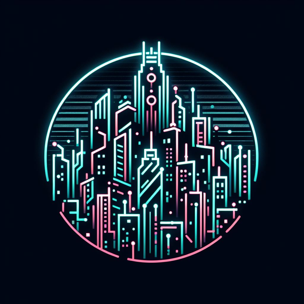
While I like the abstract nature of these, my main priority is to make them look good at icon size. So I'd rather not have any words on them. Can you create some without any text? That colorful one might actually work pretty well, although I worry it's treading a little too closely into Outrun territory:

How about this?
Added credit in the community sidebar. Thank you.
Hi BrikoX, please feel free to change your community icon any time when you find a better one. I only did it for fun and didn't expect to "win" honestly.
Awesome, nice work!
This icon won the vote! Good job!
Hi Hammerjack. Please feel free to change your community icon any time when you find a better one. I only did it for fun and didn't expect to "win" honestly.
I had some fun with the inpaint and prompts. Apparently inpaint can take output image as an input and here are some iterations.
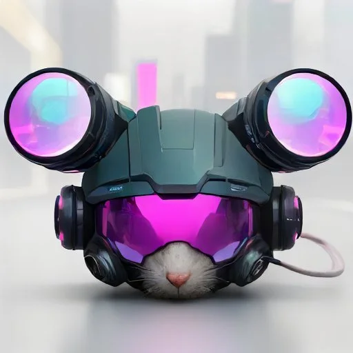
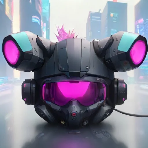
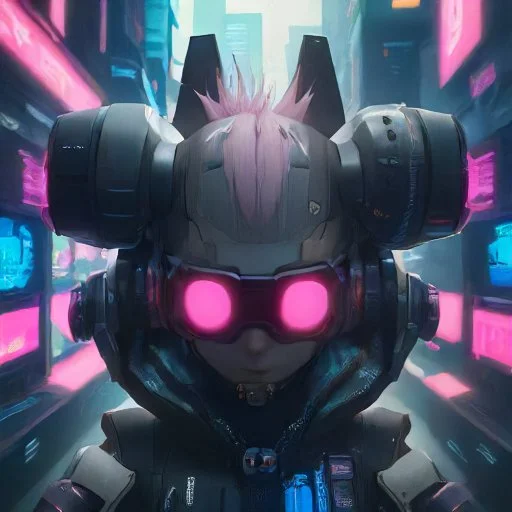
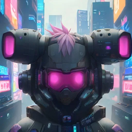

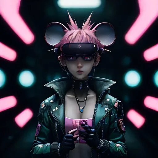

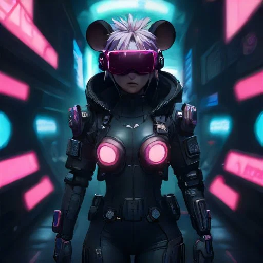
Those are all far out. My vote's for the first one bc it looks good zoomed in as well as shrunk down.
I'm torn. The first one looks too much like a flight helmet than a cybernetic visor but would still be recognizable when shrunk down. The later pictures (with the girl) look much more cyberpunk but have too much detail for them to look good when shrunk down to icon size. Also, the ears get a little too "Mickey Mouse" in those full-body pictures.
Honestly, the fourth picture (last one before she gets a body) looks the most cyberpunk to me while still not having too much detail. Hmm...
This was a ten minute play with leonardo.ai, feel free to try something yourself.
I’ll be on vacation all next week. I know no one really cares, but I’ve been trying to post something every day and if a week goes by with no new posts, I don’t want anyone to think I disappeared or gave up on this community. I’ll be back next week with more random nonsense to post each day.
Been there fam, I gotcha back.
Thanks for all your help keeping this community active!
Yeah no problem, I was posting daily to [email protected] for a while and got someone to take over for a week I was offline.
I think that's the key to growing these smaller sub-lemmys: at least 1 person posting regularly and a couple others posting when they can.
