That’s insane. Like it was designed specifically to end up here. 
Images of text-designs, that are barely readable due to the placement of the words or letters
Please indicate which post is original by writing "OC" and properly credit stolen posts.
Please mark NSFW posts properly, don't spam, yadadadada
That’s insane. Like it was designed specifically to end up here. 
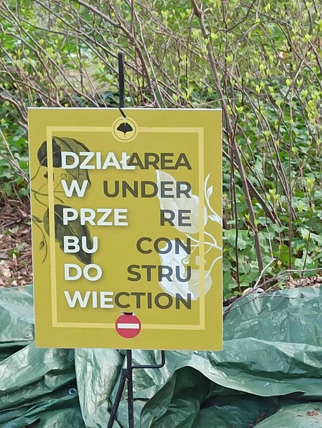
I'd say, they did a good job separating phrases by colour and the Idea isn't too bad. But I can't stop seeing "Diar(rh)ea wunder" in the first two lines
I thought this was just some polish sign until I looked at the instance
Comment unclear. Do you mean:
What dies the whole thing say translated to English?
Left and right text (dark and light) say the same thing. The left is in Polish, right is in English