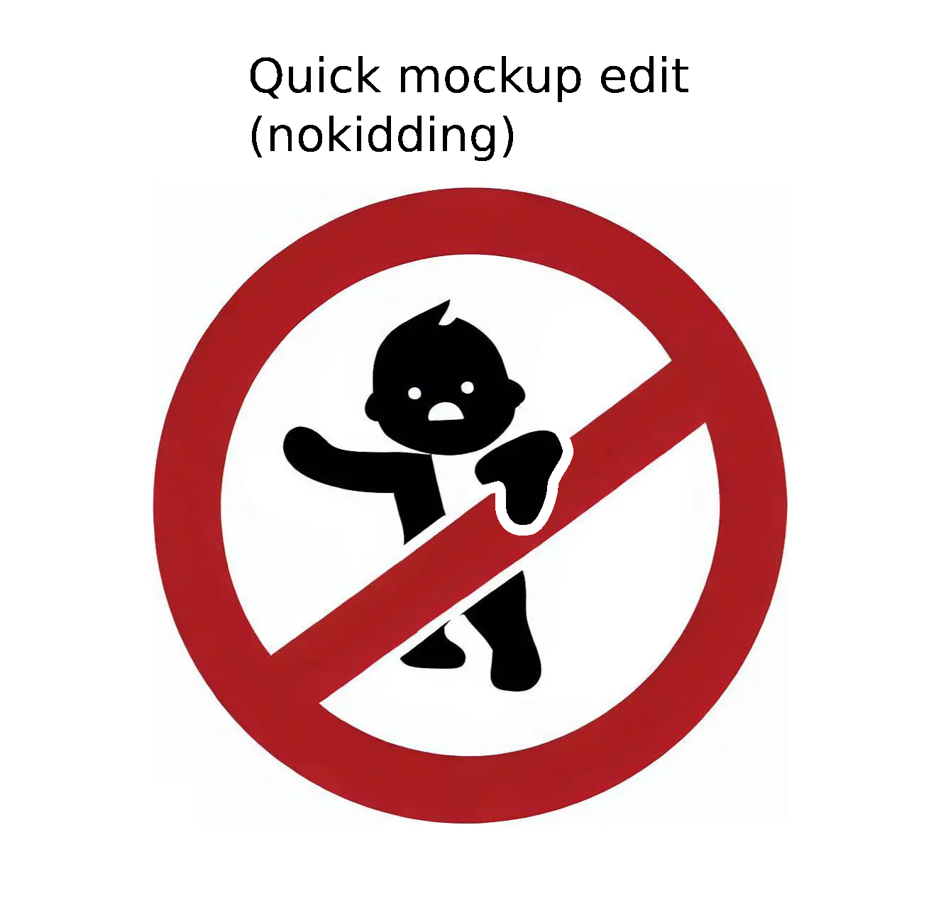
Hi! The updated community logo is spanking! So cool! 🤩 There's one minor detail my hobbyist logo designer eyes caught that I would recommend tweaking. The character's black hand in front of the red bar could be separated from the red bar with a little bit of white between those two color areas. That would make it possible to print the logo by using only one color so that it would still be possible to tell apart the area of the hand in front of the bar from the actual bar in that situation. That would be especially useful in some fabric printing situations and also when printing on paper using rudimentary machinery. Otherwise, really nice 👍
EDIT: I mean just adding a white border between the above-mentioned parts, similar to those elsewhere in the logo.
EDIT: I posted a quick mockup to visualize what I mean.