I like it a lot. It makes the device feel really cohesive between apps. And changing the color every now and then feels like a breath of fresh air. Also, the pastel colors help to get rid of blue/grey tones which is easier for the eyes.
this post was submitted on 03 Aug 2023
16 points (100.0% liked)
Android
27333 readers
162 users here now
DROID DOES
Welcome to the droidymcdroidface-iest, Lemmyest (Lemmiest), test, bestest, phoniest, pluckiest, snarkiest, and spiciest Android community on Lemmy (Do not respond)! Here you can participate in amazing discussions and events relating to all things Android.
The rules for posting and commenting, besides the rules defined here for lemmy.world, are as follows:
Rules
1. All posts must be relevant to Android devices/operating system.
2. Posts cannot be illegal or NSFW material.
3. No spam, self promotion, or upvote farming. Sources engaging in these behavior will be added to the Blacklist.
4. Non-whitelisted bots will be banned.
5. Engage respectfully: Harassment, flamebaiting, bad faith engagement, or agenda posting will result in your posts being removed. Excessive violations will result in temporary or permanent ban, depending on severity.
6. Memes are not allowed to be posts, but are allowed in the comments.
7. Posts from clickbait sources are heavily discouraged. Please de-clickbait titles if it needs to be submitted.
8. Submission statements of any length composed of your own thoughts inside the post text field are mandatory for any microblog posts, and are optional but recommended for article/image/video posts.
Community Resources:
We are Android girls*,
In our Lemmy.world.
The back is plastic,
It's fantastic.
*Well, not just girls: people of all gender identities are welcomed here.
Our Partner Communities:
founded 1 year ago
MODERATORS
i hated material ew as soon as it was announced. so much padding everywhere, and so little contrast - to paraphrase the incredibles: if everything's orange^[other colours are available, i just like orange], nothing is. your eyes will adjust to it. i want actionable items to stand out, not be a slightly lighter shade of the same colour. it also looks rather like a fischer-price my first phone interface
i must say, if an app (for example, jerboa) uses material 3, i usually try to look for an alternative
some examples:
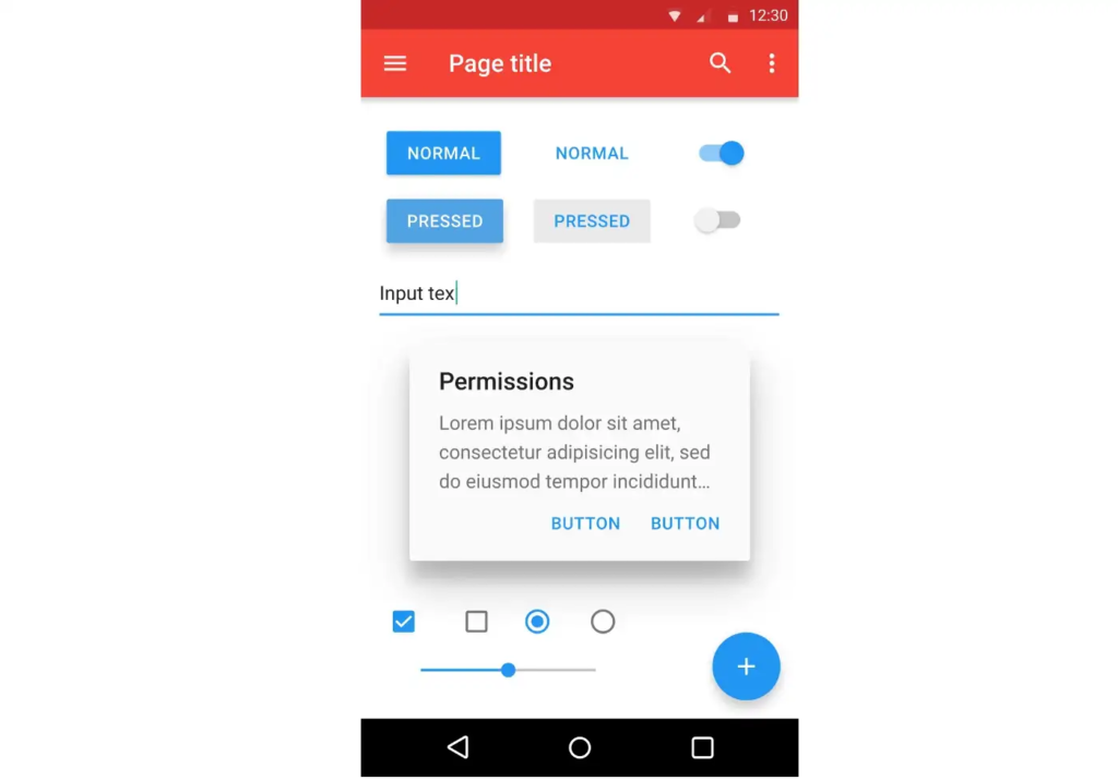
with material design, it's clear what's a header, what's a footer,^[look at the lack of contrast on that "new post" button] and what each button's state is.
with all the padding, there's also less space; leading to less functionality
with material ew, it's much harder to tell at a glance what each app is, one has to scrutinise the icon rather than just tell at a glance by colour
i also really dislike monet; the way it pulls this horrible washed out sickly pastel colour from a wallpaper and washes it over the entire app. if i just pulled one accent colour, and applied that to, say, the header and main action button, i'd like it a lot more
much harder to tell at a glance what each app is
Is that a Google launcher issue? I'm using Nova Launcher and my apps are still all different colors, the app icons don't use the material you color.
it's a google launcher "feature".
it's only available on a13, i think, and not all launchers support it. but it is part of the m3 design language, so i included it as an example
Can't you turn it off?
well probably, in fact i've never had it turned on. but it's part of the m3 design spec, so i'm going to use it as an example to criticise the m3 spec.
Fair enough. I have it on, not much of a problem for me to recognize the apps but it gives a much more consistent look to my home page. I agree that Material You has sacrificed productivity in favor of appearance, and a lot of people may not like it. Meanwhile, I personally don't have much of a problem with that.
i personally think it's sacrificed productivity in favour of pastel vomit, but i realise that's just my opinion.
It's a beta feature that's currently off by default, but it's pretty clear Google wants to force it eventually
I strongly dislike it. Having themed colors seems immature and less functional. Having it tied to a wallpaper makes even less sense. I set my system color to grey and use an icon pack for my third party launcher. Padding and other regressions are harder to fix.
4.4 was peak android.
strong dislike
everything is bloated and round, the quick settings tiles are too large, like it was intended to be used by a grandma
the colour scheme outside pixel is too unsaturated, oneui and aosp roms are not as colorful as pixel ui because google copyrighted it ig
I like it.
As somebody that prefers low contrast, it's great
I think it's ok. The problem is my wallpaper is a cat so everything material you is like light coffee colored which I don't really like. But I'm too lazy to find a better color that doesn't look worse.
I really like the idea. However, I think maybe 1 or 2 apps on my phone support the color theming.
I love it. Also makes it easier for app devs, like myself, to build an app that blends in with the device you're using it on.
I don't like the background tint, but after removing it with Repainter I love the consistency on all my apps
Mostly ambivalent to it.
However, the quick settings is a big downgrade from before. Less buttons, more space. And don't even get me started on the horrible design of the internet toggle.
i hate it
I love the coherence so overall it is great. It just looks clean and nice. I wish, however for more apps to have amoled mode with material you cause some of them dont have one. I also think that if you are creating an app that has some characters you shouldnt use material you. When I use app with mdy i feel like it is more of a tool than individual app. Overall it is great, brings coherence and minimalism but if you want to stand out from the crowd dont use it.