1
Really Old Computers
(lemmy.world)
Trout only!
Im so confused why this wouldn’t work and I didn’t see anywhere in the article the actual reason. Can anyone explain it better? Can you not just play a vr video file? Is it blocking the sites? I’m just confused.
I really like his videos but those past ones about the pinball machines would put me to sleep so fast! I’m glad he’s doing another photography topic!
I saw Bald and Bankrupts short series on the Darien Gap and it looked insane. Huge respect to these people putting themselves through that for a chance at a better life.
I’m kinda torn on this thing. I watched the LTT Wanshow segment about it and it seems cool. But also seems very gimmicky or like the entire thing could have been just an app. It will definitely be interesting to see how this technology grows and changes in the coming years if it really takes off. I know they sold out a bunch of their preorders so that might mean good things to come.
Depending how much you want to play around with it, you may be able to configure something with Shortcuts to get the desired behavior. I have something similar set up for screen brightness and media volume based on what WiFi networks I’m connected to or places I’m at.
Is this any different than EPA rated MPG listed on vehicles? Obviously their quoted range is an absolute best case scenario. Still fun to meme on the cyber truck though.
Wouldn’t that be great! Unfortunately,I feel like the us will never get to the point of having any decent socialized healthcare. :(
What sort of argument is this? Obviously if the net catches a fucking person then yeah good job nets. But the root of the problem isn’t people falling off the bridge on accident. It’s people with unaddressed mental health issues wanting to kill themselves. How about we address the mental health aspects instead of just making them jump off a different bridge or shoot themselves or any other of a million different ways to kill yourself. If I really wanna die a net on that specific bridge won’t stop me I’ll just find another way.
What idiots are downvoting this? The problem isn’t that the bridge is too high. It’s that the people who have suicided there in the past had no access to mental health care. You downvoters are not looking at the root of the problem. You really think all the suicidal people are just gonna magically cure themselves because they installed nets?
The money spent on not only the nets and installing them etc but also the lawmakers that wasted their time coming up with this idea and meeting about it etc etc is ALL a waste of public funds and could have been put to much better use towards the actual problem.
This is just Americans patting themselves on the back pretending they’re doing a good job 👏🏼
This highlights the problem of Thc-a and the inability of the police to judge whether or not it is actual cannabis or not. It could have even been a cbd blunt they were smoking! The police would never know. They even were honest and said what it actually was and where they got it.
Regardless of that, who gives a fuck if they’re smoking outside waiting on the bus??? Just because the officers were driving by and smelled smoke… fucking power tripping pigs need to go fuck each other in the mud.
Just let people consume a natural herb if they want why do they care SO much.
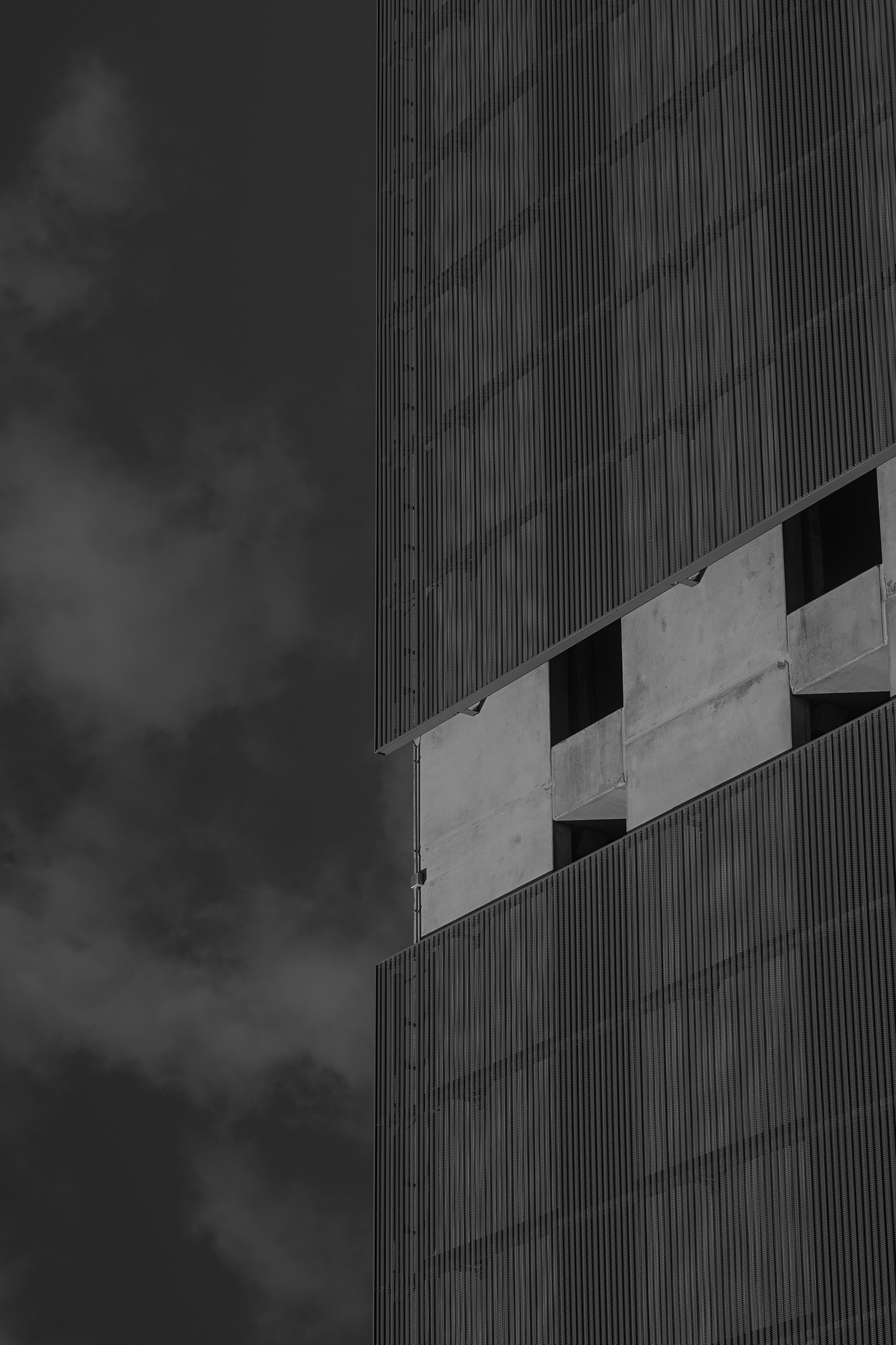
So I've been sitting on this one for a long time - it too comes from the January photos. I was inspired by another photographer who was posting abstract architectural photos on the reddit community and I wanted to try my hand at the style. I really like architectural photography, but it gets boring sometimes because it seems there's only a handful of good angles you can get of a particular building. So this kind of reinvigorated my creativity.
To give some perspective, the roof line of the building is on the left. I've rotated the photo around and to me it looks like a closeup shot of a much taller building with the clouds behind. I really like that. The junction box sitting there is a little distracting to me but it isn't so bad & I'd rather not edit things out of the photo. Not only is it usually obvious to me where my own edit took place but it also goes along with my hang up about being disingenuous in my photography.
I enjoy a lot of the texture here which was my main intrigue when snapping the photo. The wispy, smoke-like clouds remind me of the steam you see coming up from the streets sometimes. The weird metal facade over the concrete is just plain awesome to me - it looks soft and rigid at the same time. The concrete of the building has a nice smooth texture as well.
I'm not sure what to think of the lighting. I think the gray sky behind the white clouds is a little too dark. The building itself looks pretty cool to me and I really like how dark the windows turned out. And the whole photo might adhere too much to the rule of thirds, it kind of gives me that too-clean feeling.
Overall I think I did a pretty good job for a first go at this style!
I'm not sure what to do with this photo. It's from a series that I did back in January where the goal was to take at least one photo per day all in B&W. It was just something fun to do that would rekindle some inspiration and help me in a time I was feeling very uninspired.
I chose B&W to give myself less to think about when shooting. Too often with color photos I want to edit the colors to make them pop or look more like they did in my mind's eye when taking the photo. But with B&W that isn't so much of an issue for me because now the photo looks nothing like it did when I was shooting and can it kind of be it's own thing. I like that.
It's challenging for me to edit any photo, and this one is no different. I like that without color you can pump the contrast and exposure and really darken the shadows and make it kind of how you want just in messing with the light sliders. I'm pretty happy with how the lighting turned out. I wanted it to be very contrasty much like tri-x but when I did that intentionally it felt kind of wrong so I backed out and went with this. Maybe because the image is too clean and most of the shots I've seen on tri-x are very rough, gritty, etc.
As for the framing and whatnot, this photo is quite cropped. Originally I did not notice the man lying on the bench and was moreso just taking a shot of the tracks to pass the time waiting for the train. When I got back to view the photos I liked the way he was off to the side on the right of the frame but he wasn't the focus. So I cropped in maybe like 25% to get the frame we have here.
I like the emptiness/loneliness of the photo, but I feel like it's a bit too empty and is missing something to tie it all together nicely. I would have liked it better if maybe there was a group of people waiting near the man but no one was paying him any attention, just like I didn't notice him at first.
So, what are your thoughts on the edit? Should I go full crazy and blast the heck out of that contrast slider? Should I have cropped differently? I just feel like this could be a great photo and it's one I look at often. It just needs a little something more in my opinion.
ISO 100 | 50mm | f8 | 1/100s

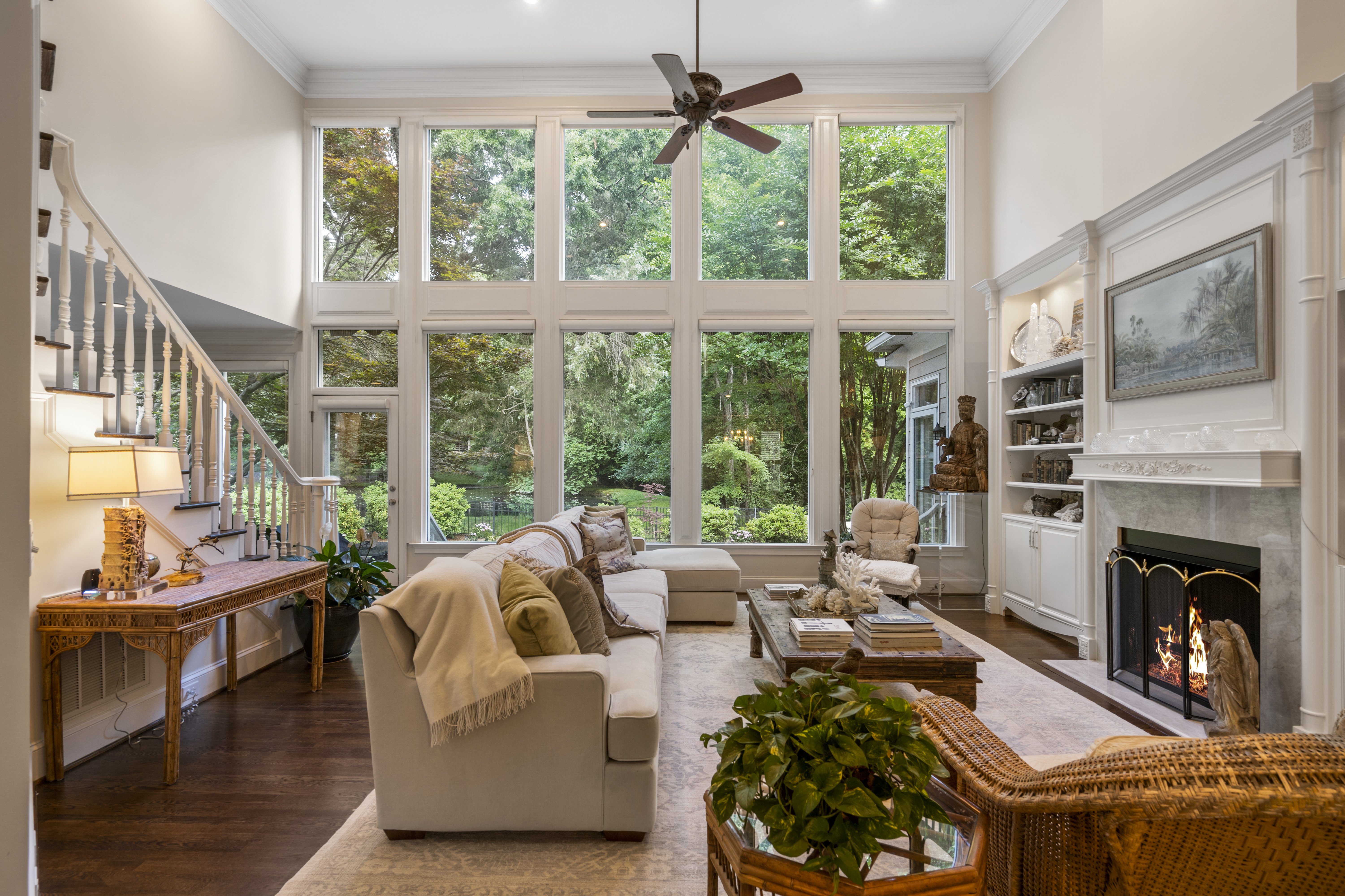
This one here is one of my all-time favorite interior photos. I absolutely love the gigantic windows and hate to think how expensive something like this would be.
As for the photo, I like everything about it. The staging was fantastic and the colors and design of the space works so well. I feel like these interior type photos are hard to critique because I really didn't do much work to get this photo. Just tripod positioning and the thought process to decide this was a good angle to capture.
I do think i should have raised the tripod. There may have been something preventing me from doing so. I know there was a catwalk style walkway overhead and maybe that ceiling line was butting into the frame when the tripod was higher...who knows! This photo was taken at least a year ago, but I think it's a great one to share!
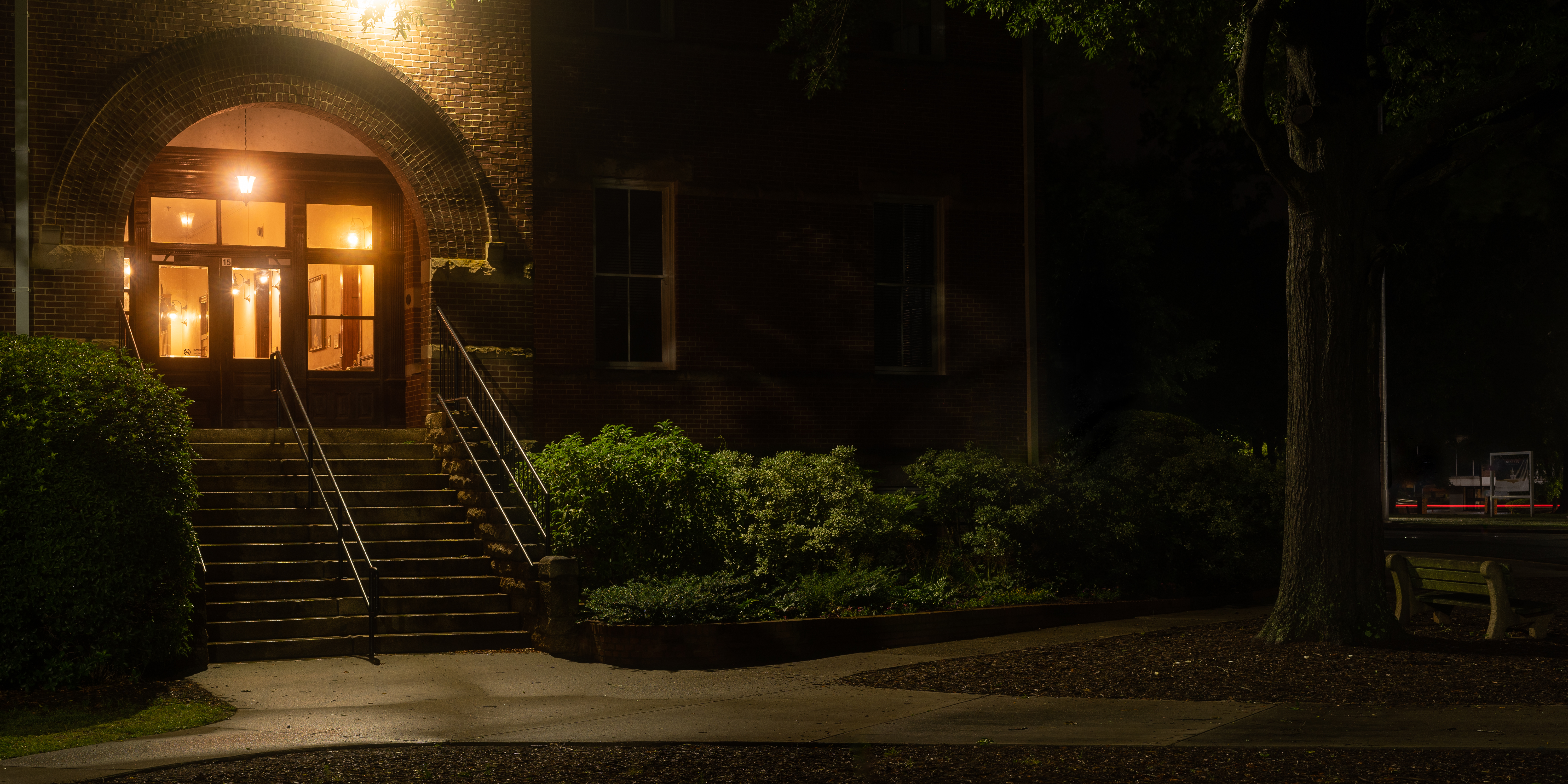
This one right here is one of my most recent favorites. A couple weeks ago on Memorial Day weekend it rained the entire few days. So what better way to make the most of the rain than taking photos! I went to a local college that has a few very old, historic buildings ( a favorite subject of mine) that I'd been considering photographing for quite a while. And it was finally the time.
I set out with my rain jacket on, boots laced tight, and a grocery bag wrapped around my camera and lens to hopefully protect everything. I used a 1/8 promist filter stacked on top of a 1/4PM because I'm on a budget and can't afford a more dense mist filter just yet. These are also 72mm filters on a 48mm lens which just looked hilarious, but as you can see the results are pretty good!
Things I like: everything? but more seriously, my favorite part of the image has to be the red streak of brake lights directly over the bench on the right side of the frame. I wanted to show the bench in the photo but not bring too much attention to it and I think the red streak guides the eye over there and makes you wonder just a bit.
The glow and color of the lights inside the building are also just wonderful to me. I love some good lights! And the color of them was perfect for the atmosphere I was going after.
Things I don't like: I think the area in the middle of the frame is kind of uninteresting and needs a subject like someone strolling through with an umbrella and maybe walking a dog...that sort of thing. In order to mitigate this I tried using a wide ratio for the crop and I really think it works. The crop kind of makes two photos that are tied together by an uninteresting middle part that your eyes walk back and forth between to get to the more interesting parts of the image.
Anyways give me some feedback! What do you like? What do you not like? Do you hate it? All thoughts are welcome! :)
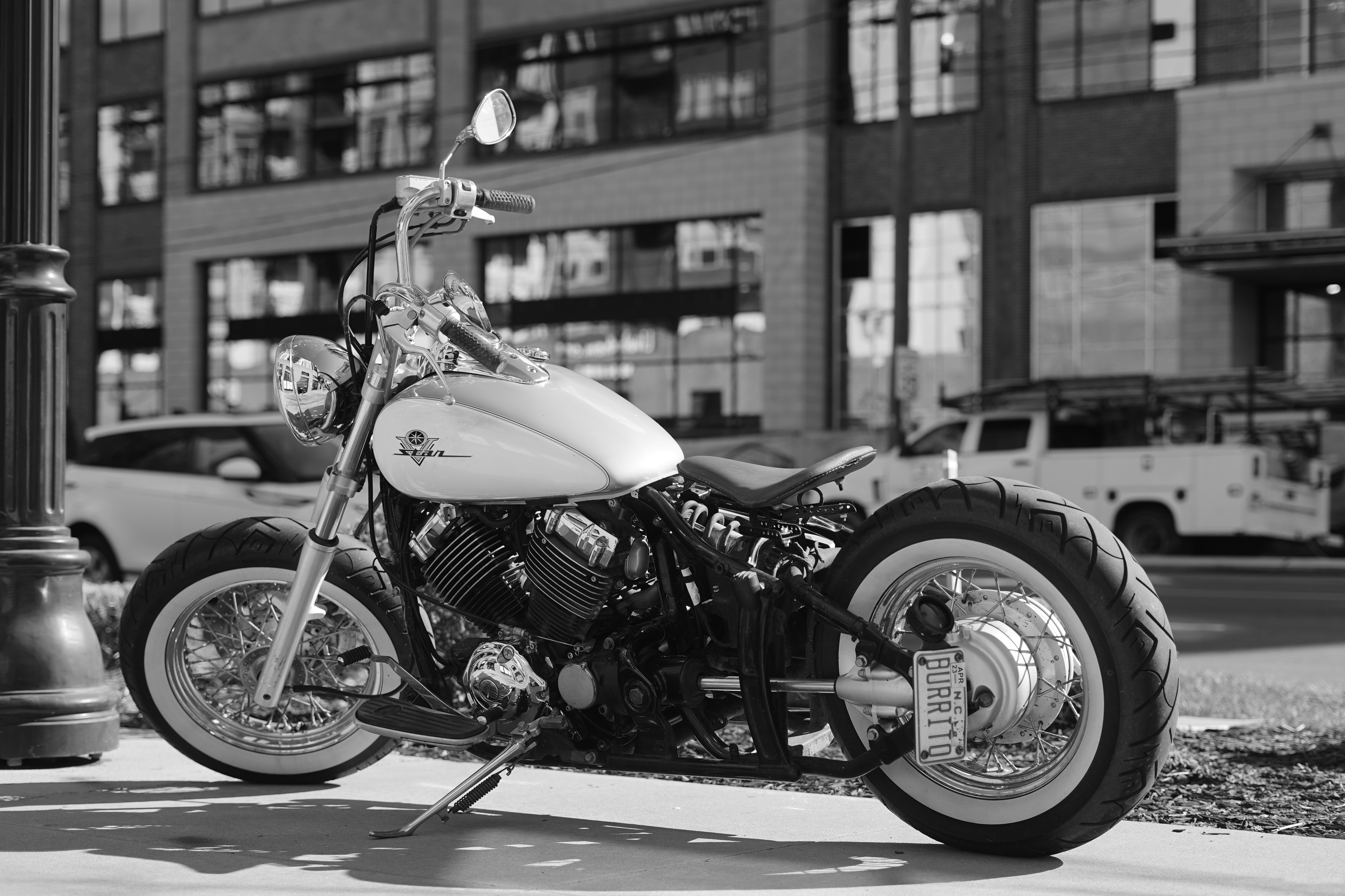
This one is a bit of a weird one for me. I don't usually photograph vehicles but this one really stood out to me mainly because of the license plate but it's also just a beautiful bike!
Anyways I really like how the light is shining off of different parts on the motorcycle especially the bright highlight on the gas tank and the tops of the engine. I also like the gradient on the rear tire. And I think the depth of field blur of the background is also sufficient and not too much bokeh and not too sharp - I think it looks very natural.
Things I don't like:
I think the background is too busy with the SUV and the work truck back there. If I were to take the shot again, I'd wait for the traffic to clear for sure. The owner of the motorcycle had seen me out there taking photos by this point and was talking my ear off about different aspects of it which did distract me from the photo and might have led to this mistake. I love meeting new people when doing street photography though!
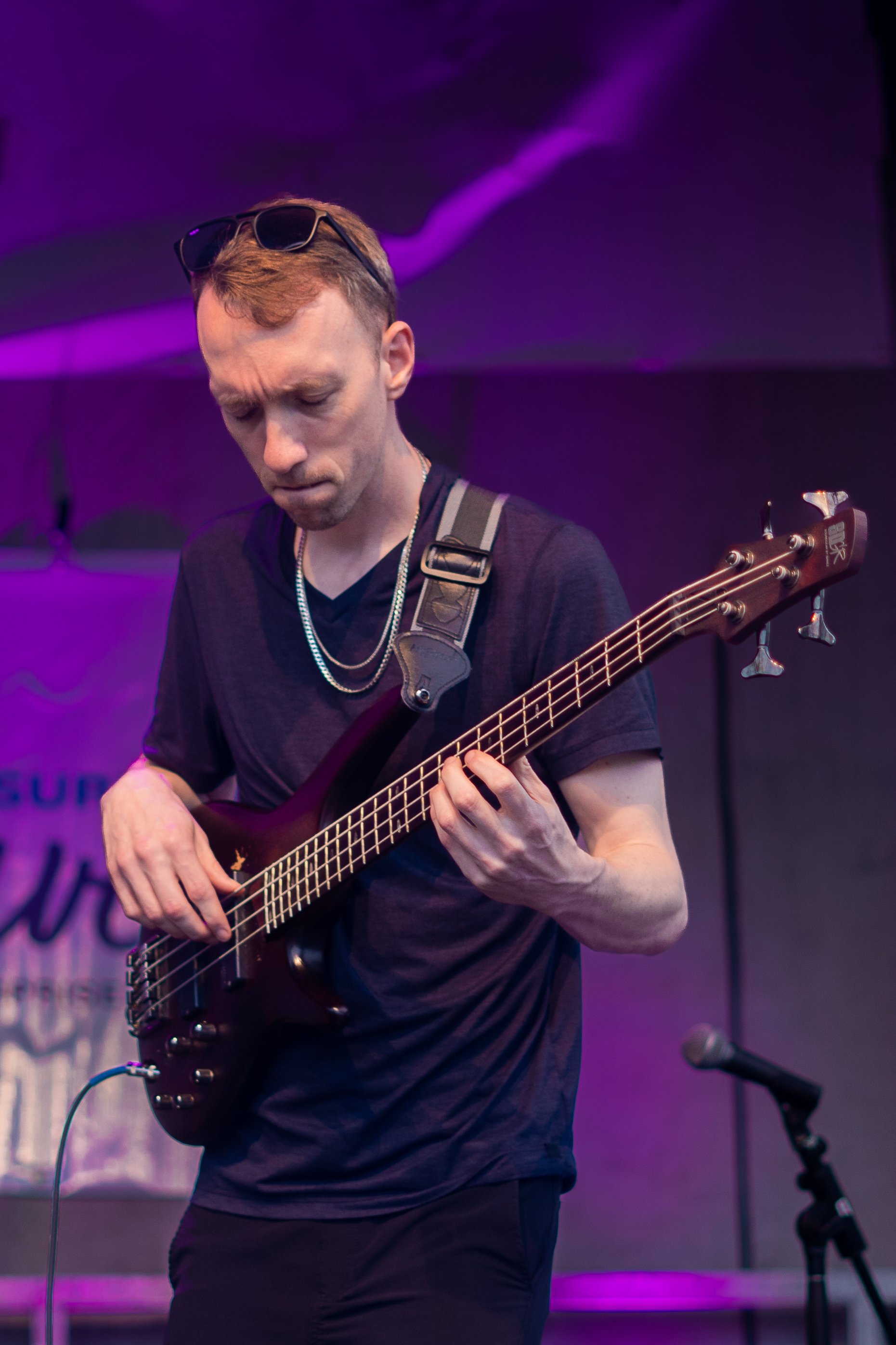
This was my first time photographing live music! I took a ton of photos that evening and this is, by far, one of my favorites.
I really enjoy the purple tones of the lighting on the backdrop. I feel like purple is a pretty uncommon color overall and I think it really makes this image pop. I like the concentrated look on the player's face like he is really focusing on nailing all the notes. I believe they were playing Gold on the Ceiling.
Another aspect of this photo that I like is the angle of the bass itself because it accentuates the depth with the leading lines of the strings and the neck of the bass. It feels like it's coming out towards the viewer.
Some things I don't like:
I feel like the background is too busy. I tried to fix a few things in Lightroom and even removed the text on the big banner behind the player, but I still feel like it's too busy.
I feel like the microphone could be removed from the image. And I would do that, but I don't like spending hours on making the removal look as perfect as possible and instead will just try to mitigate those distraction in the future when shooting other performers.
There is a pole directly behind the cord to the bass that jumps out to me and looks like crappy masking or some sort of retouching, like the cord is glowing a bit because of that. Personally, this is really distracting to me and may warrant a crop to remove that altogether.
Looking forward to your thoughts!
If your camera supports it you can try registering faces to prioritize the auto focus for a few of the standout players.
If your camera doesn’t have any ibis and you’re shooting with a crop at 200mm I think maybe you’re right that 1600 isn’t quite fast enough. You could go higher or maybe try out a monopod to help stabilize.
There should be a tracking AF option where you can select a focus point and then let the camera track the point but your camera may not have that option either.
If no tracking AF try using a larger point. My camera calls it zone AF where it focuses on one of the 9 boxes made by the lines of thirds.
It could also be a “get good” situation where you just have to anticipate a little of what might happen and try to be ready for shots a few seconds ahead of time. Practice makes perfect after all.
I hope that maybe this helps!