Just to be clear, the story about the couch does not appear to be true: https://www.snopes.com/fact-check/jd-vance-couch-cushions/
Just to be clear, the story about the couch does not appear to be true: https://www.snopes.com/fact-check/jd-vance-couch-cushions/
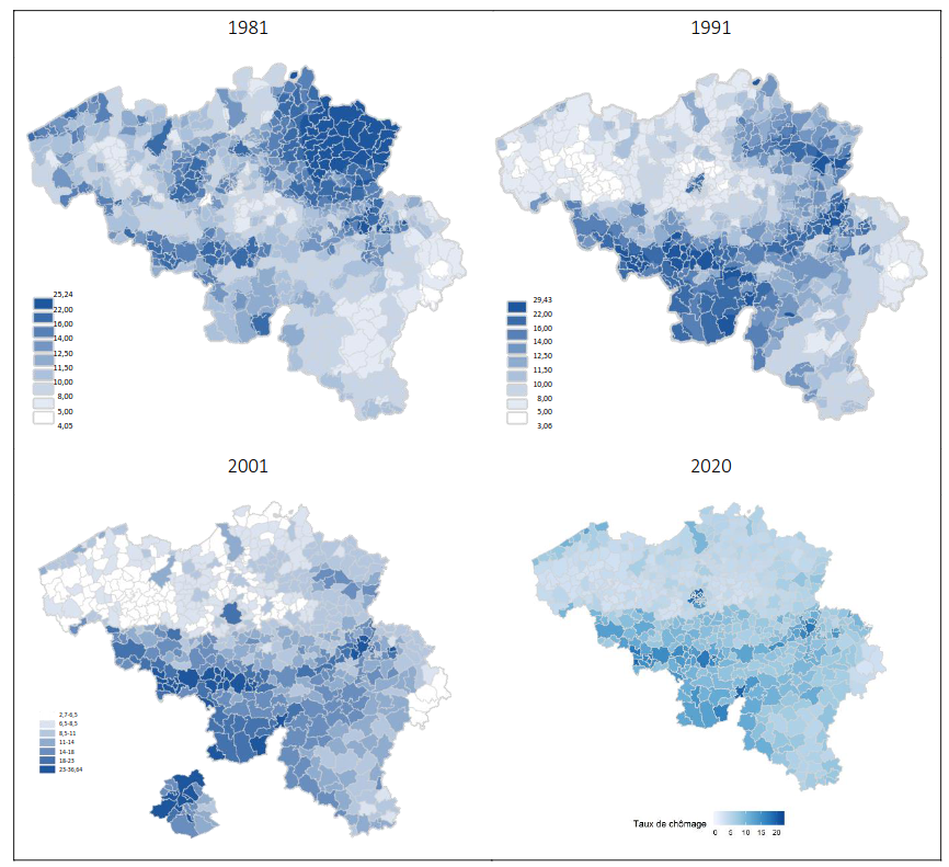
In the map it can be clearly seen that the unemployment is higher in Wallonia than in Flanders. This is largely due to the fact that Wallonia has historically relied on its heavy industry, such as steel and coal, which has moved abroad the last decades. In fact, the Sambre and Meuse valley which was the industrial heartland in Belgium thanks to its coal resources, can be clearly seen on the map.
It is also interesting to see how the distribution of unemployment has changed throughout the years, as seen on these maps:
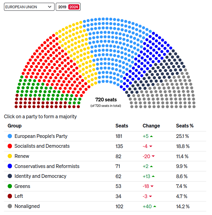
TL;DR Far-right on the rise more or less everywhere based on the estimates, green parties on the decline. Let's just hope it will not get too dire consequences in the five years to come.
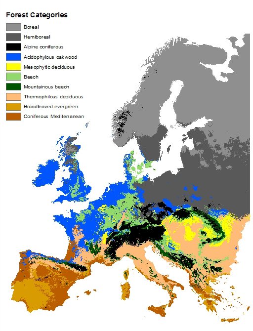
I found this map of dominant tree species in Germany while investigating it:
https://atlas.thuenen.de/layers/geonode:Dominant_Species_Class
Indeed, there is are significant difference between the maps. Perhaps most notably in Baden-Würtemberg where there seems to be a lot of fir. But I also think there is a a clear correlation between the maps. I also find it interesting to see the correlation between the suitable habitat for oakwood and the absence of forests.
More info about the map and the forest types here. The forest types are described in chapter 6.
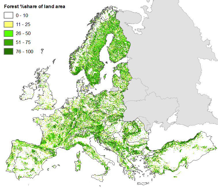
The map does not necessarily show what kind of forest actually grows in different places, if any, but rather which forest type you could expect to find there naturally, if it would be forest. But it probably matches reasonably well with what actual forests look like, although most of Europe is of course not covered by forests.
Here's a map over forest cover in Europe:
The graphical abstract is even better than the title:

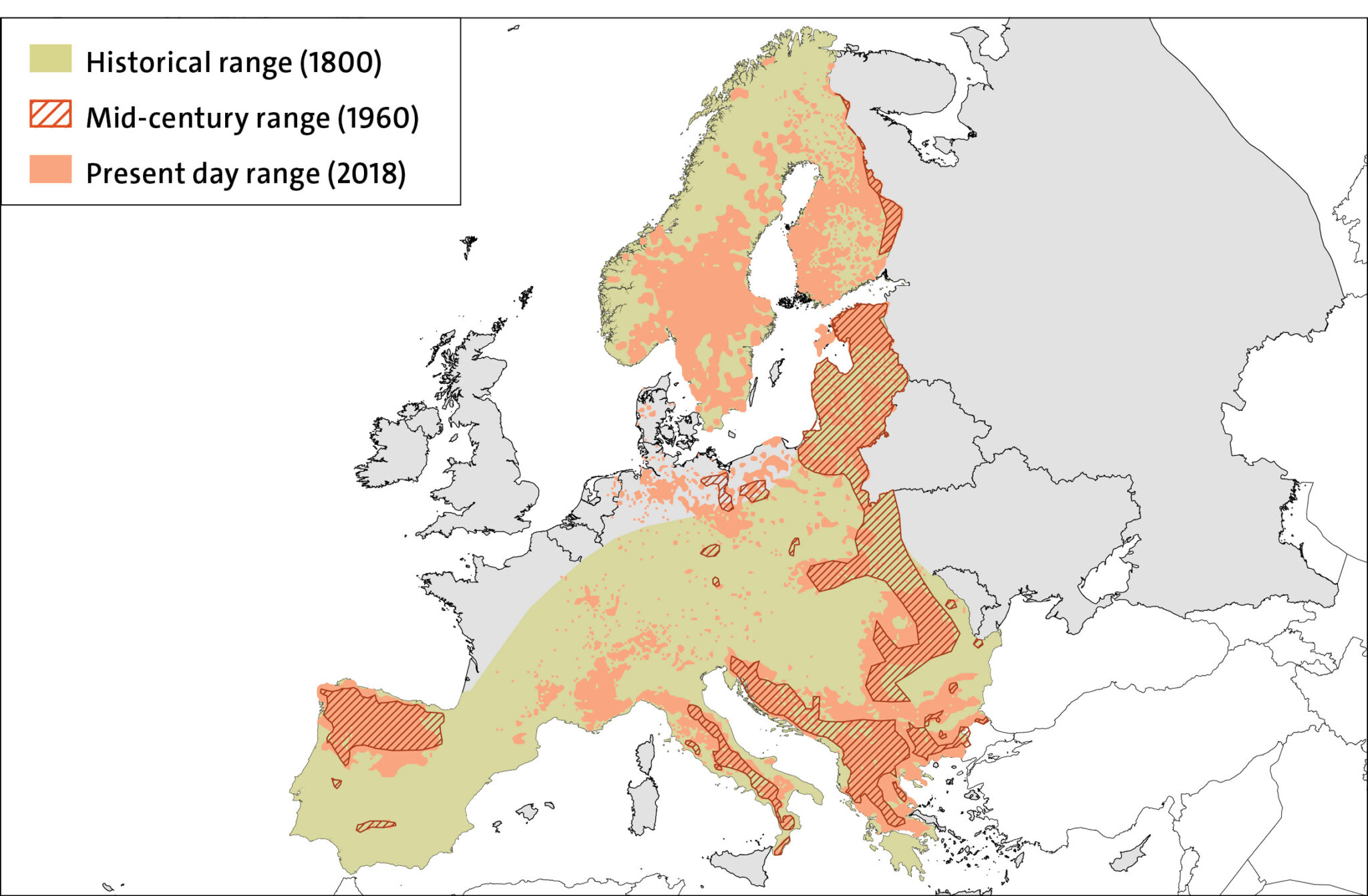
Map is a bit confusing since it has no data for Russia and Belarus, but there are wolves there. Here is another map with population numbers as well:

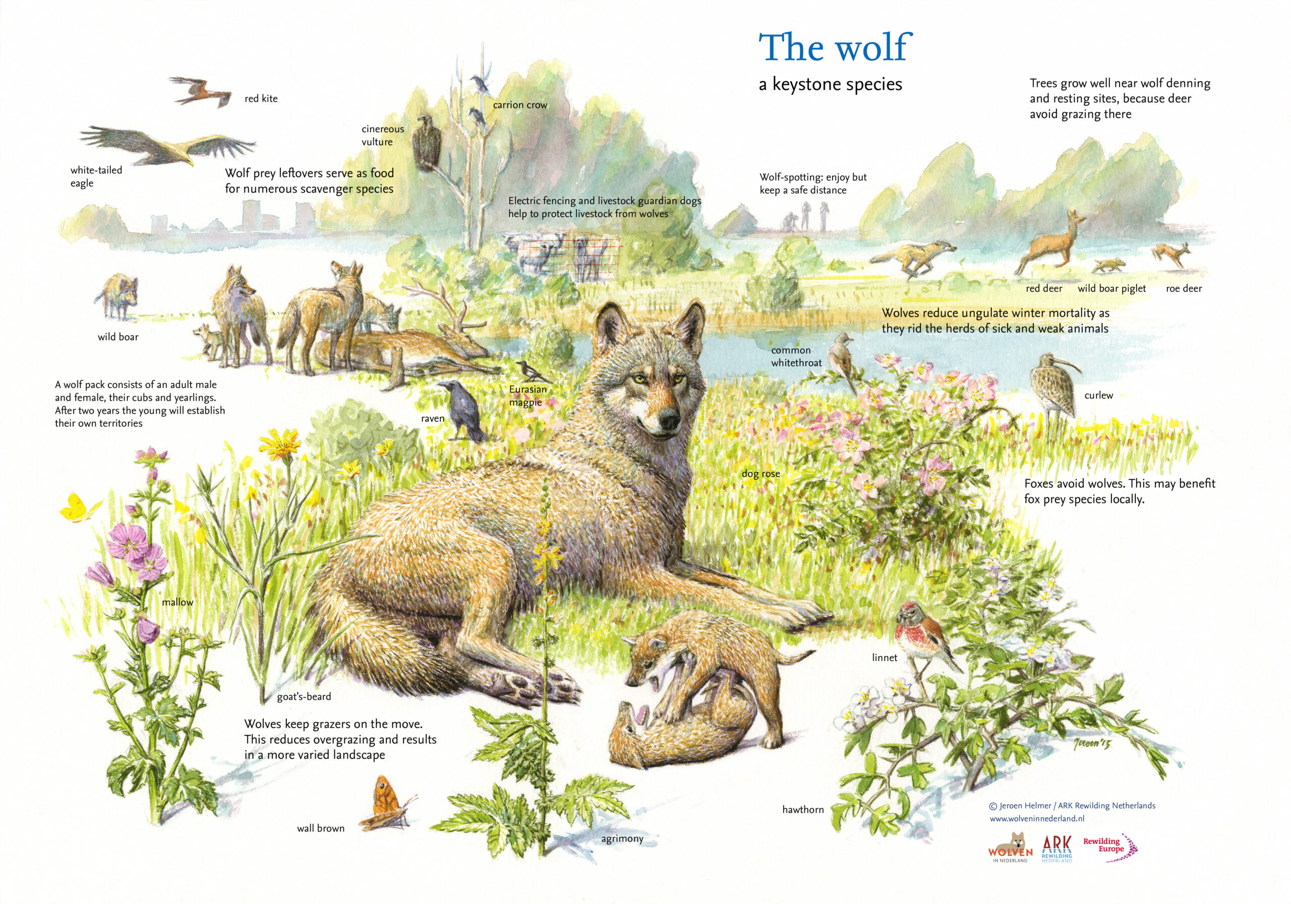
Also, pretty infographic about wolves from the same source:

Cervantes did it first:

Still got nothing on this guy that made a ride that takes like 3*10^78^ years to finish
Who the fuck made this inforgraphic?
It's from Wikipedia. Admittedly, I didn't do much fact-checking and just trusted it. But of course you can always contribute by improving the map.
Cool map! I spent quite some time looking at the many details. Also interesting to see that the Chinese were so aware of world geography at the time, even if it was thanks to exchanges with Europeans.
Cool! I had never heard about this theory for explaining color blindness.

The figure 80% needs to be nuanced a bit. The reason for such a drastic decrease is that there is a lot of forest land in Sweden. In 1990, the emissions were 71,6 Mt CO2eq, while the absorption was 51,39 Mt CO2eq. In 2023, the emissions were 44,22 Mt CO2eq and the absorption 41,22 Mt CO2eq. The net emissions did indeed decrease >80%, but that was because forests made them low in the first place. If we look the emissions only, they only decreased 40%, which is still a good achievement, especially since the population has grown, but far from 80%. Source, Swedish Environmental Protection Agency
So to a large extent the amazing figure is due to geographic luck. It's not very easy for other countries to copy this solution unless they also are lucky enough to have lots of forests.
It might also be worth noting that if you look at Sweden's consumption based-emissions instead, they are about twice as high as the emissions withing Swedish borders. Ourworldindata publishes consumption-based emissions for all countries, and by that measure Swedish emissions are low by European standards, but many countries have lower emissions and Sweden is by no means an outlier. (Note, numbers don't agree with those from Swedish Environmental Protection Agency, probably due to different methodology.)