this post was submitted on 18 Dec 2024
846 points (98.6% liked)
Comic Strips
12988 readers
2920 users here now
Comic Strips is a community for those who love comic stories.
The rules are simple:
- The post can be a single image, an image gallery, or a link to a specific comic hosted on another site (the author's website, for instance).
- The comic must be a complete story.
- If it is an external link, it must be to a specific story, not to the root of the site.
- You may post comics from others or your own.
- If you are posting a comic of your own, a maximum of one per week is allowed (I know, your comics are great, but this rule helps avoid spam).
- The comic can be in any language, but if it's not in English, OP must include an English translation in the post's 'body' field (note: you don't need to select a specific language when posting a comic).
- Politeness.
- Adult content is not allowed. This community aims to be fun for people of all ages.
Web of links
- [email protected]: "I use Arch btw"
- [email protected]: memes (you don't say!)
founded 2 years ago
MODERATORS
you are viewing a single comment's thread
view the rest of the comments
view the rest of the comments

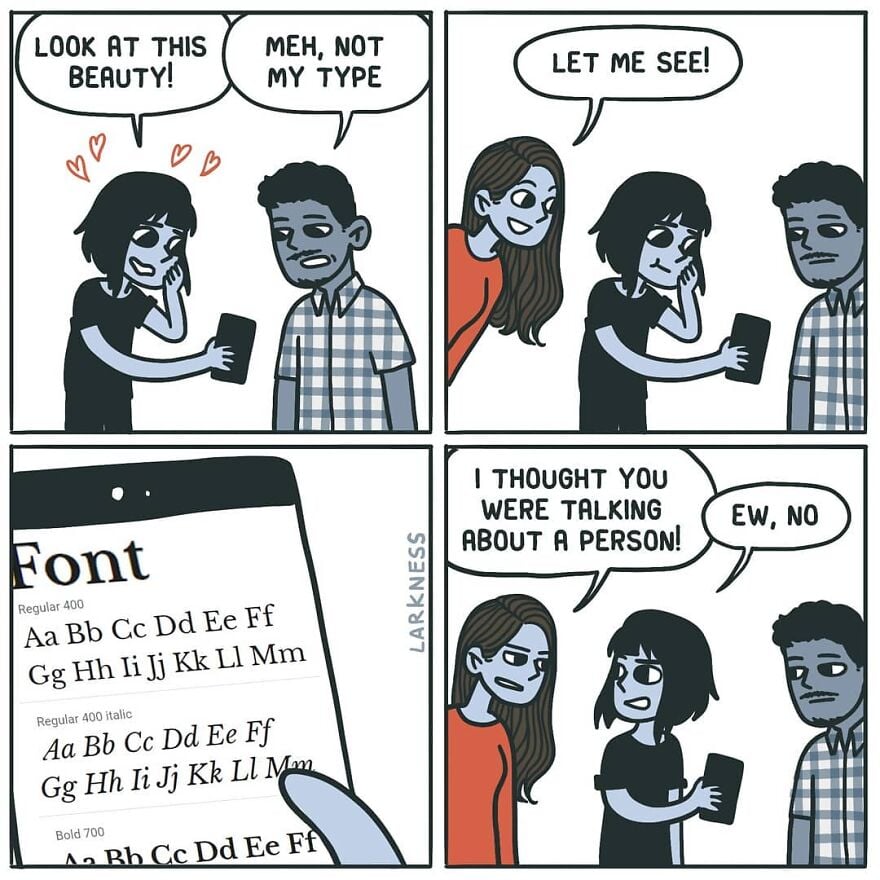
Wait, is this Comic Sans? Some just want to see the internet burn
I feel like the comic sans hate did die down in recent years and justly so. It was overhated IMHO. It's an ok font for certain uses. The problem was mostly people misusing it to serve roles it was never designed for.
I saw a meme where it was "big brain" to use it for their IDE/notepad so I tried it out and my god it's not even funny how legible and easy on the eye it is.
You may enjoy these:
Comic Mono https://dtinth.github.io/comic-mono-font/
Fantasque Sans Mono https://belluzj.github.io/fantasque-sans/
They're good, but I find both to be marginally less legible than Source Code Pro where the i and j are clearer, particularly when next to each other. The a is less clear in Source Code Pro though, so I'm still looking for the perfect font.
It will look good in a children story-book. Not in a professional email.
Sure, but we use Papyrus, not Comic Sans.
I know a person who professionally does something with text. She made it her mission to format every single email in ComicSans, bold, italic, red, centered.
See that's funny. My boss using comic sans light blue for emails explaining highly technical shit to non-technical users? Funny in theory, absolutely not in action.
that's how you teach them to highlight and copy/paste text