Well I've never heard of any of those games! Thanks!
There's a PS1 game called One which I think might be cyberpunk:
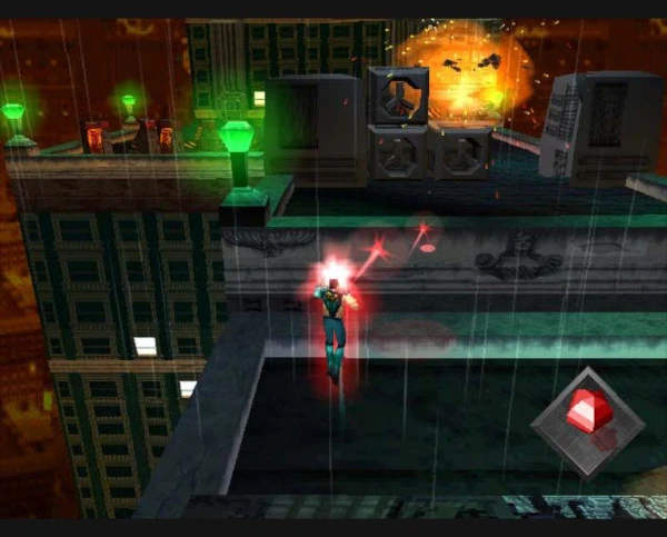
But unfortunately, either I'm terrible at the game or the game itself is terrible because I can't beat the first level.
You can always just scroll down to hide those buttons since the view isn't locked. If only the bottom-half of the screen scrolled and the menu was always visible i could understand the complaints.
Honestly, I doubt people will spend that much time on the profile page such that we need to optimize its screen real estate. It's more important that they can find what they're looking for the first time they visit the page since they probably won't go to it too often. That's just my opinion though, maybe other users spend all day on the profile page.
I will say though, your mockup of sliding the menu out from the right looks great, I just don't think it's needed on the profile page.
The display name of "Raccoon" and the unread comments count looks great, thanks!
But I'm not seeing any difference with the "Fade read posts" option. Can you share screenshots of what you expect faded vs non-faded posts to look like?
I understand this novel is practically a diary, but that doesn't mean it has to be a good movie.
I've read a lot of PKD's books and while i won't stop anyone from enjoying them, I personally felt like he had great ideas/worlds but struggled with telling a story in that world. So I'm not confusing the films made from his work with the actual work, I'm specifically only referring to the films. I think when films use his novels as a template for world-building, it turns out great. But attempting to accurately portray his novels on film tends to fall flat.
It's perfectly fine if you to disagree with me, but I wasn't making any comment about the novels or his writing style. I was only making broad generalizations of the film adaptations.
It's more GitS, which is always a good thing. With the new character models you can tell this is a new continuity and to not worry about trying to align into earlier stories/plotlines, even though everything is still similar. This is kind of telling the story of how Major joined Section 9, but things are different enough that you wouldn't call it a prequel series.
Arise is probably the easiest to get through because it's only four 50-minute OVAs. Then they re-cut those 4 OVAs into eight 30-min episodes and called the series 'Arise – Alternative Architecture'. Of course, just to complicate things, Alternative Architecture got another "OVA" as the final two 30-min episodes called Pyrophoric Cult. So you could consider the entire series to be 5 OVAs. Oh, and I guess Ghost in the Shell: The New Movie is also part of this continuity. So 5 OVAs and a movie.
You can watch the entire series on Crunchyroll. Note that Crunchyroll shows "season 1" as being all the OVAs, "season 2" is the re-cut OVAs into episodes (Alternative Architecture), and "season 4" is The New Movie. I have no idea why Crunchyroll didn't call that "season 3"...
That's a perfectly fair solution for myself, but I'm hoping it's easy to make this change in the code so everyone can benefit from it. I'll definitely go this route if the code can't be changed though, thanks!
To be fair, this includes all novels and video games too. As far as animation, I see it as: the two movies, Stand Alone Complex anime, Arise anime, and SAC_2045 anime. It isn't too overwhelming in my opinion. Although, Stand Alone Complex is like 52 episodes, which is longer than most anime I watch.
Also, Stand Alone Complex and SAC_2045 both had their episodes pared down into compilation movies (which is what the arrows represent). So you could get through those even faster if you wanted.
Awesome! I'll be sure to switch to the dev build!
I actually don't like the idea of using the FAB, it "hides" these pages too much. The FAB disappears when you start scrolling and if I saw a "+" button on my profile page I would never think clicking it would allow navigation to other pages.
If anything, you could expand/collapse those 5 options at the top, or turn them into horizontal tabs rather than vertical menus. But please don't hide them all within a "+" button. I already missed the "hide read posts" button because I never thought to click the "+" FAB on the main screen. I just assumed clicking the "+" button would be a "create post" so hiding options unrelated to post creation behind that button is extremely confusing to me.
If you're going to hide lots of options behind a FAB, please change it to a hamburger icon (three lines)  or something else other than a "+" icon.

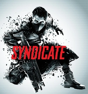

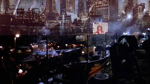
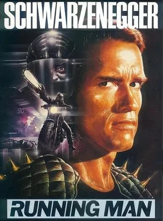
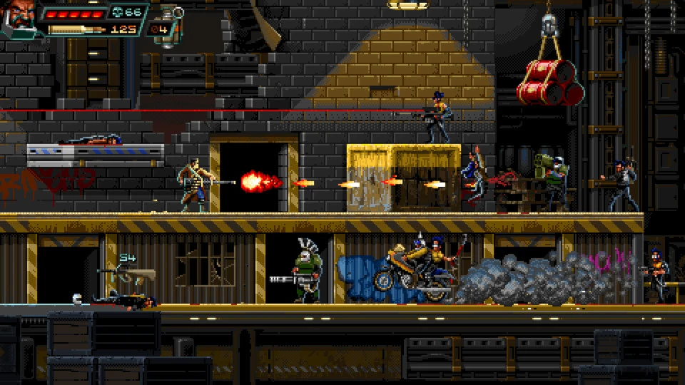

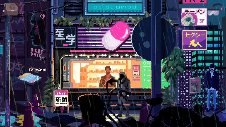

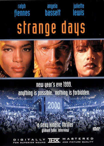

Snatcher is a fantastic choice for a retro cyberpunk game! I'm not going to judge what your favorite retro cyberpunk game is, I only mentioned action-oriented games to try to get people thinking.
Also, I'm more likely to try a game I've never heard of if it's action since point & click adventure games usually demand more dedicated time. You can't just pick up a point & click game and play for 10min to see if you like it.