cross-posted from: https://feddit.org/post/3142575
Be respectful
cross-posted from: https://feddit.org/post/3142575
Data is fugly. Should be order by the per capita number , unless the intent was to mislead
Totally. There's really no point in using anything /except/ per capita!
I'm a person, not capita!
Well but how many heads do you have? If you have two heads do you eat same amount as 2 persons?
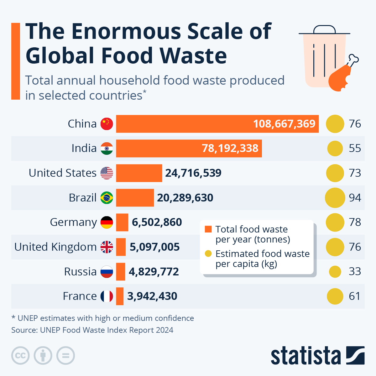
Per capita with total as tiebreaker:
Brazil 94kg
Germany 78kg - 17% less than Brazil
China 76kg - 2.6% less than Germany
UK 76kg - 2.6% less than Germany
USA 73kg - 3.9% less than UK/China
France 61kg - 16% less than USA
India 55kg - 10% less than France
Russia 33kg - 40% less than India
Not necessarily.
This way shows where the biggest impact can be made. If you’re deciding where to spend money to address the issue, your money is better spent in the top four no matter what the per capita numbers are.
Both numbers are valuable, but the visualization is bad. Per capita is very nearly not visualized at all.
That's not true.
It totally depends on the problem and the solution. If there is no economy of scale at force for the solution, it won't make a difference.
It depends how you spend your money but it probably goes further if there's less people. Your money's better spent where the ratio of waste to people is highest.
It's a population chart...
Per-capita figures are on the right. I think this metric should be given the bar chart.
The more useful bit is the "per capital" data on the right side.
Brazil being so high is surprising to me
Russia being so low makes sense and is a bit sad
I was surprised too. There’s a lot of food waste in food commercial hubs there, and there are accurate numbers for that. This mentions household waste, but I doubt they have any numbers for that in Brazil (and much of anywhere else, really). So I’m guessing that’s whatever numbers they can get on food waste.
Looked at the UN report that this chart is trying to use and found this: “Food waste” is defined as food and the associated inedible parts removed from the human food supply chain.
Wait, so they're including inedible parts like husks, peels, etc. that can't actually be used for food? So this is more a combination of food waste and food byproducts, then. It might say more about the types of foods that these countries prefer than how wasteful there are if they consume more foods with inedible byproducts.
The motivation behind doing it was that different cultures treat what is food differently as is exemplified in their example of chicken feet. However, that also raises big questions on the efficacy of this data since houses which use raw fruits and vegetables are probably likely to have higher food waste by this definition since most people aren't buying bone-in meat. But since a big objective of their report was tackling greenhouse gas generation from said food waste, I guess it makes sense in that context? I tried to figure out the exact methodology by which they estimate their numbers but I wasn't able to find it.
It's crazy when you think about the whole supply chain: preparing the soil, ploughing, applying fertilisers, applying pesticides, harvesting, processing, transporting, and then you just chuck it out and each step of production had its footprint.
It's why expiration dates must be updated to reflect real expiration dates, not "best by". We toss large amounts of food because of that. Probably large amounts of restaurant waste, too.
I think it's more of the expiration date should be more explicitly a suggestion and a limit for the retailers. People think after the best by date it's no longer good, when in reality it literally means what's written: better before, not bad after. I'd say it's a wording thing first, because using an actual expiration date is impossible, and would open food producer to petty lawsuits about the product being not good 1 day before the estimated date
My grocery started a campaign where the "guarantee your milk has at least 10 days," so they're discarding or diverting milk not just on the 'best by' date, but 10 days before that. All I can hope is that it's getting diverted to lower-cost stores or food banks and not actually getting thrown out, because that's ridiculous.
It's crazy when you think about the whole supply chain: preparing the soil, ploughing, applying fertilisers, applying pesticides, harvesting, processing, transporting
It's also crazy how efficient modern agriculture must be to do all these things and get affordable products in the end
efficiency ≠ price
you've glossed over a lot of economics. Like, for one thing, the EU gives about €55 billion in agricultural subsidies a year.
Cost of production puts a lower bound on the price. In case of competitive industries, price floats just above that limit
Right. And food is sold at below that lower bound, which is one reason it is affordable.
The solution I propose: every household gets a government issued pig.
Why not a pony?
this seems like a useless metric as is
How much is this percentage wise?
NPR/USDA estimate that adults eat about 2000 pounds of food per year, so 94kg/2000 pounds = 10%. 73 kg/2000 pounds = 8%. Not bad, honestly, considering, for example, a banana peel is 12% of the banana.
So if they've shown percentage the numbers wouldn't really fit the agenda. Biased article is biased
Multiply anything by a billion people and it's going to be a big number - food waste, plastic grocery bags, paper napkins. It can be a way to encourage people to think about their own contribution to environmental problems, but it often ends up distracting people into making a big deal of, and demanding personal lifestyle changes over, something that's actually a small contributor to the real problem.
Yay finally something the US isn’t number one in.
Brazil...we need to talk.
Not terribly clear as to why.
Damn, China, give some of it to all those starving kids my parents told me about.
Actually, that's a good thing, because if some extraordinary event happens, like a gigantic volcano eruption, we want to have food to spare.